Savouriq Zine - Turmeric Edition
Monthly Released Zines Featuring Different Spices Each Month
Lead Designer
Adobe Creative Suite | Illustrator | Photoshop | InDesign
Project Overview
Savouriq releases a new zine every month, each one highlighting a unique spice through stories, vibrant visuals, easy-to-follow recipes, DIYs, and everyday hacks. For this project, I was responsible for the entire design of the zine—including layout, color palette, and typography. I carefully crafted each spread using a consistent grid system to maintain structure, while still allowing creative freedom for each section to feel fresh and engaging. The typography was chosen to reflect the personality of the spice being featured, balancing legibility with a strong visual identity. Color palettes were built around the tones and cultural associations of the spice, creating a warm and inviting look. Each zine feels cohesive but distinct, encouraging readers to not only learn more about spices but to interact with them in fun, modern ways that blend culture, design, and everyday life.
Design Process
Design Direction
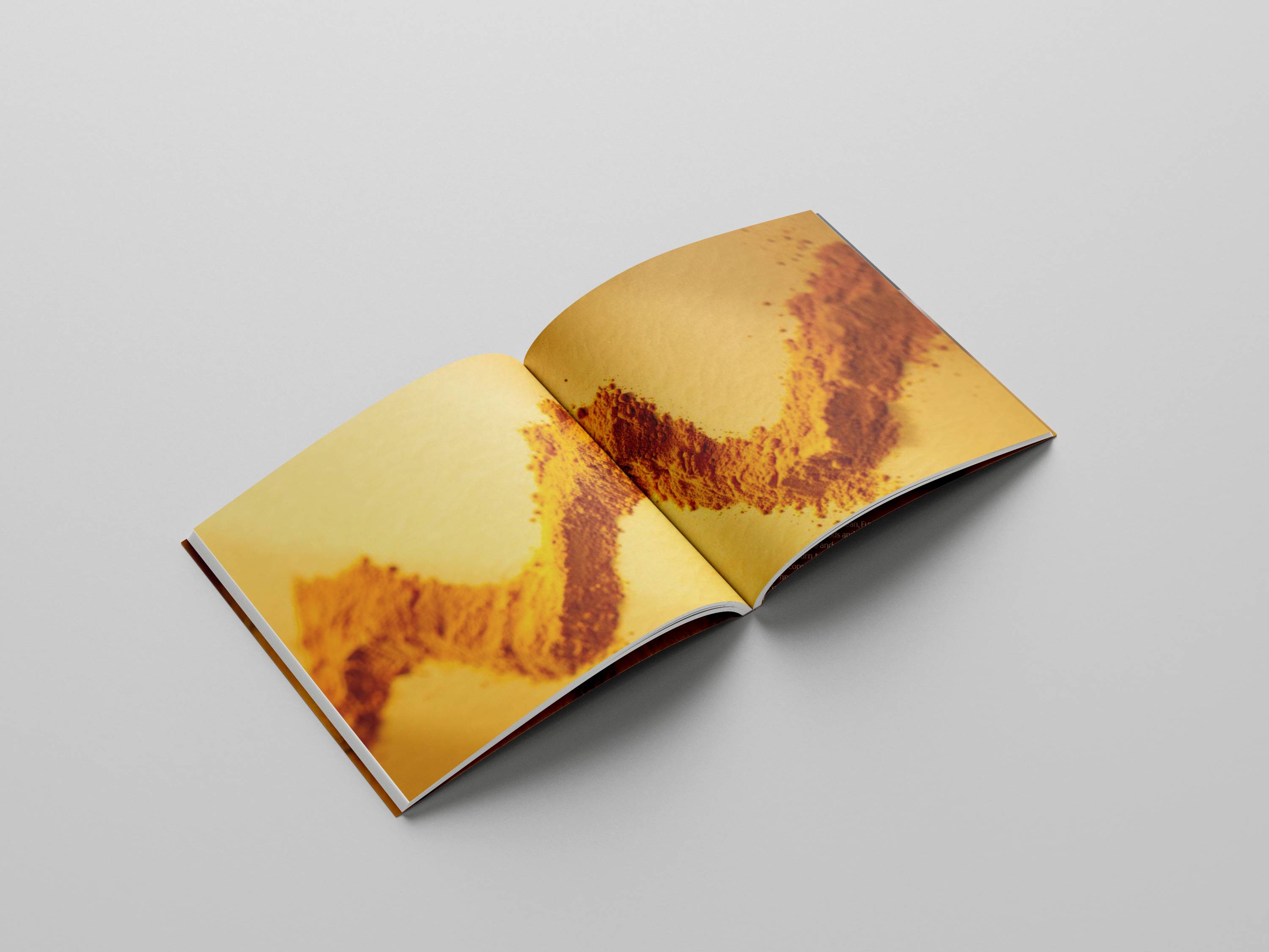
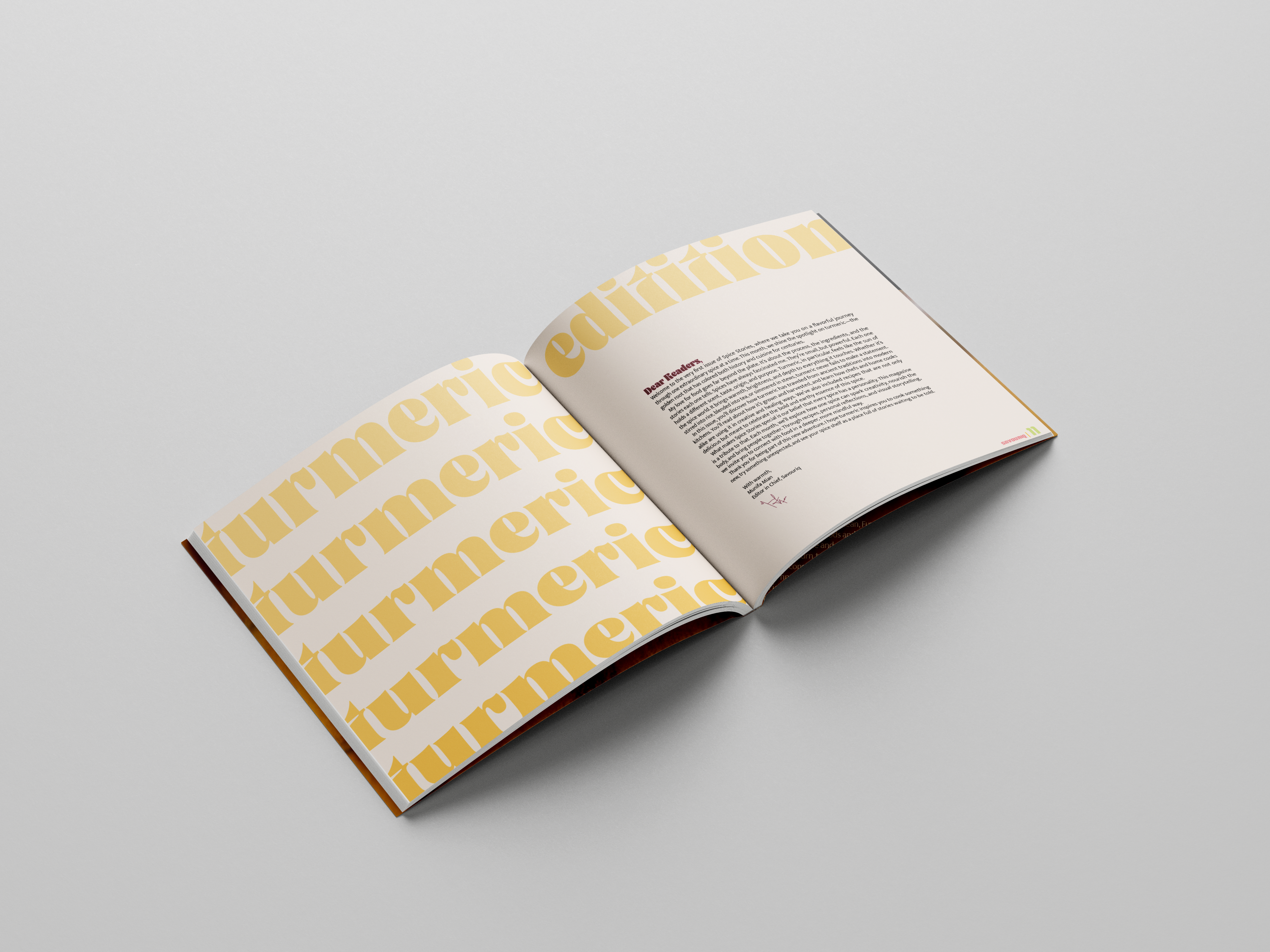
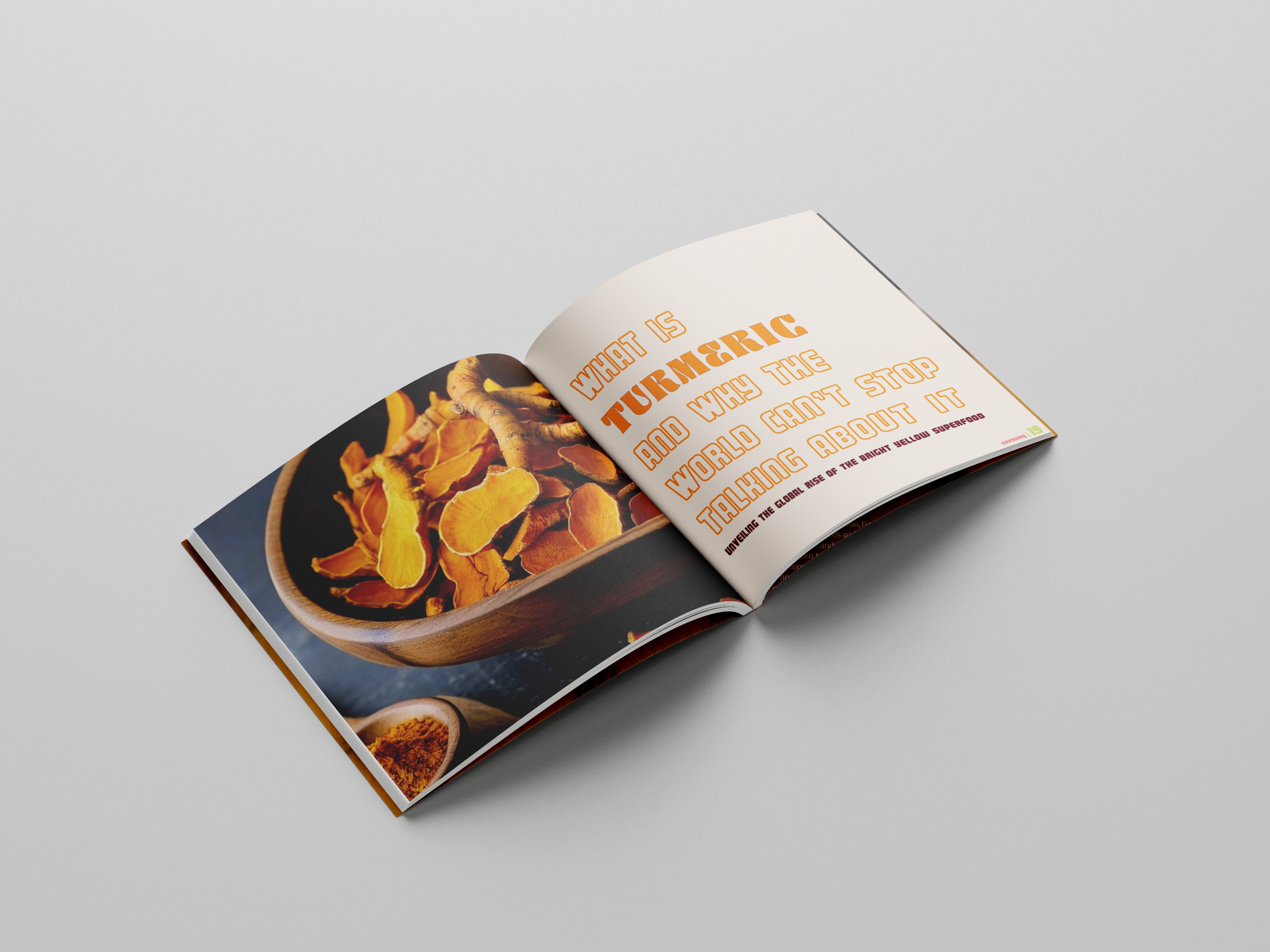
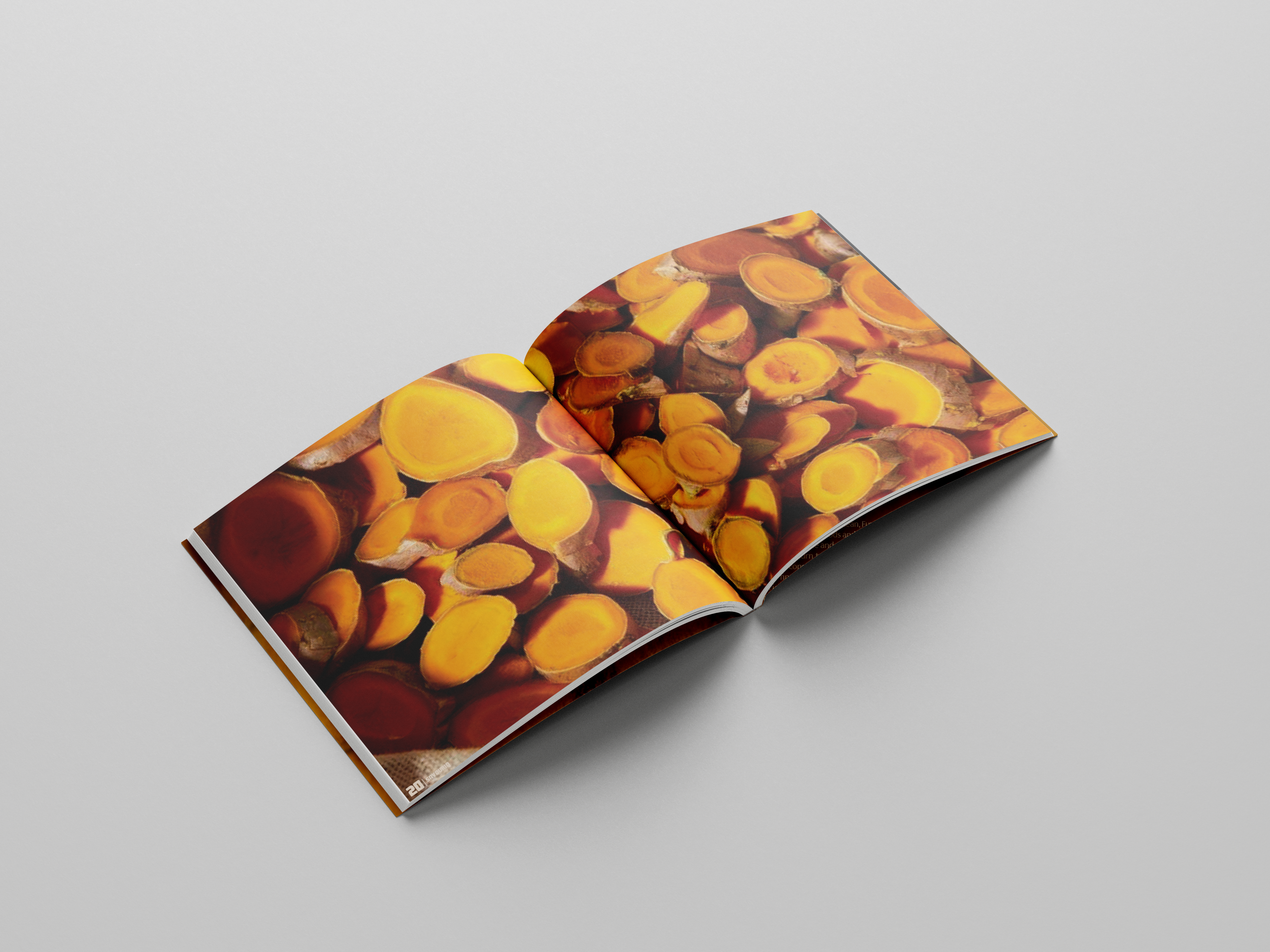
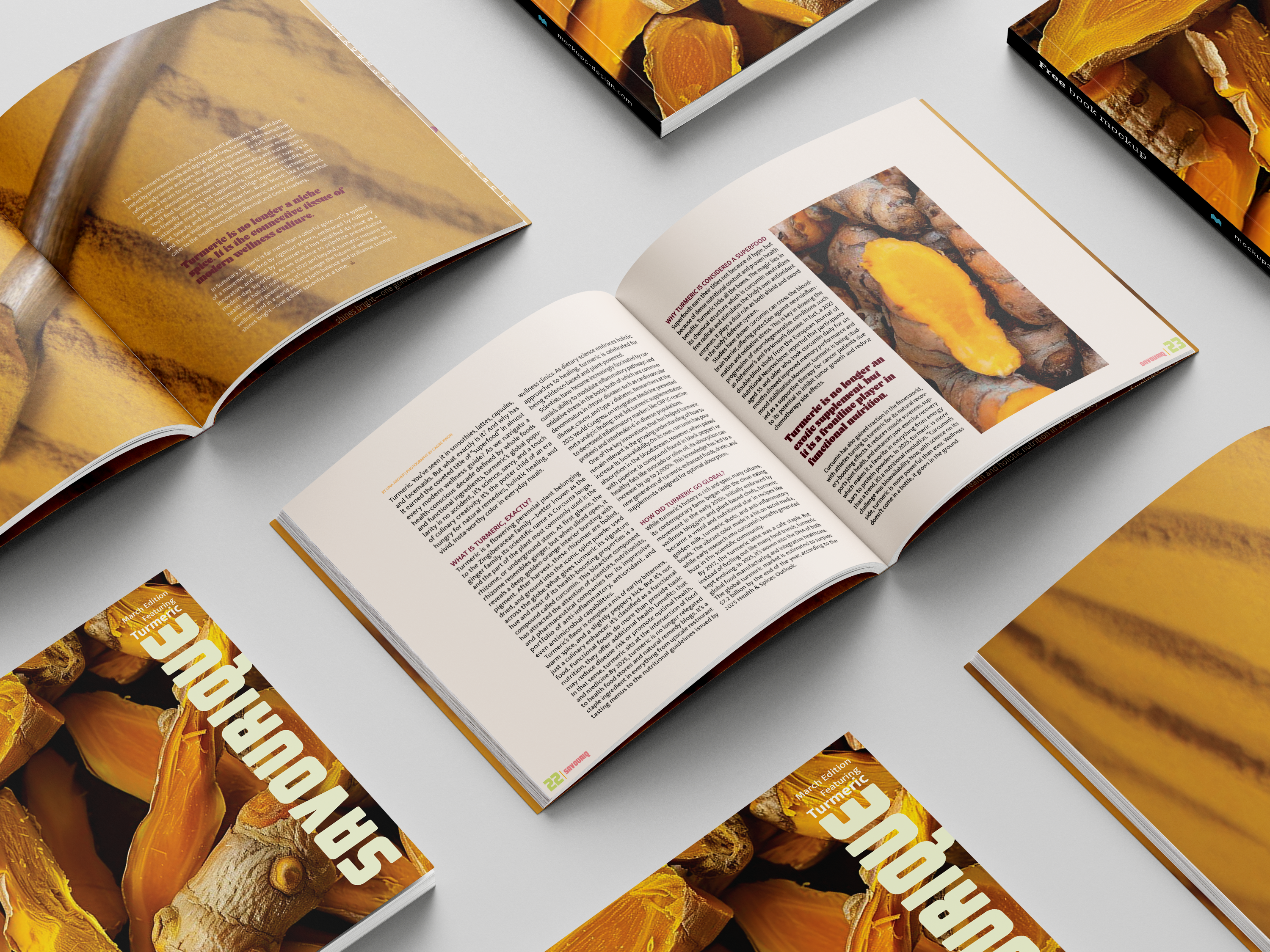
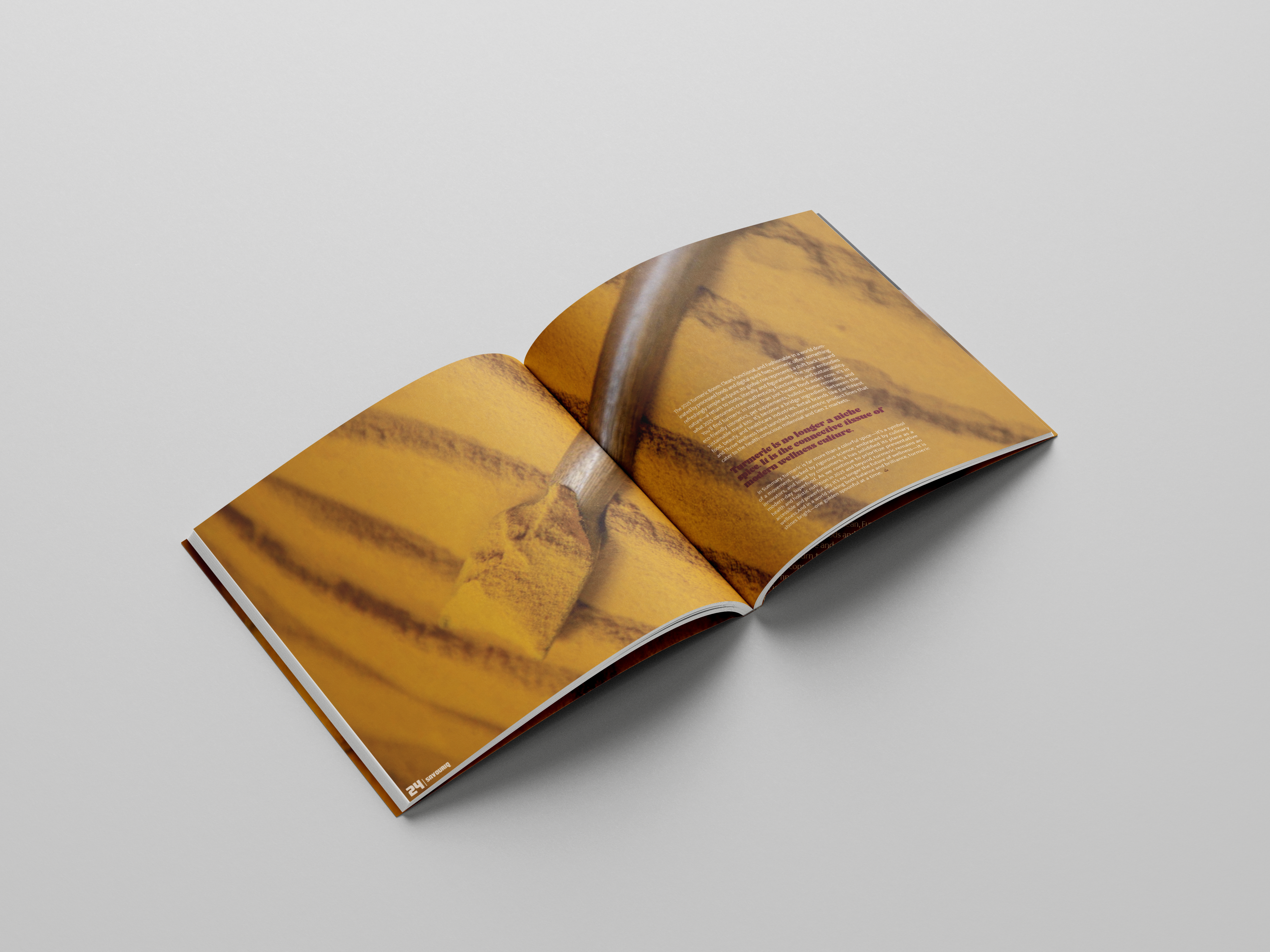
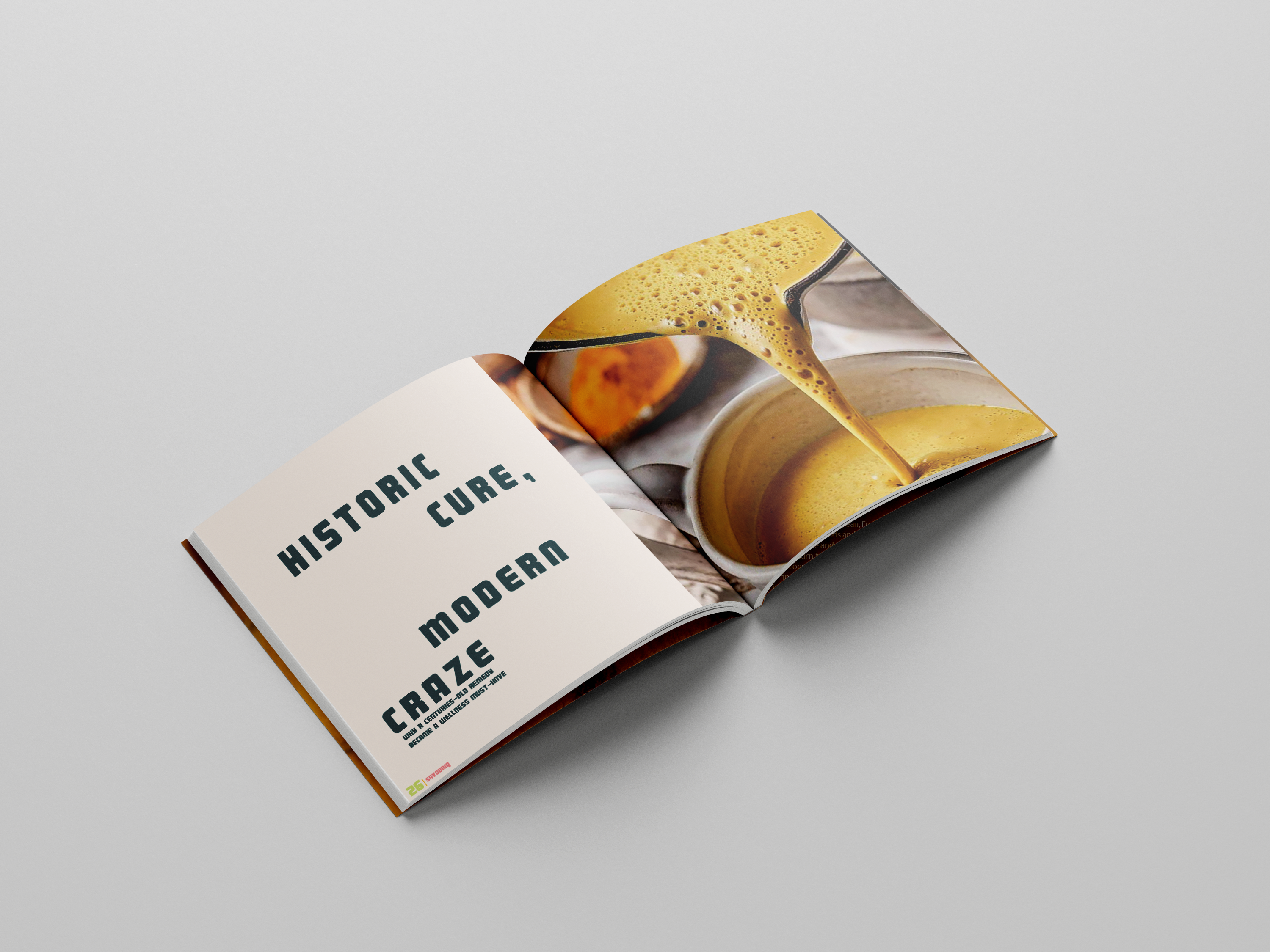
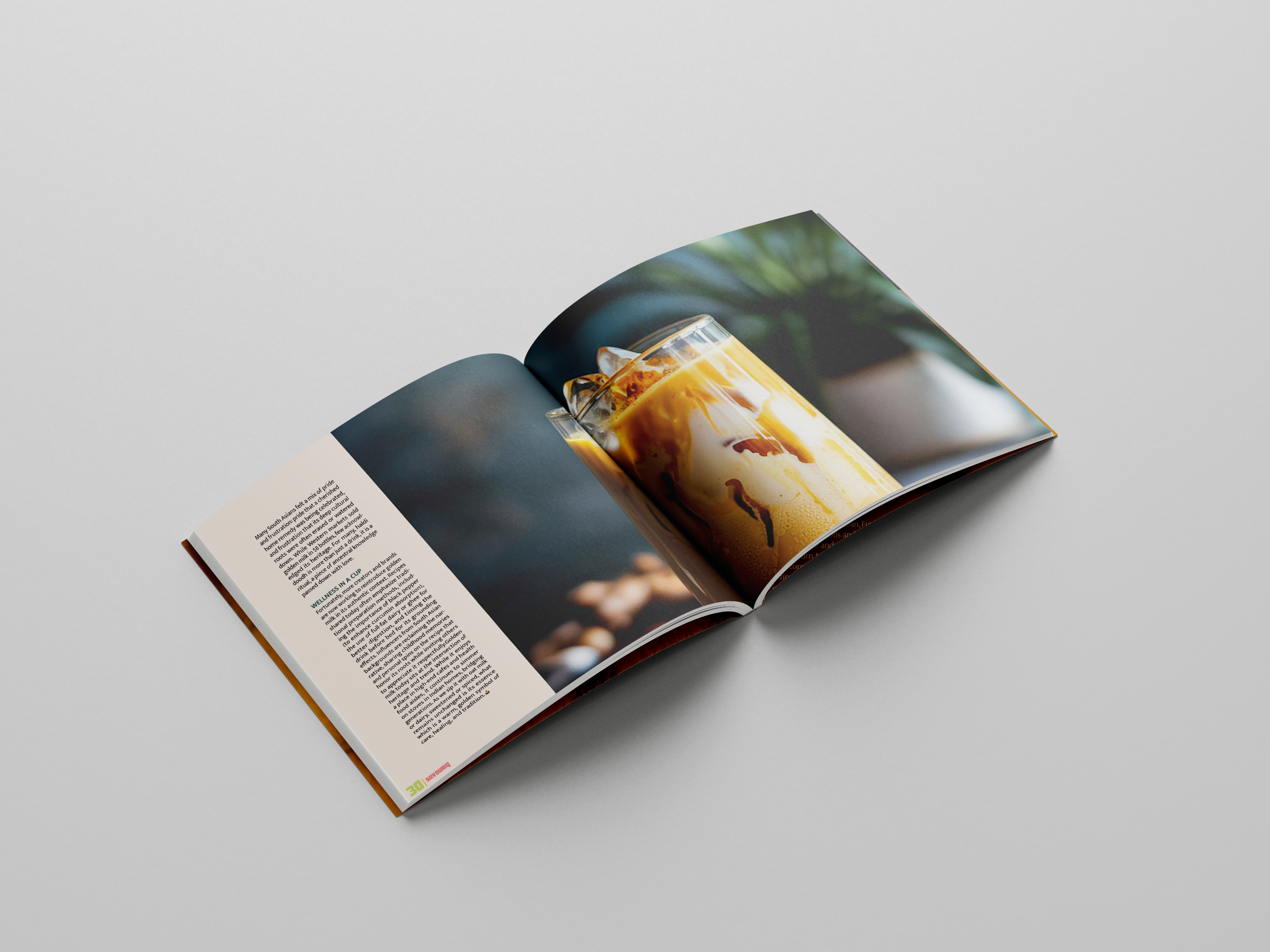
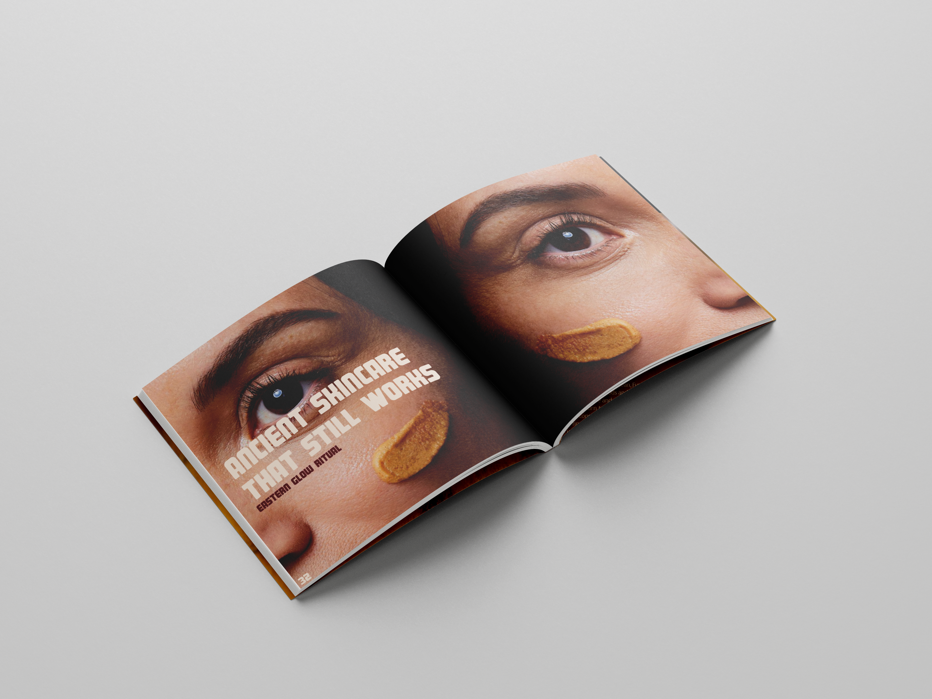
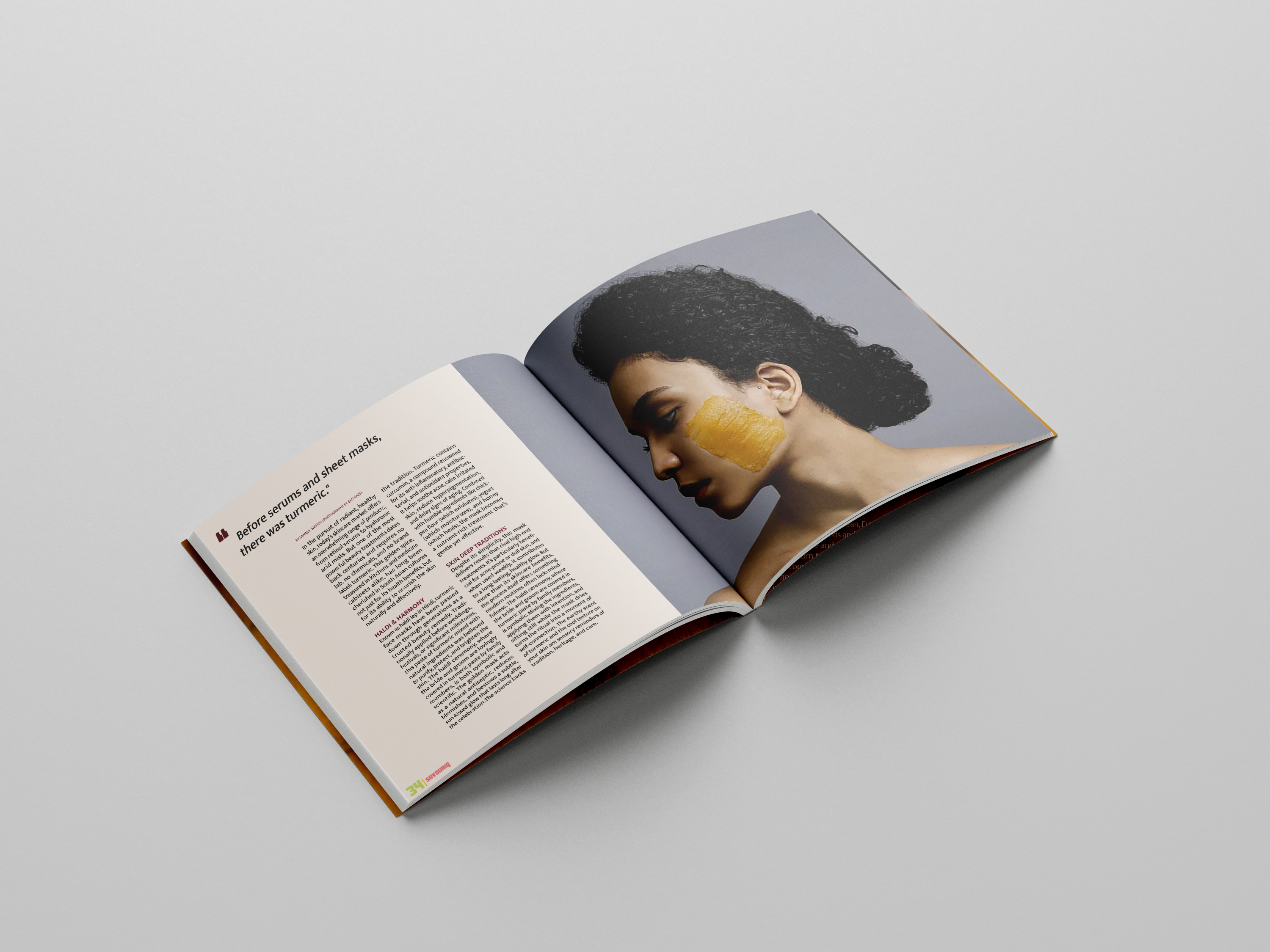
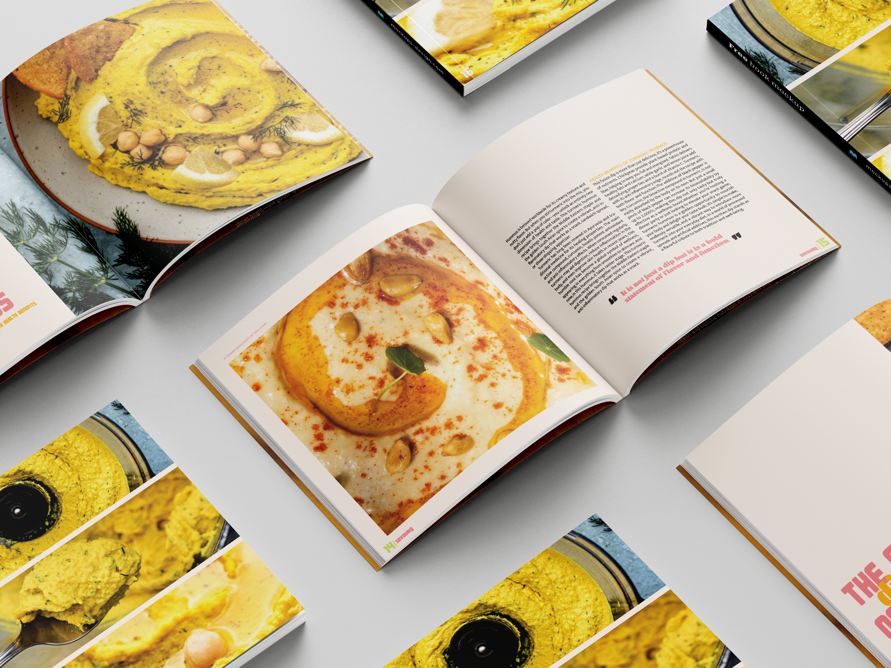
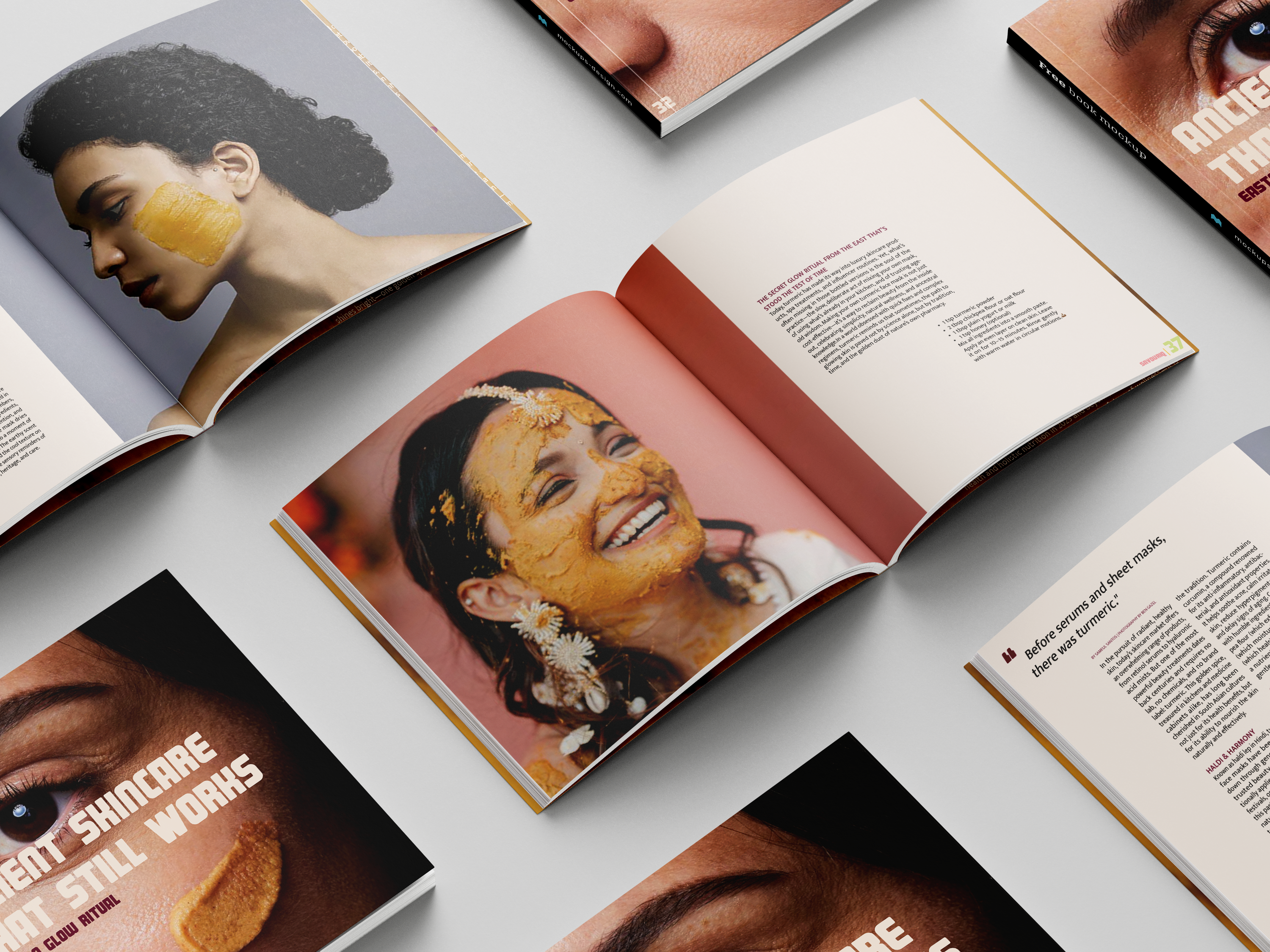
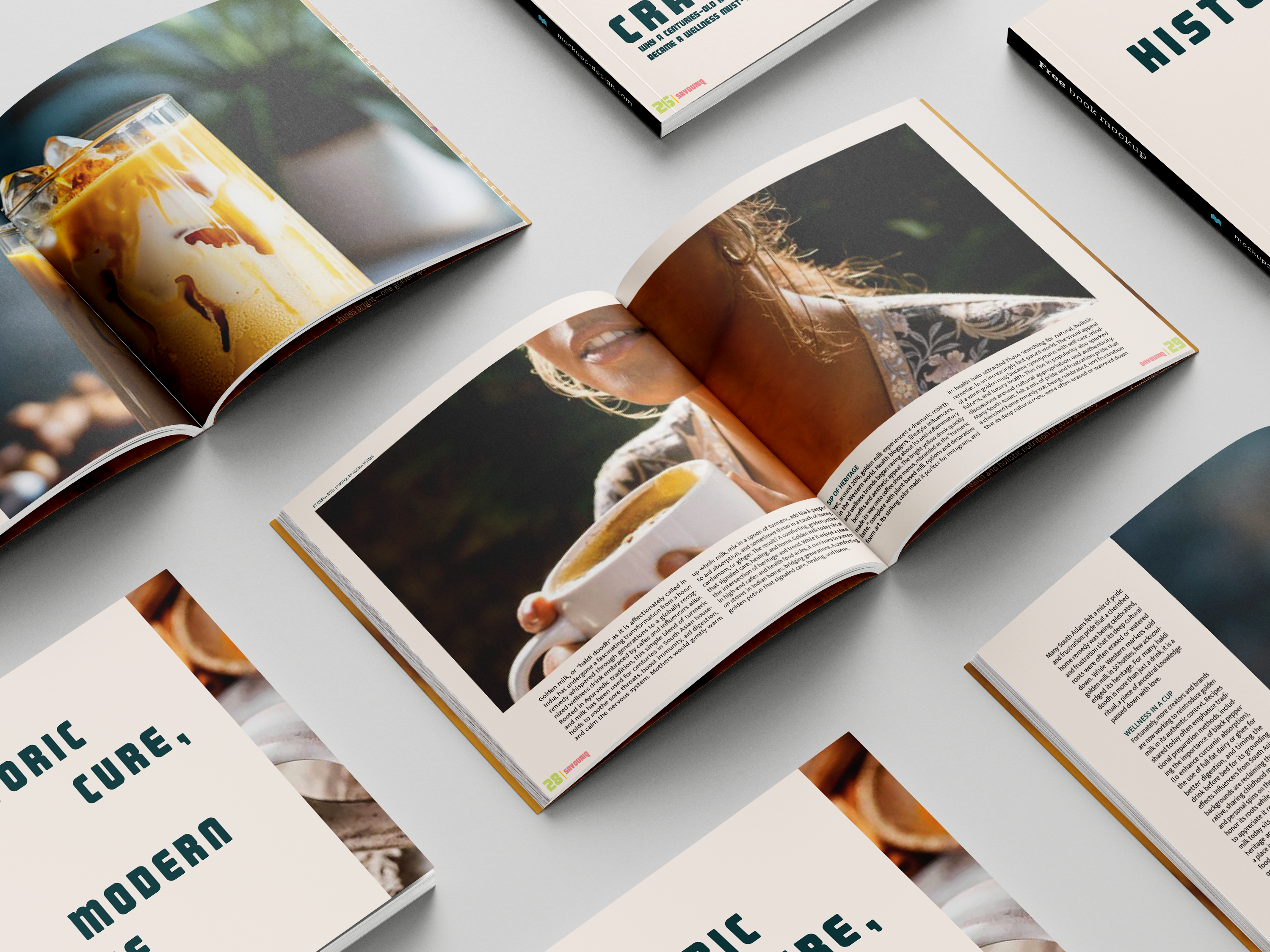
Each month, savouriq's zine explores a different spice—its origins, cultural history, health benefits, and how it’s used around the world. Packed with fun facts, easy recipes, and DIYs, the zine helps readers rediscover everyday spices in new ways. This month’s edition focuses on turmeric, highlighting its role in cooking, wellness, and global traditions.
Color Palate
zine’s color palette blends vibrant and earthy tones to capture the essence of spices in both avor and culture. It features warm sa ron yellow (# b41b – C: 0 M: 30 Y: 100 K: 0) and zesty orange (#fe9a2a – C: 0 M: 45 Y: 95 K: 0) to bring energy, brightness, and highlight key elements like recipes or spice facts. These are balanced by rosy pink (#f68f93 – C: 0 M: 50 Y: 30 K: 0) and deep plum (#6d1333 – C: 30 M: 100 Y: 60 K: 40), which add warmth and depth, re ecting the bold and rich history of spices. Dark teal (#184b4e – C: 90 M: 45 Y: 45 K: 60) grounds the palette with a sense of calm and structure, great for headers or background accents. Finally, soft herbal green (#d2e080 – C: 20 M: 0 Y: 60 K: 0) adds a refreshing contrast, representing nature and freshness. Together, these colors create a balanced, eye-catching palette that feels handcrafted, avorful, and true to the zine’s mission of celebrating spices in a playful yet grounded way.
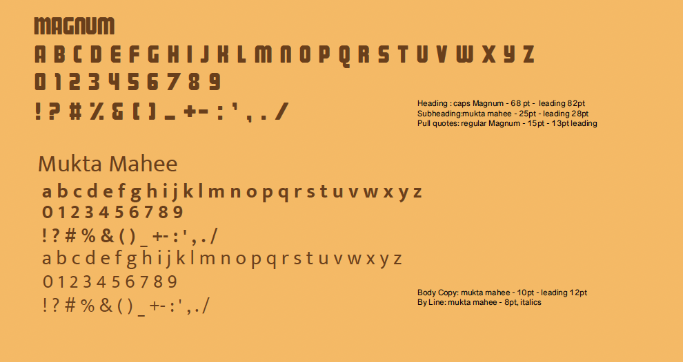
Typograpghy
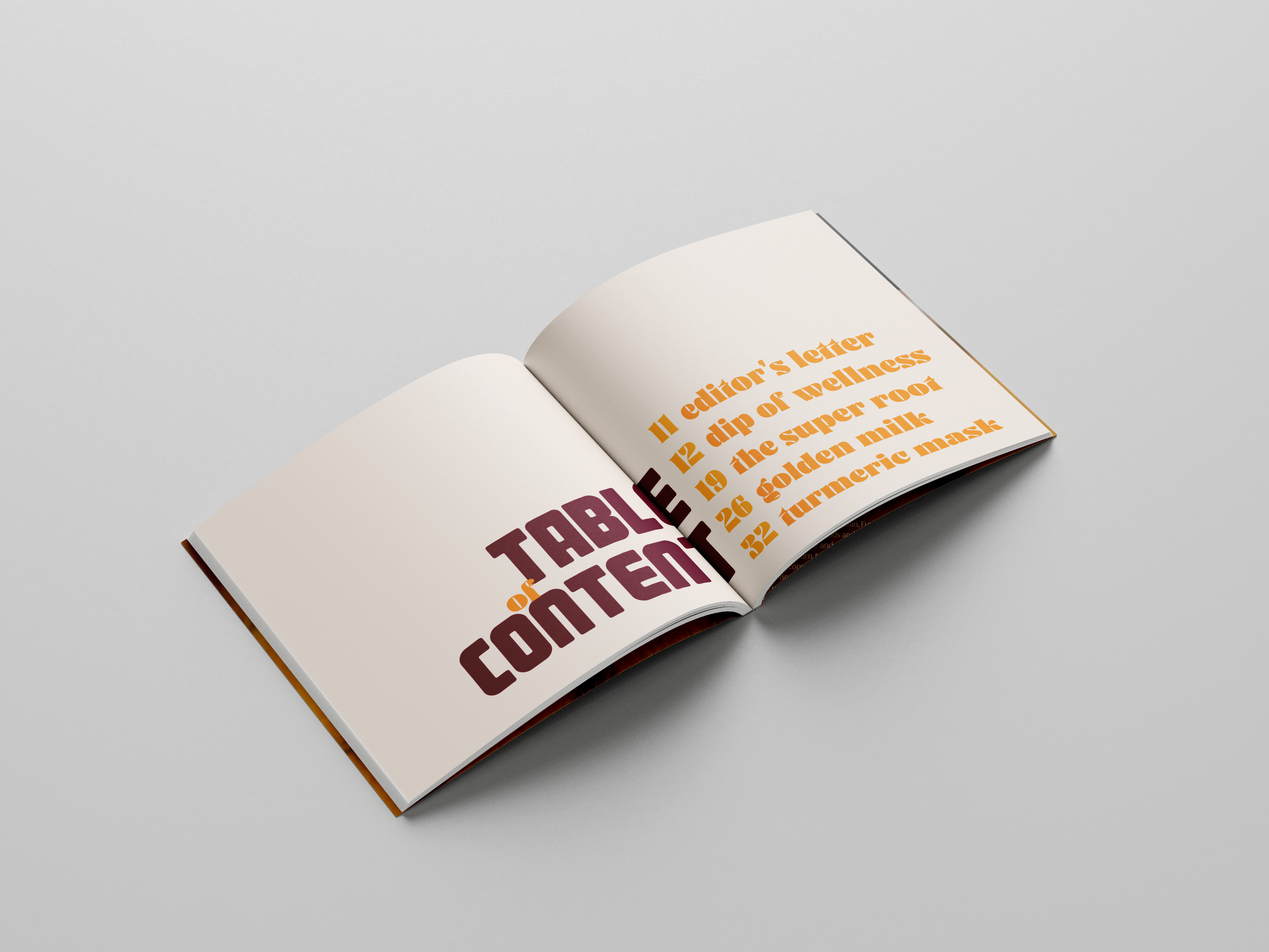
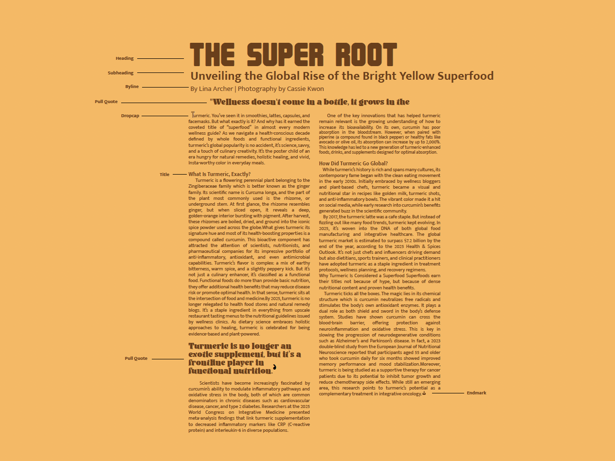
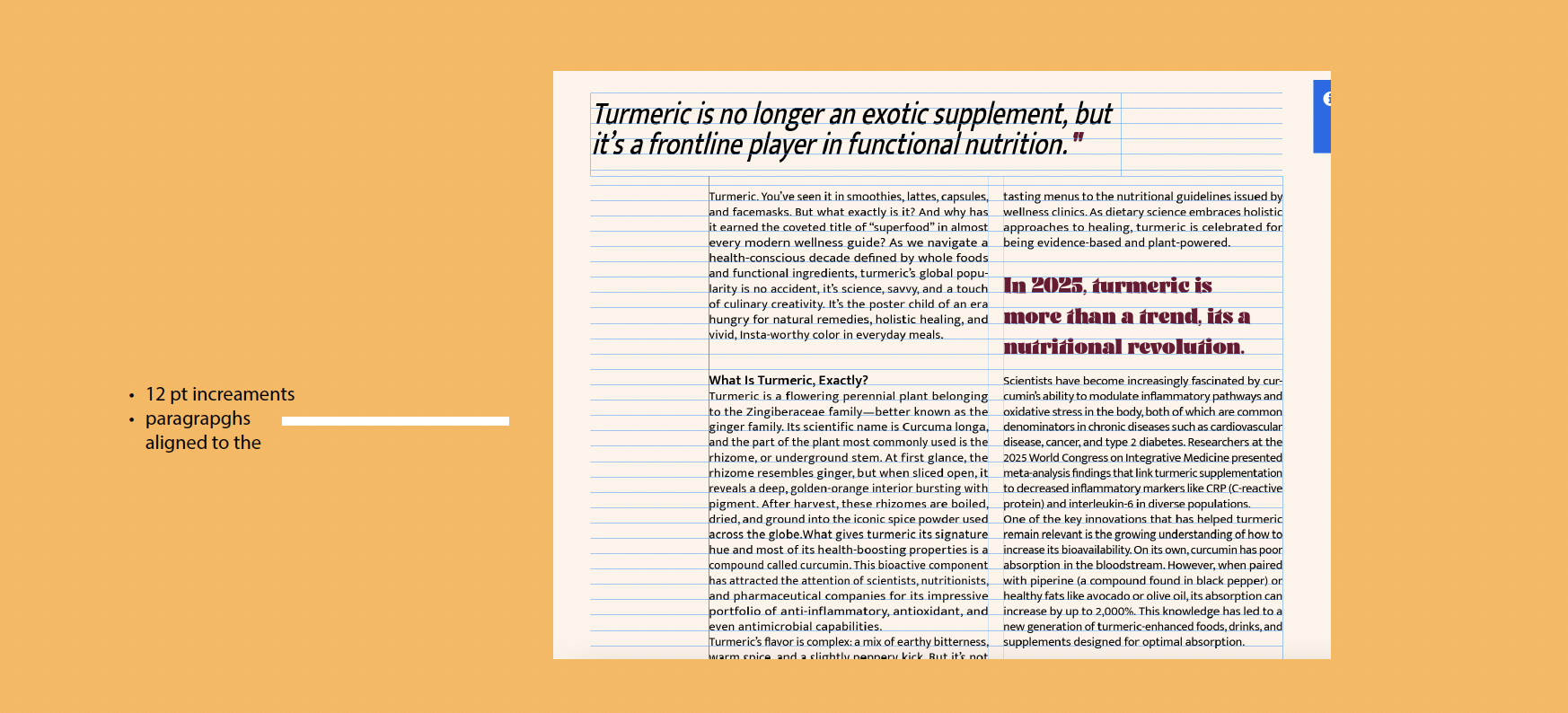
The zine exclusively uses Sans Serif typefaces to maintain a clean, modern, and cohesive visual identity throughout every page. The main headings are set in Magnum at 68pt , a bold, high-impact typeface that establishes a strong editorial tone, which is ideal for announcing each spice with clarity and confidence. Subheadings are in Mukta Mahee Bold at all caps, 25pt, delivering a structured, approachable rhythm that adds definition and flow to the content. The body text is set in Mukta Mahee Regular at 10pt with custom leading of 12 pt, chosen for its smooth readability and subtle personality that keeps longer reads engaging without visual fatigue. Additionally, Ayuga DEMO Regular will be used selectively as a decorative styling element in small features or quotes, offering typographic flair while remaining in the Sans Serif family. The choice to use only Sans Serif fonts creates a unified visual system that is minimal, versatile, and well-suited to both the editorial style and informative content of the zine. Magnum and Mukta Mahee pair seamlessly: Magnum commands attention with its condensed, impactful form, while Mukta Mahee balances that boldness with clean lines, consistent spacing, and geometric elegance. Their shared classification ensures visual harmony, while their distinct voices provide contrast and hierarchy. The zine uses custom leading to support each typeface's form: slightly expanded leading in the body text enhances legibility and creates breathing space, while tighter leading in headlines ensures a punchy and visually grounded impression. Typesetting choices like ragged-left alignment, short-to-medium line lengths (6-8 words per line), and two- or three-column layouts for recipe pages/articles help organize information intuitively, allowing readers to move through content with ease. This typographic strategy reinforces the zine’s tone, which is vibrant, editorial, and accessible, making the experience feel artistic without sacrificing clarity.
Final Design
Article Spread
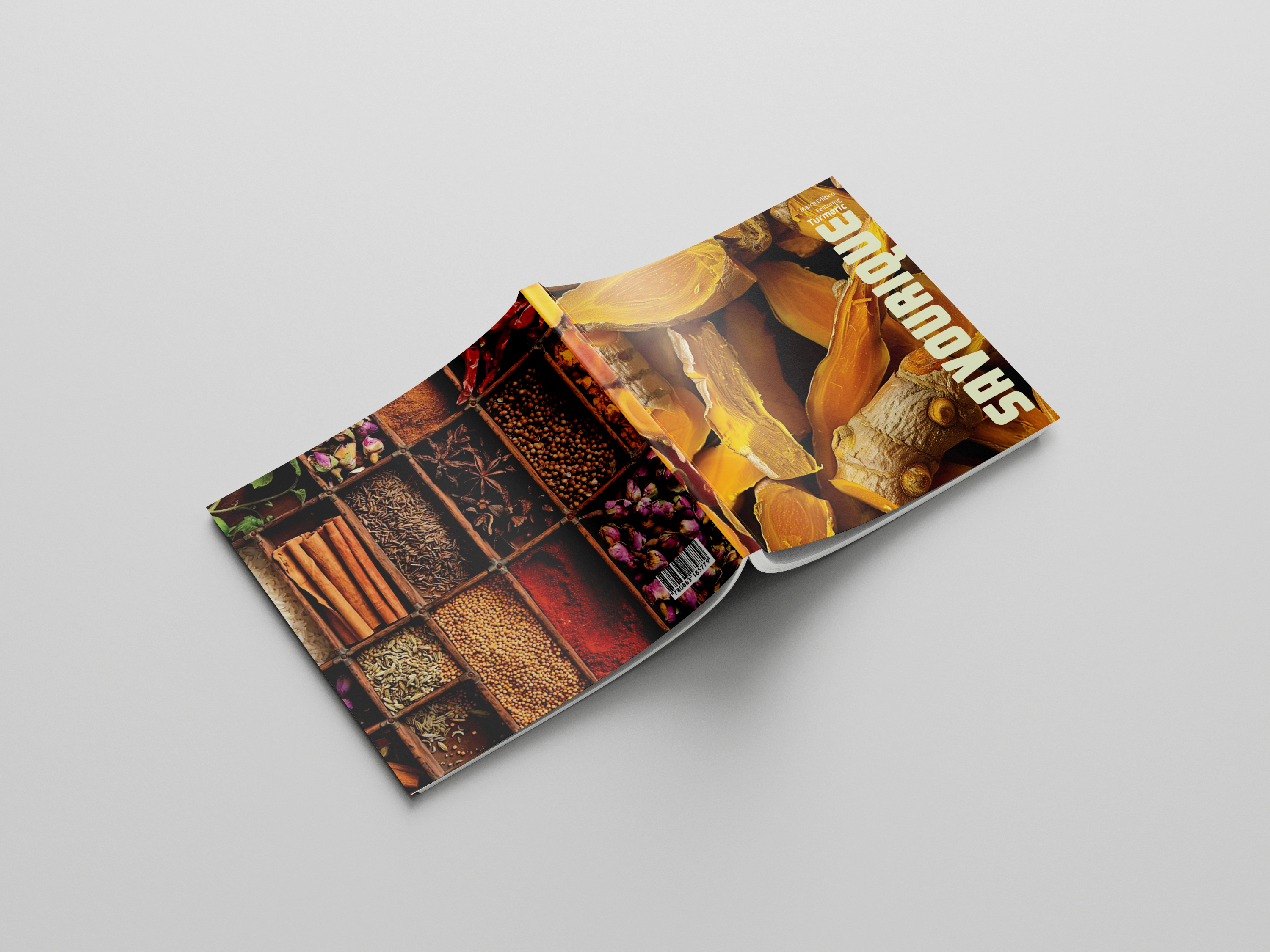
Cover
Grid
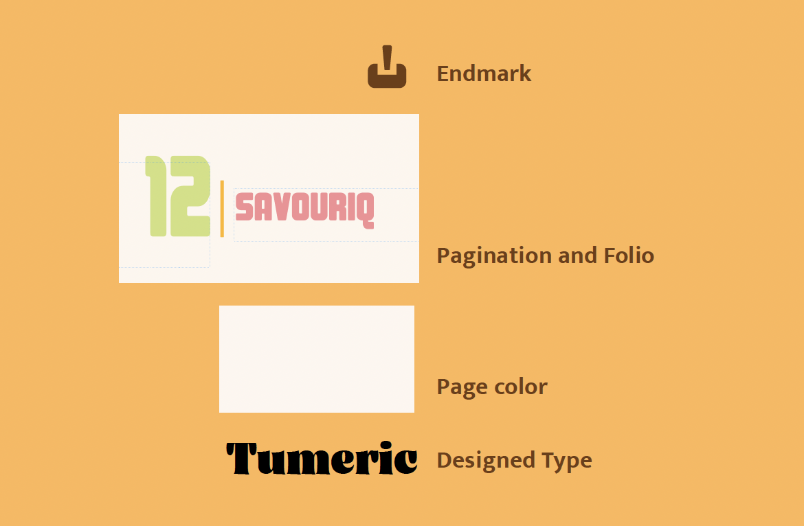
Design Elements
Target Audience
The zine is aimed at people between 18 and 45 years old of all genders, mostly living in cities but also anyone who loves spices and cooking. They usually have some college education and come from middle to upper-middle income groups. Many are young professionals or home cooks who enjoy trying new recipes and learning about di erent cultures through food. This zine is important because it will teach readers new facts about spices, their history, health bene ts, and uses. It will inspire them to cook more creatively and explore natural remedies. Overall, it helps people connect with the stories behind the spices they use every day while encouraging a healthy and avorful lifestyle.
Message
The zine is trying to promote a deeper appreciation and understanding of everyday spices by exploring their cultural roots, health bene ts, and creative uses. It encourages readers to see spices not just as ingredients, but as powerful tools for wellness, tradition, and avor. The brand message is all about celebrating global spice culture in a fun, educational, and accessible way & bringing people closer to the origins of their food while inspiring them to try new recipes and natural remedies.
Competition
My competition includes well-known food magazines like Bon Appétit, Food & Wine, and Taste of home, as well as popular cooking blogs and spice-focused newsletters. These sources often cover a wide variety of recipes, cooking tips, and food trends but usually don’t focus deeply on just one spice in each issue. What makes my zine di erent is that it focuses on one spice each month, giving readers a detailed look at its history, uses, health bene ts, and cultural importance. It’s like a mini mag dedicated to really understanding and celebrating each spice, with recipes and tips that readers can try right away. This focused approach makes the zine unique and perfect for spice lovers who want to learn more than just general cooking ideas.
Process Work
Grid
12 x 12
Baseline Grid
9pt
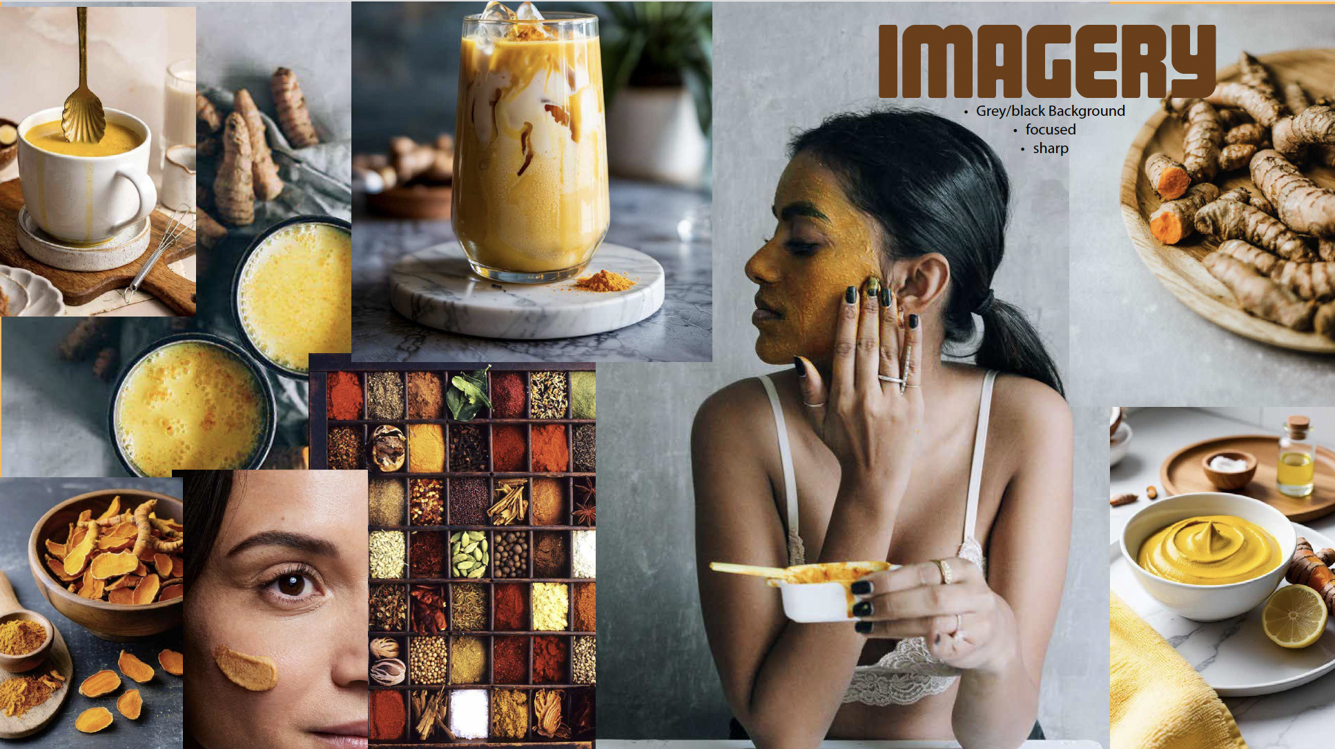
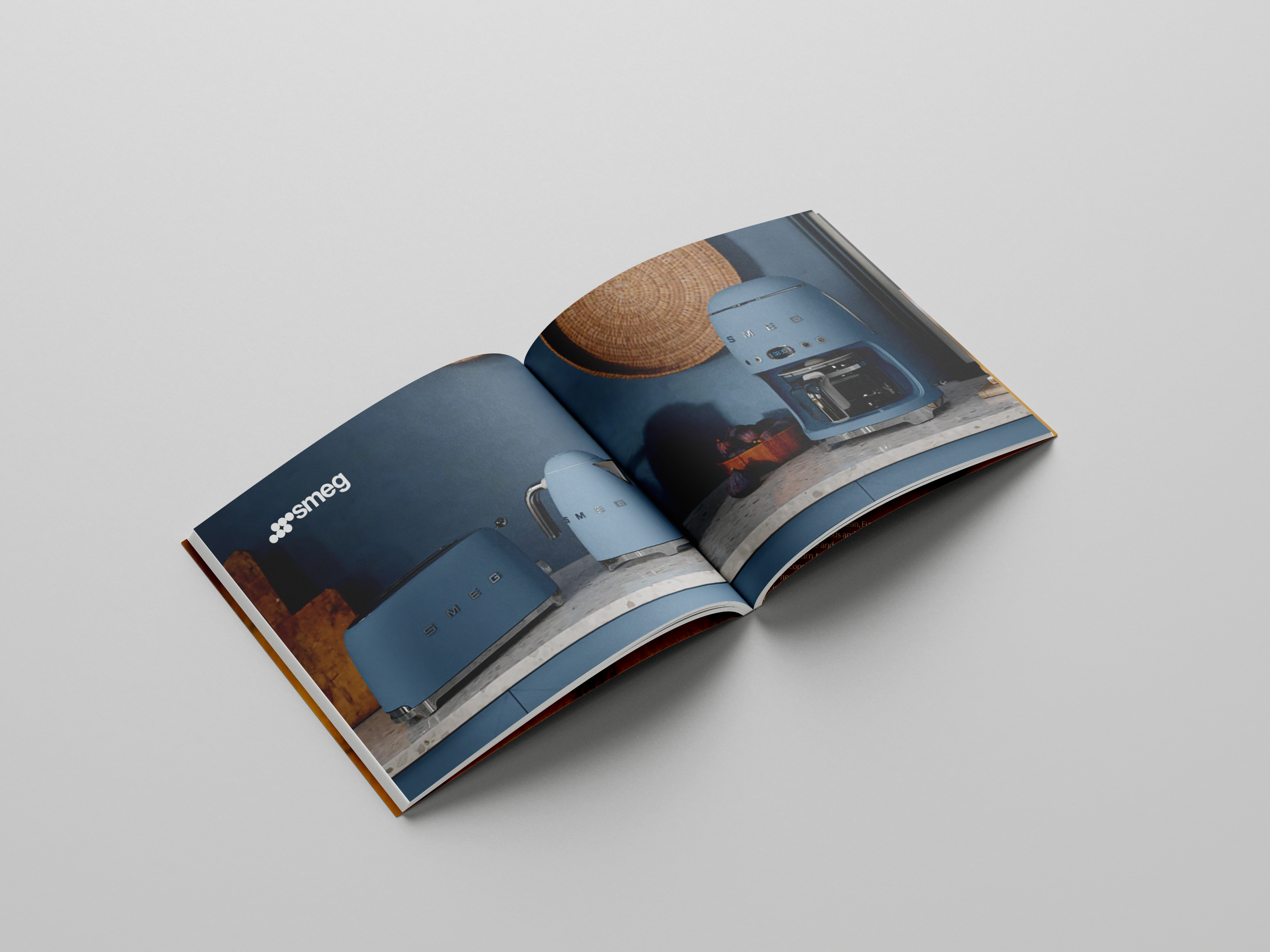
Imagery
Bold with Grey/ Neutral Background
Type Choice
Project Gallery