Savouriq
A Fresh Take on Flavor, Designed to Look Good and Taste Better.
Lead Designer
Adobe Creative Suite | Illustrator | Photoshop | InDesign | Figma
Project Overview
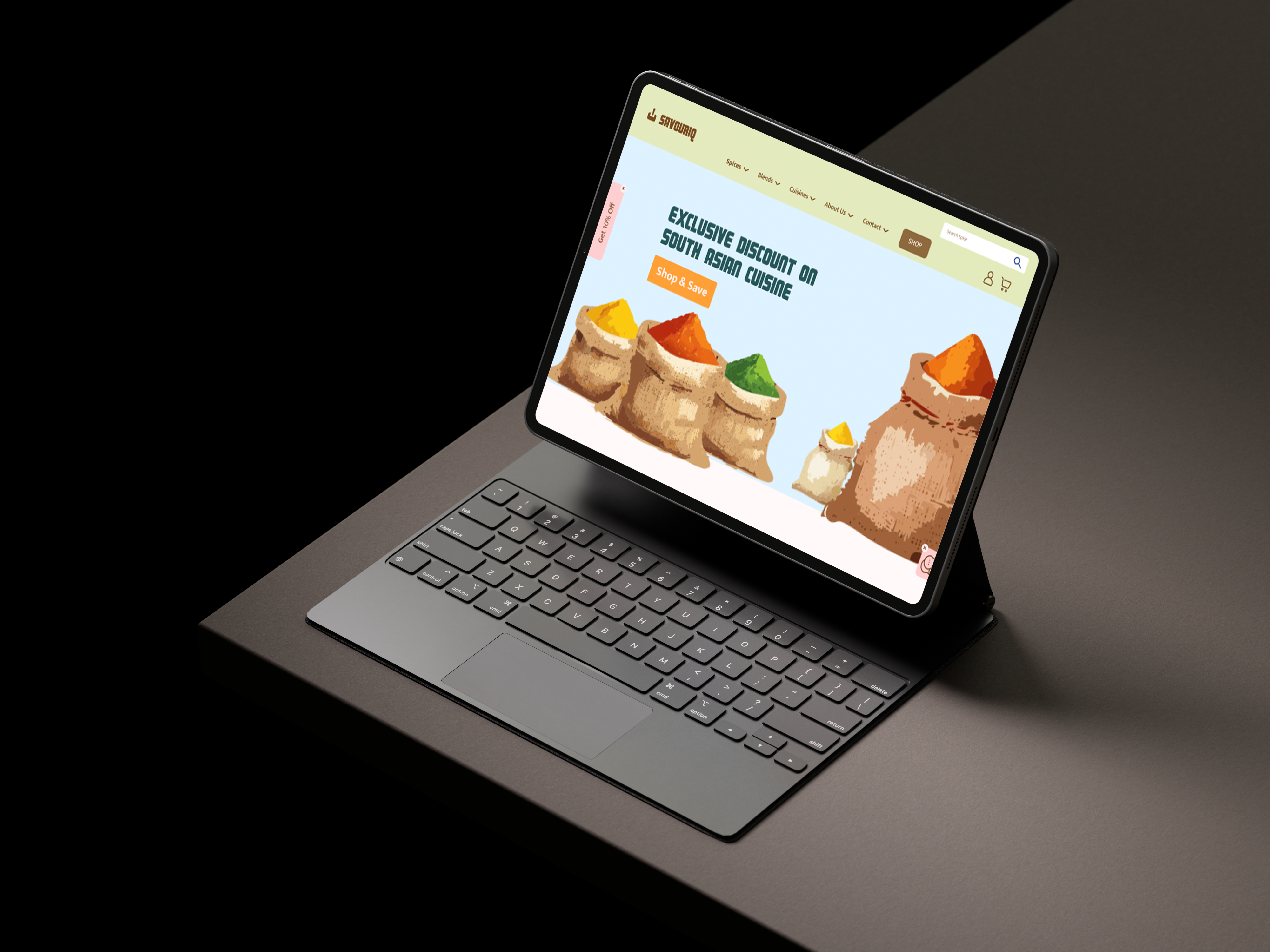
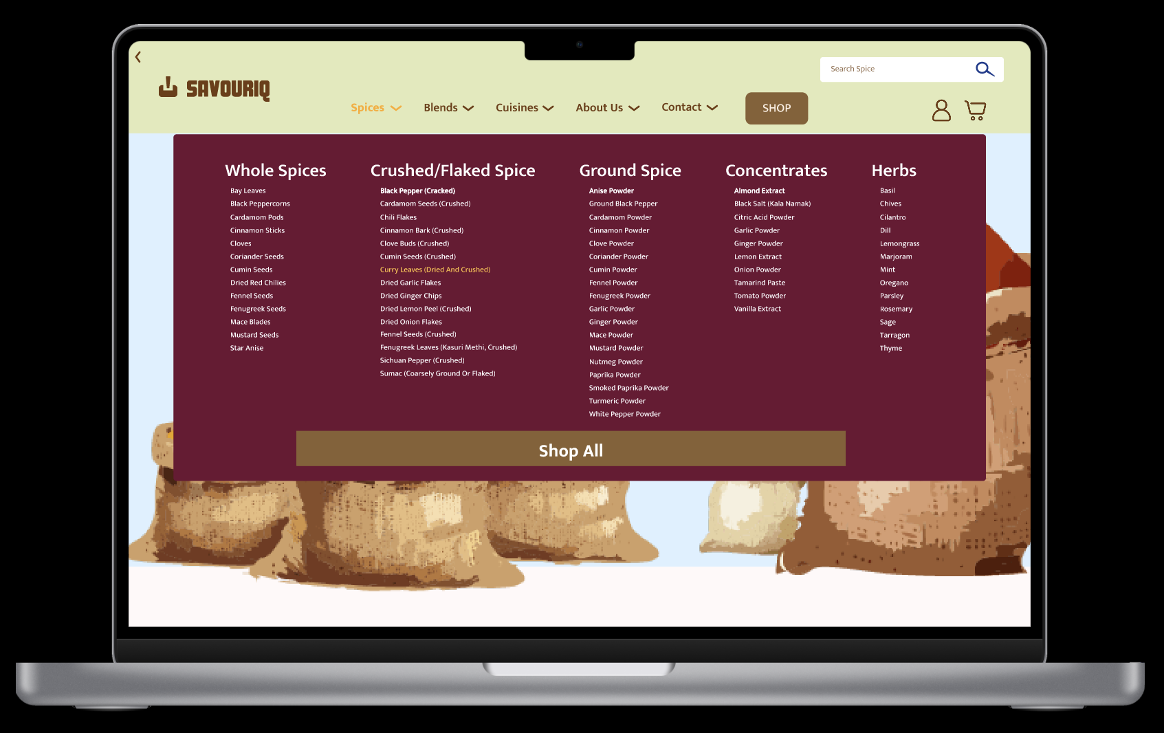
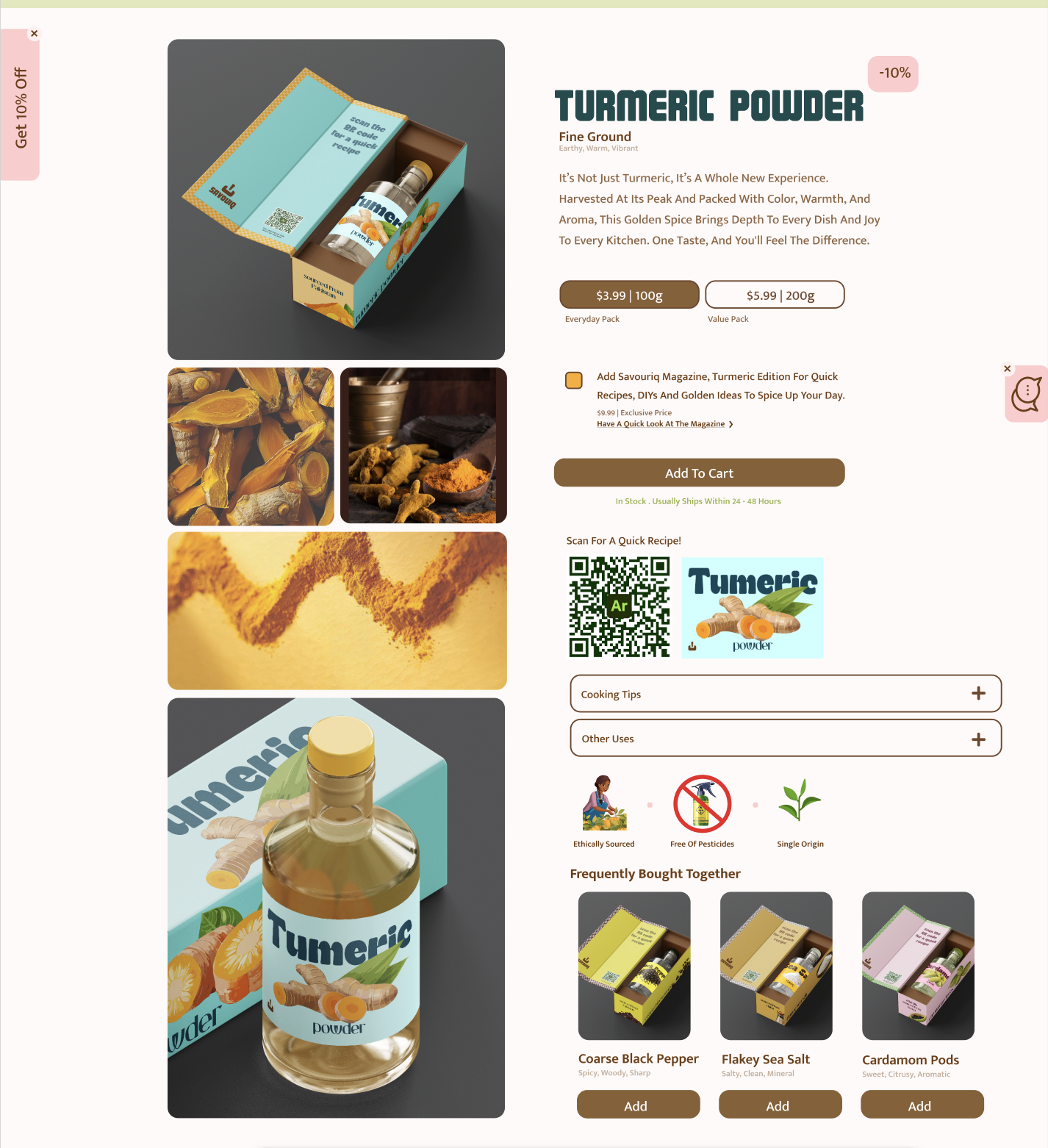
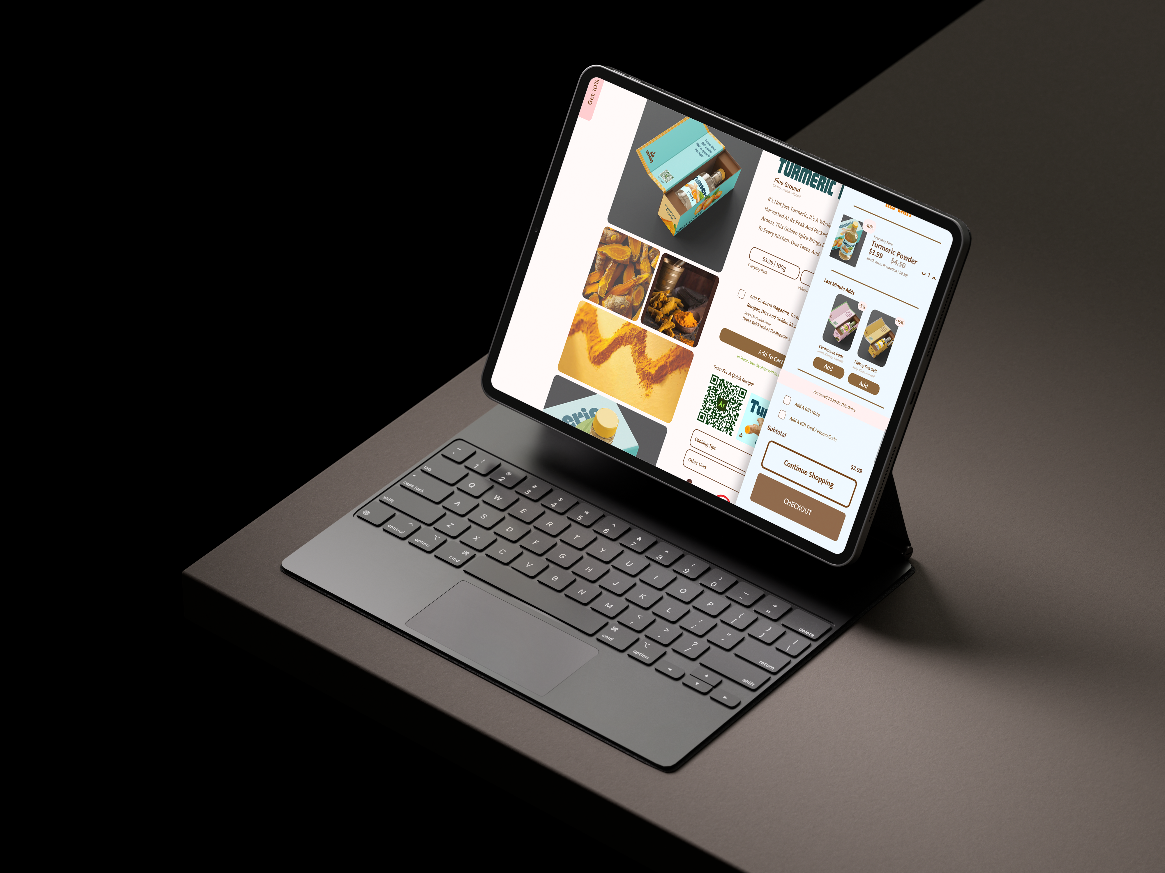
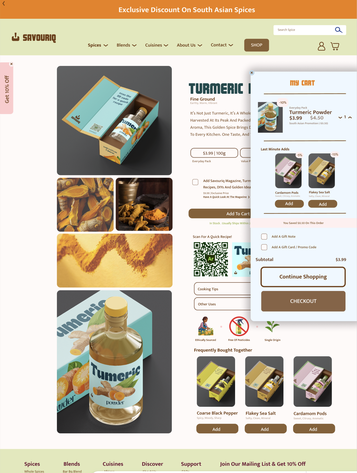
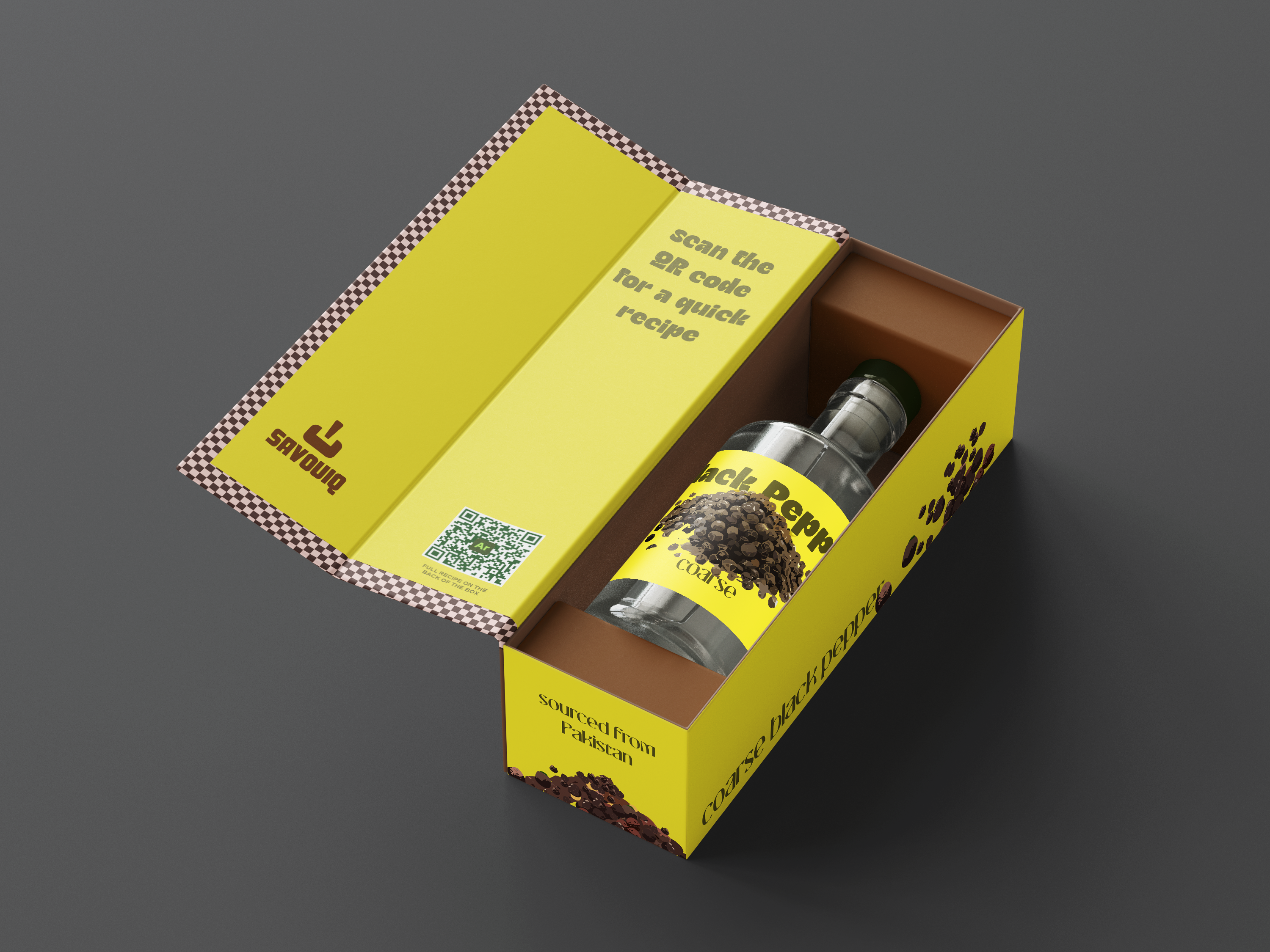
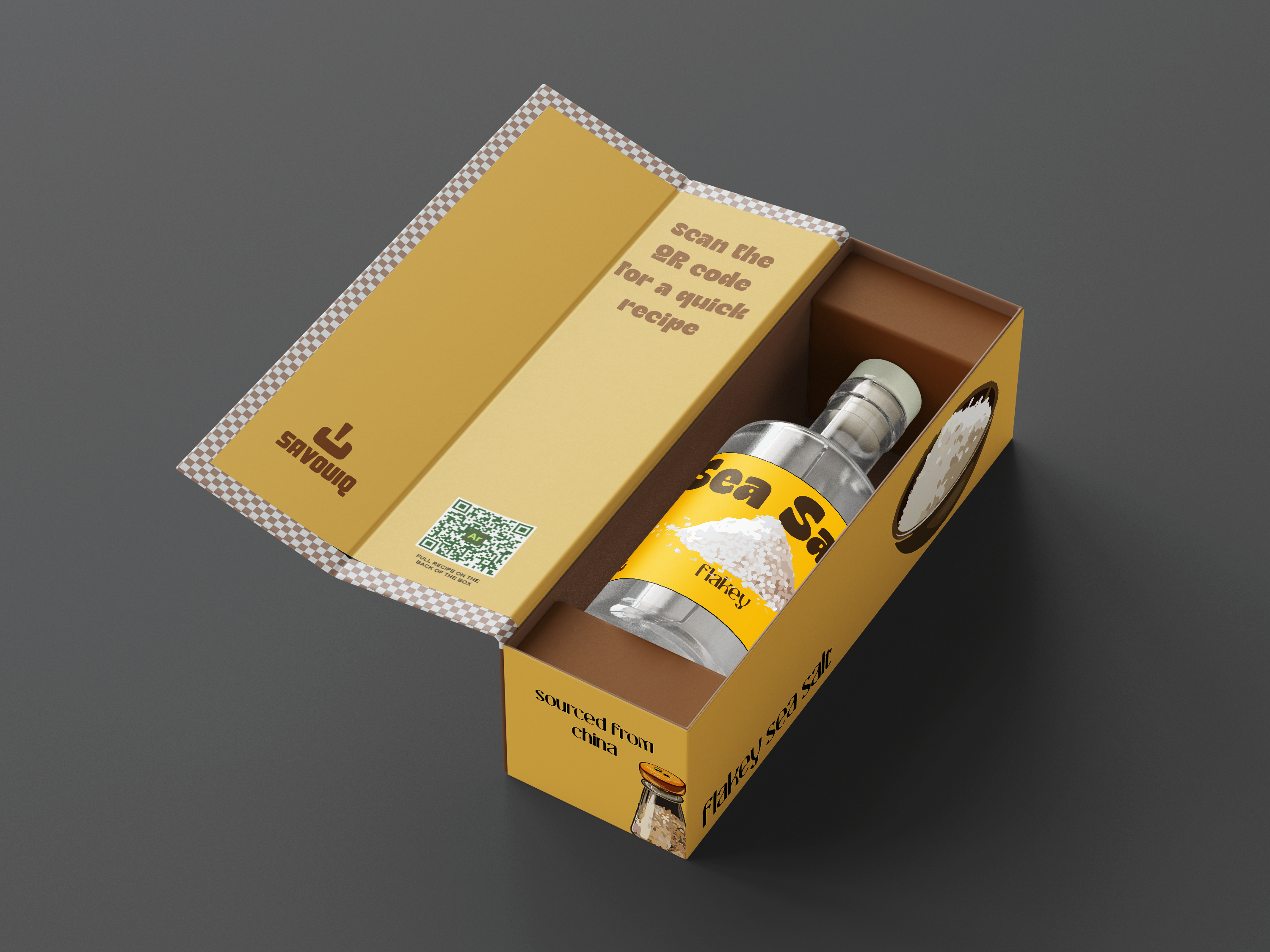
The Savouriq project blends bold design with a clean digital experience, bringing a fresh face to spice packaging and online retail. The packaging is vibrant and eye-catching, designed to stand out on shelves while maintaining a premium, modern feel. Each element, from the color palette to custom icons, was carefully chosen to reflect the brand's energy and quality. To enhance user engagement, I also designed cute recipe animations that pair with each spice blend. These playful visuals encourage users to interact with the packaging by scanning a code or visiting the site, creating a memorable and useful experience beyond the product itself. The website was crafted with the same attention to detail, offering a visually striking yet user-friendly interface. Designed with multiple breakpoints, it adapts seamlessly across devices to ensure a smooth experience whether you are browsing on mobile, tablet or desktop. Strong typography, white space and clear navigation guide users from discovery to checkout with ease. Every part of the design works together to make Savouriq not just a product but a lifestyle brand with real presence both online and offline.
Design Process
Design Direction
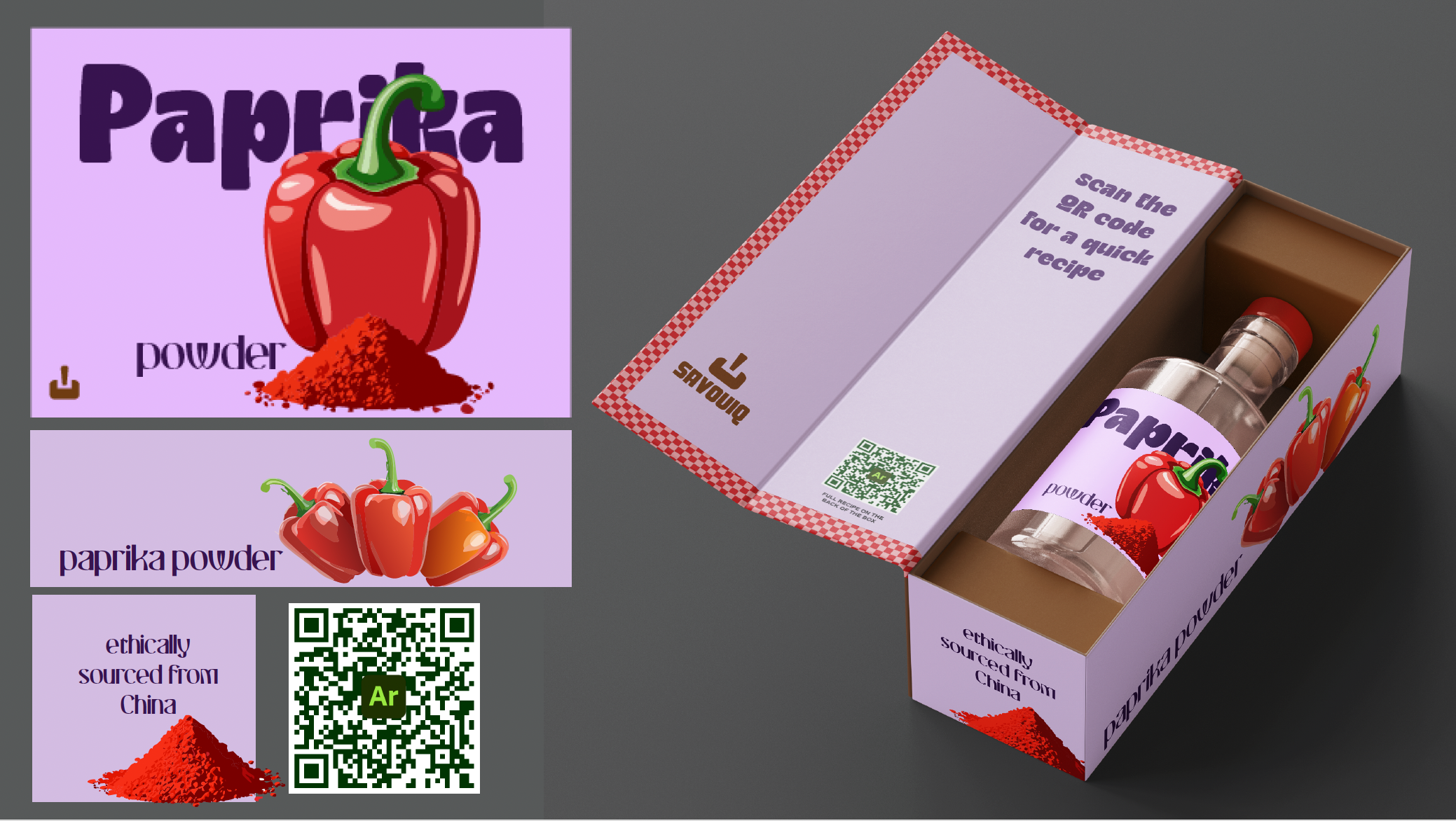
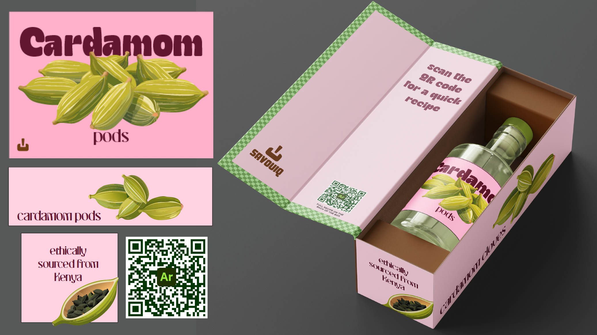
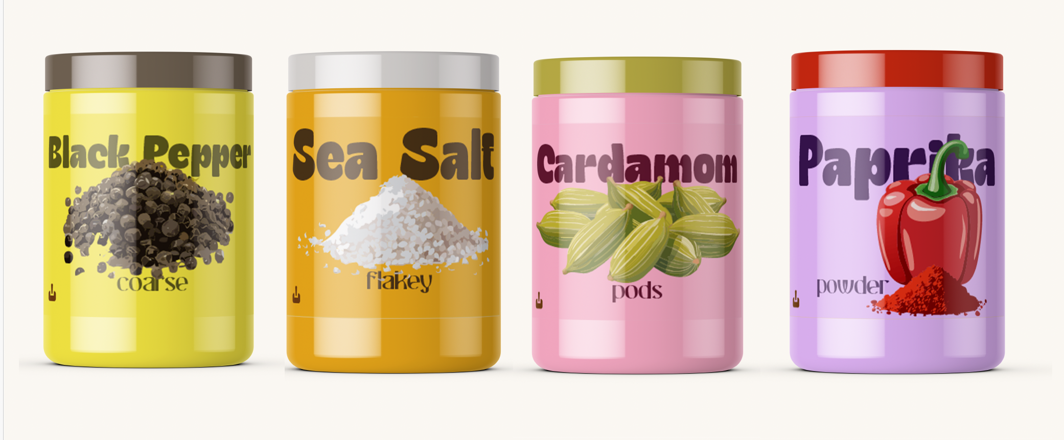
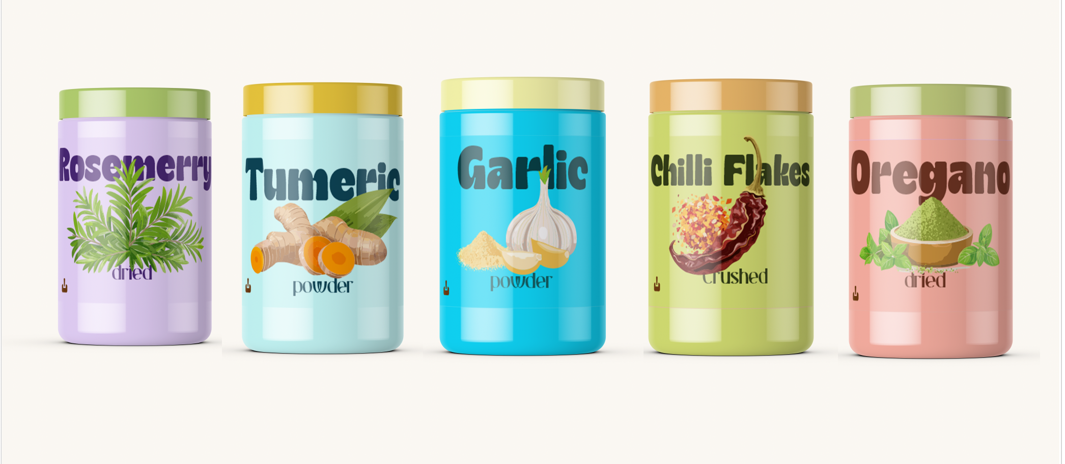
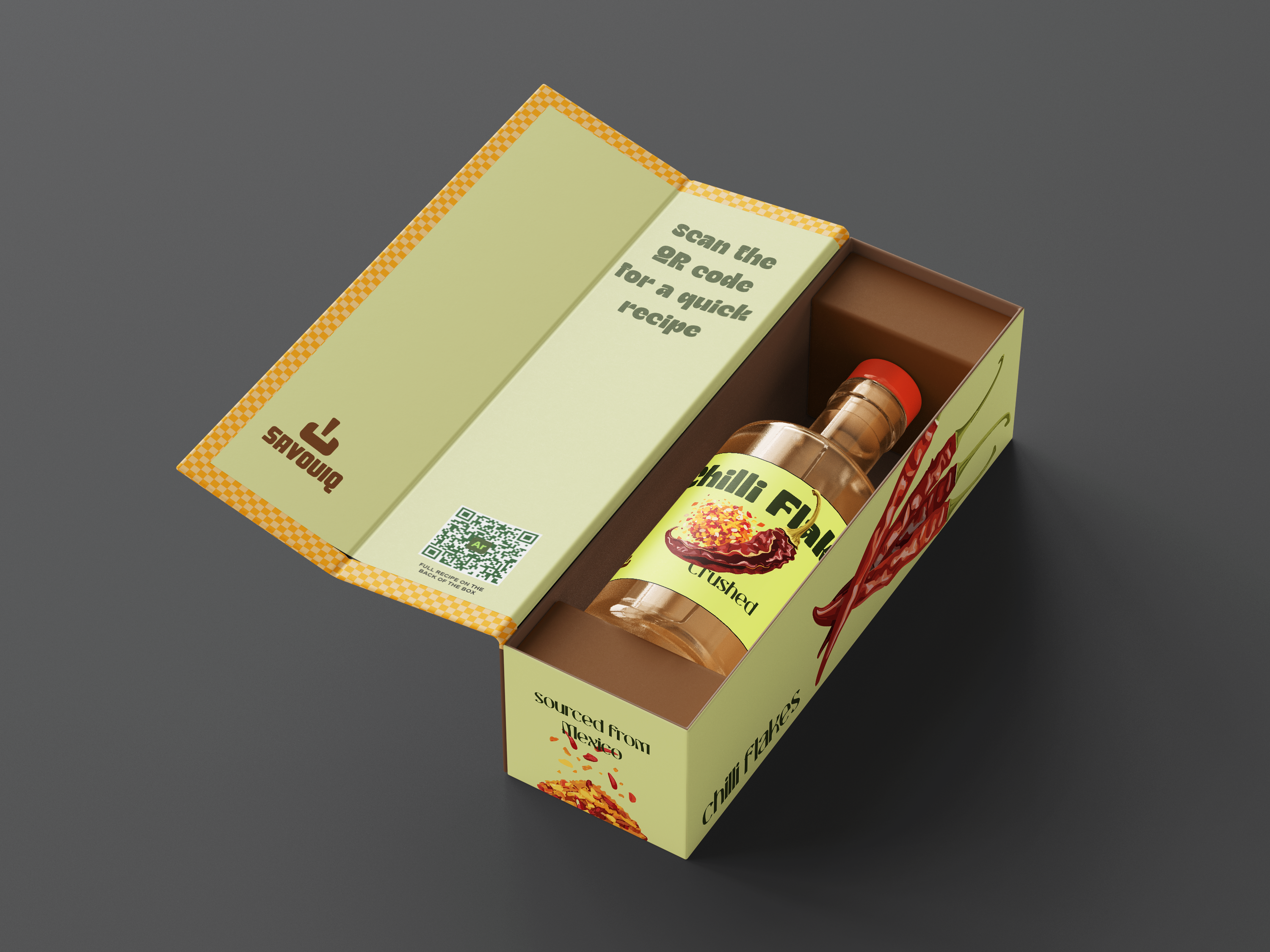
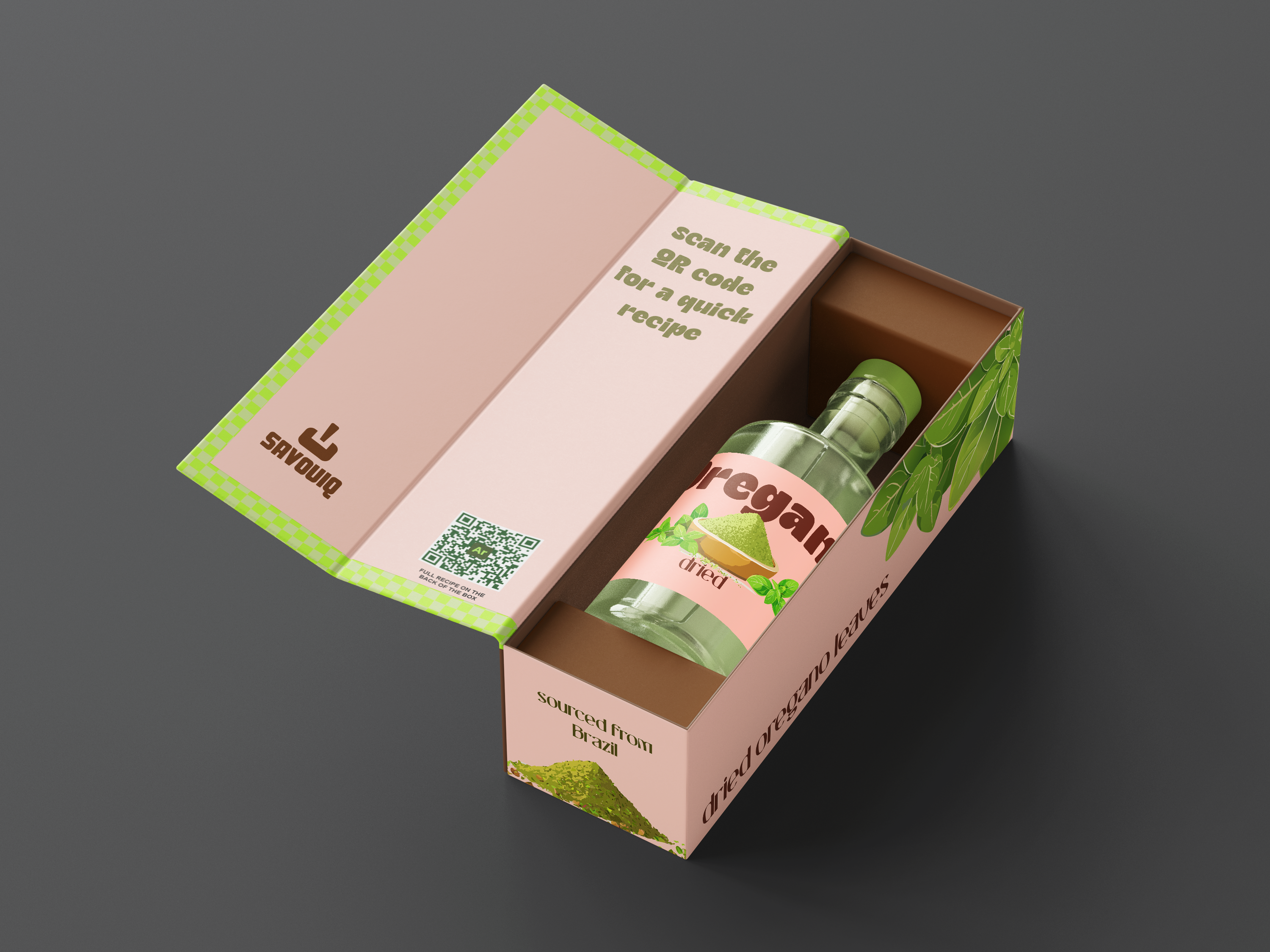
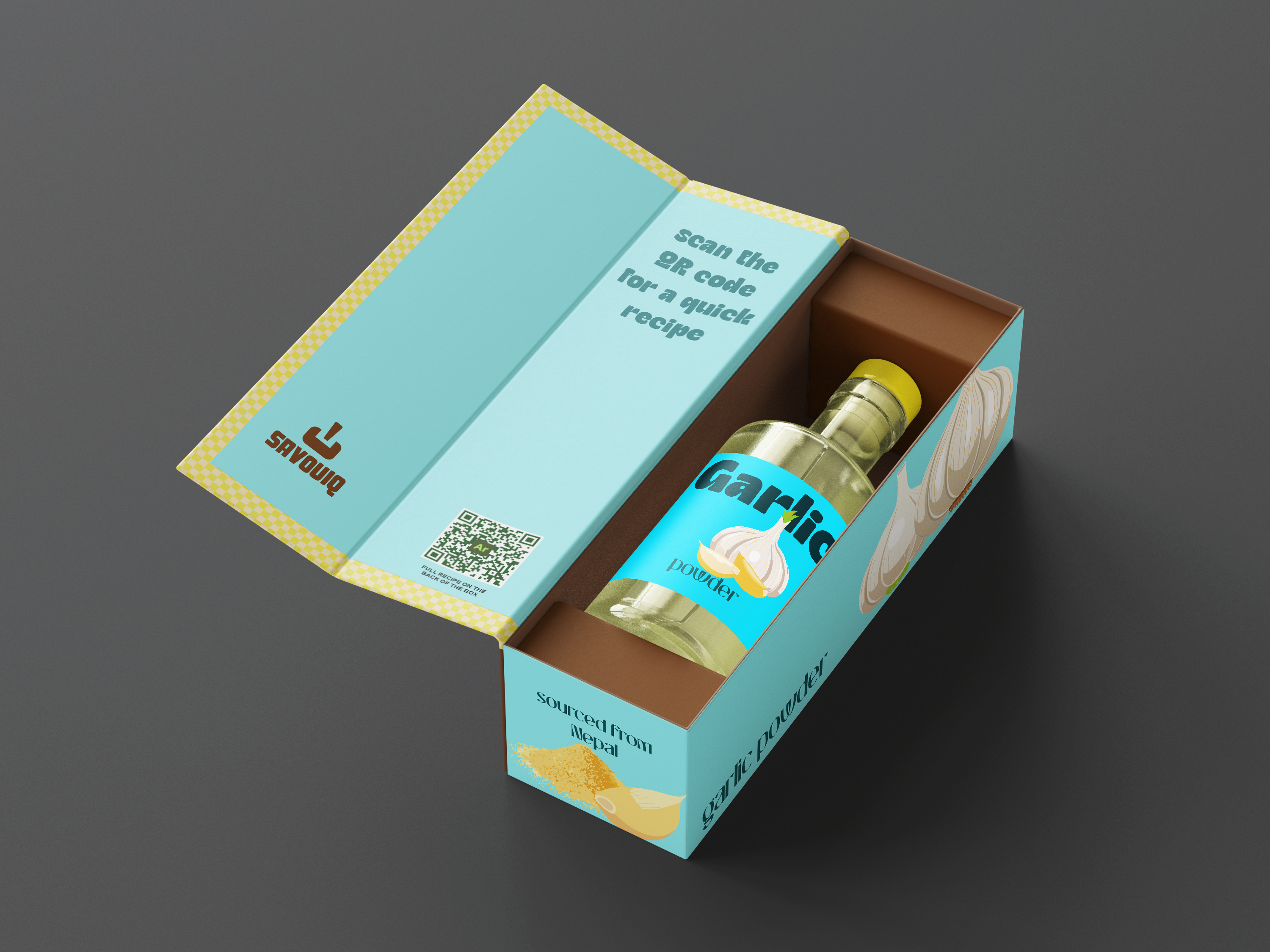
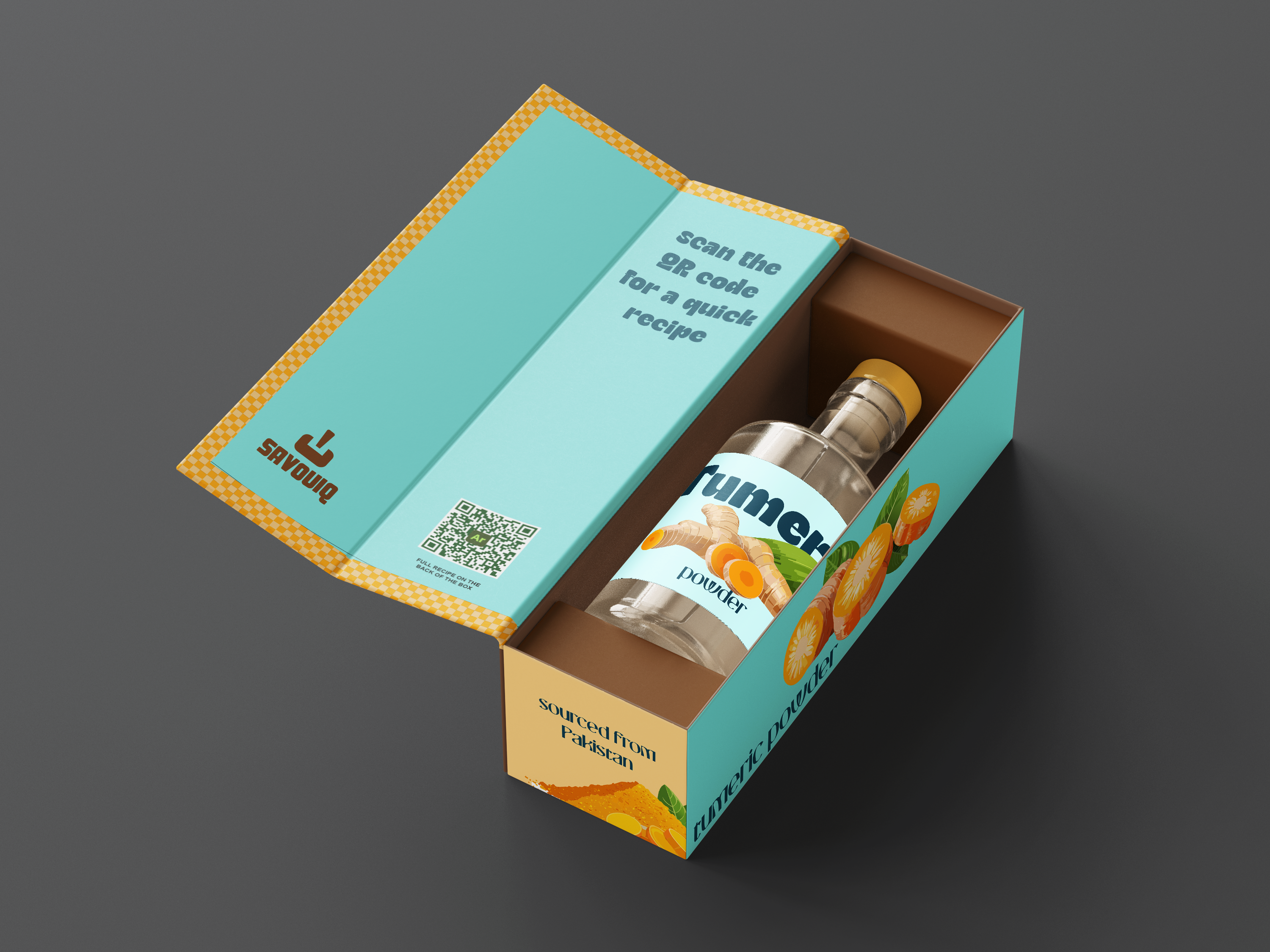
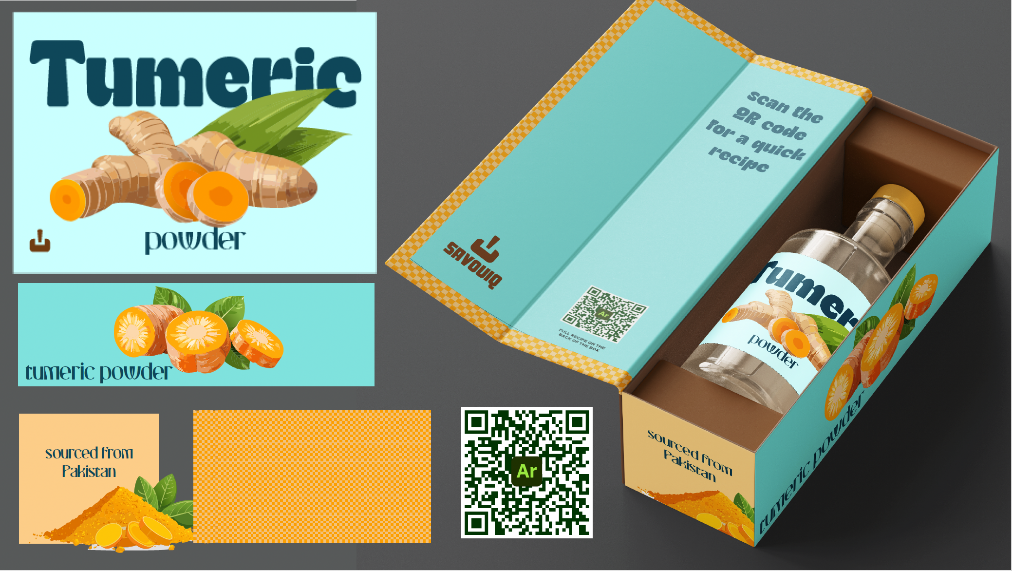
Each element of the packaging features custom illustrations tailored to the spice’s identity, paired with bright, bold colors that make it fun, energetic, and countertop-worthy. The design was intentionally playful yet premium, with the goal of encouraging users to not only buy the spice but proudly display it in their kitchens.
UX Strategy
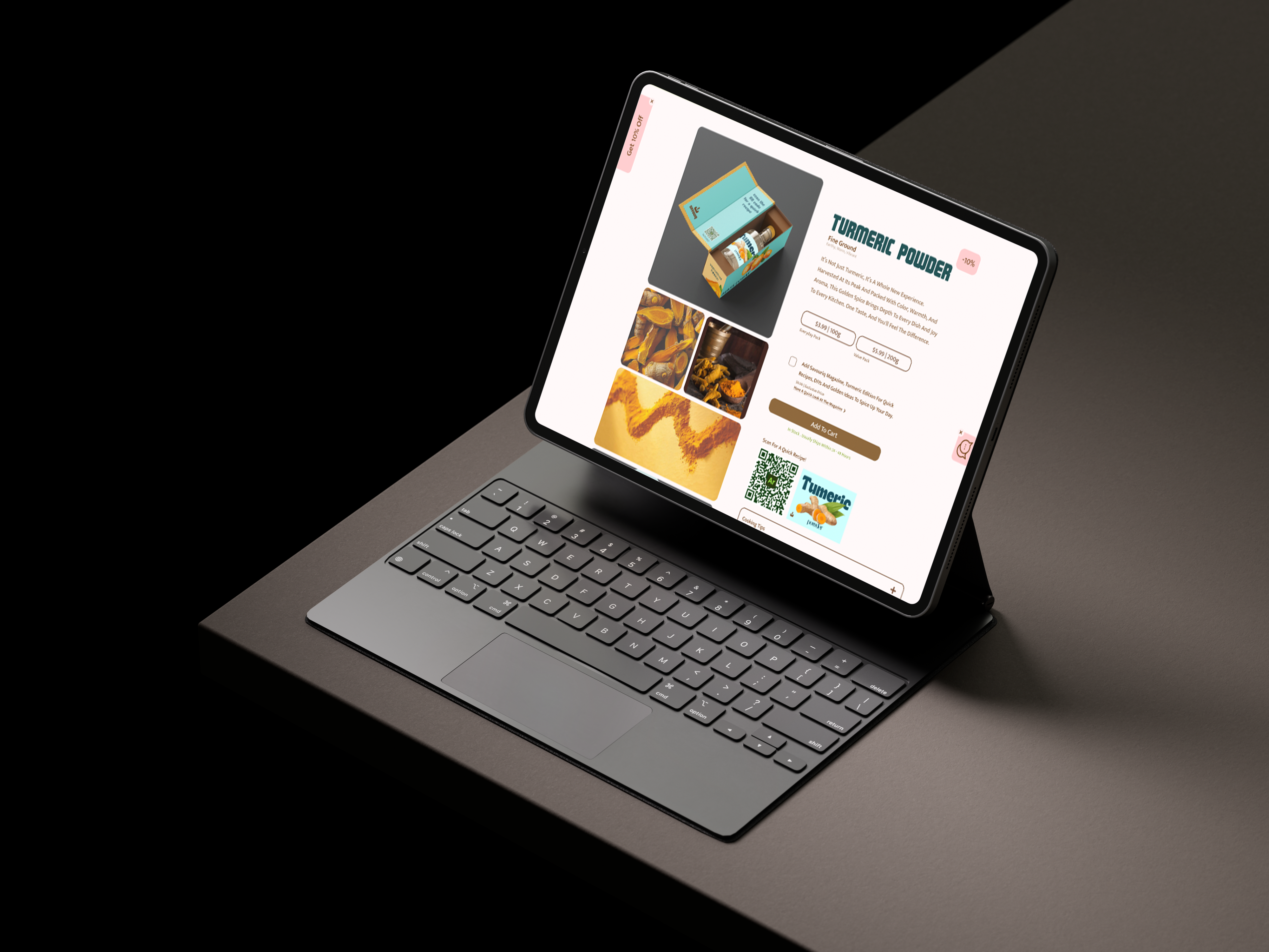
The website is designed to be clean, intuitive, and visually rich — encouraging users to explore the story of turmeric, view easy recipes and DIYs, and purchase both the spice and its matching zine in one smooth flow. QR codes on the packaging link directly to recipe content online, adding another level of interactivity.
Visual Design
Creation of a cohesive visual language that balances historical context with modern design principles. Playing with type to balance out the visuals.
Final Design
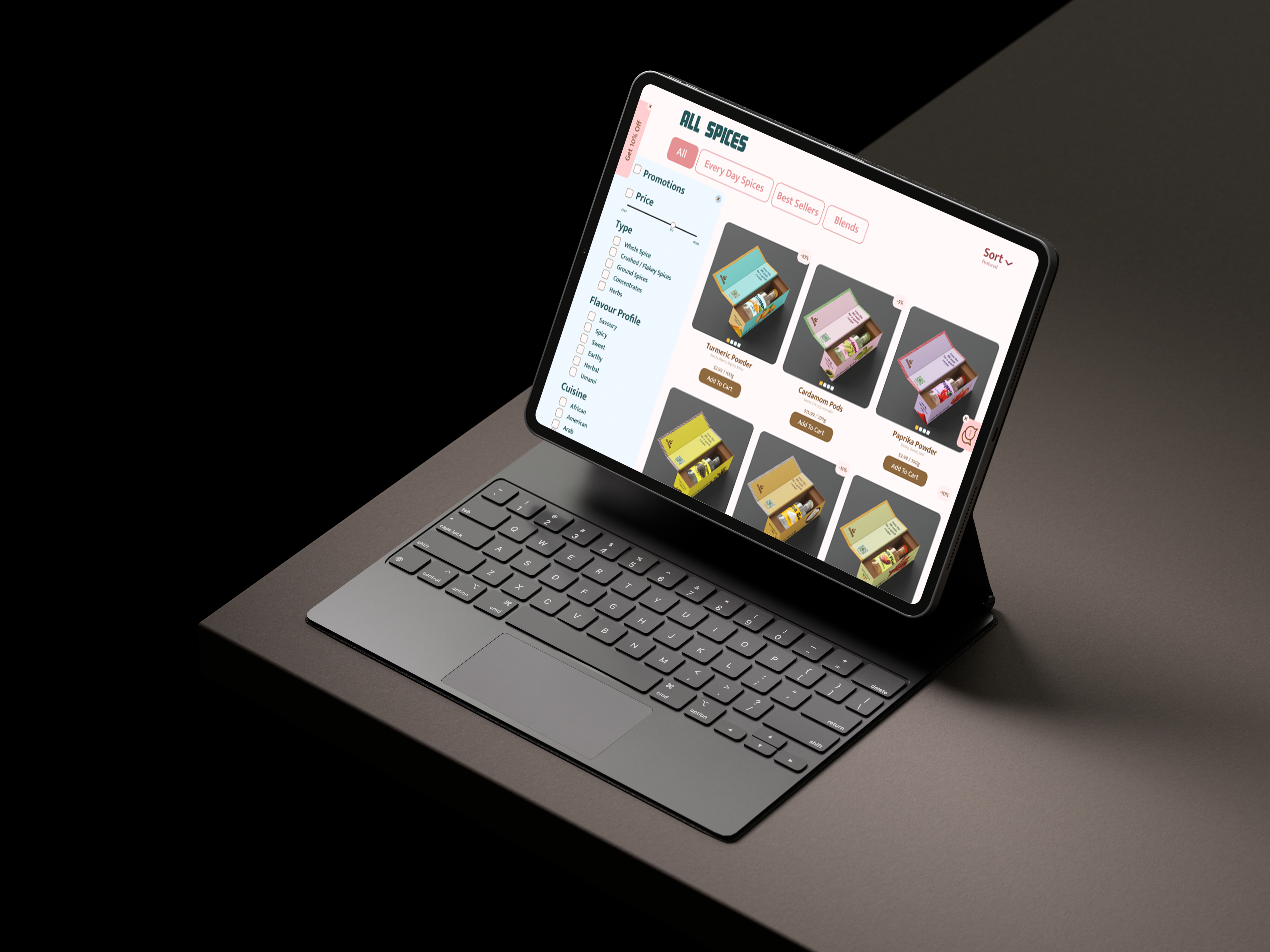
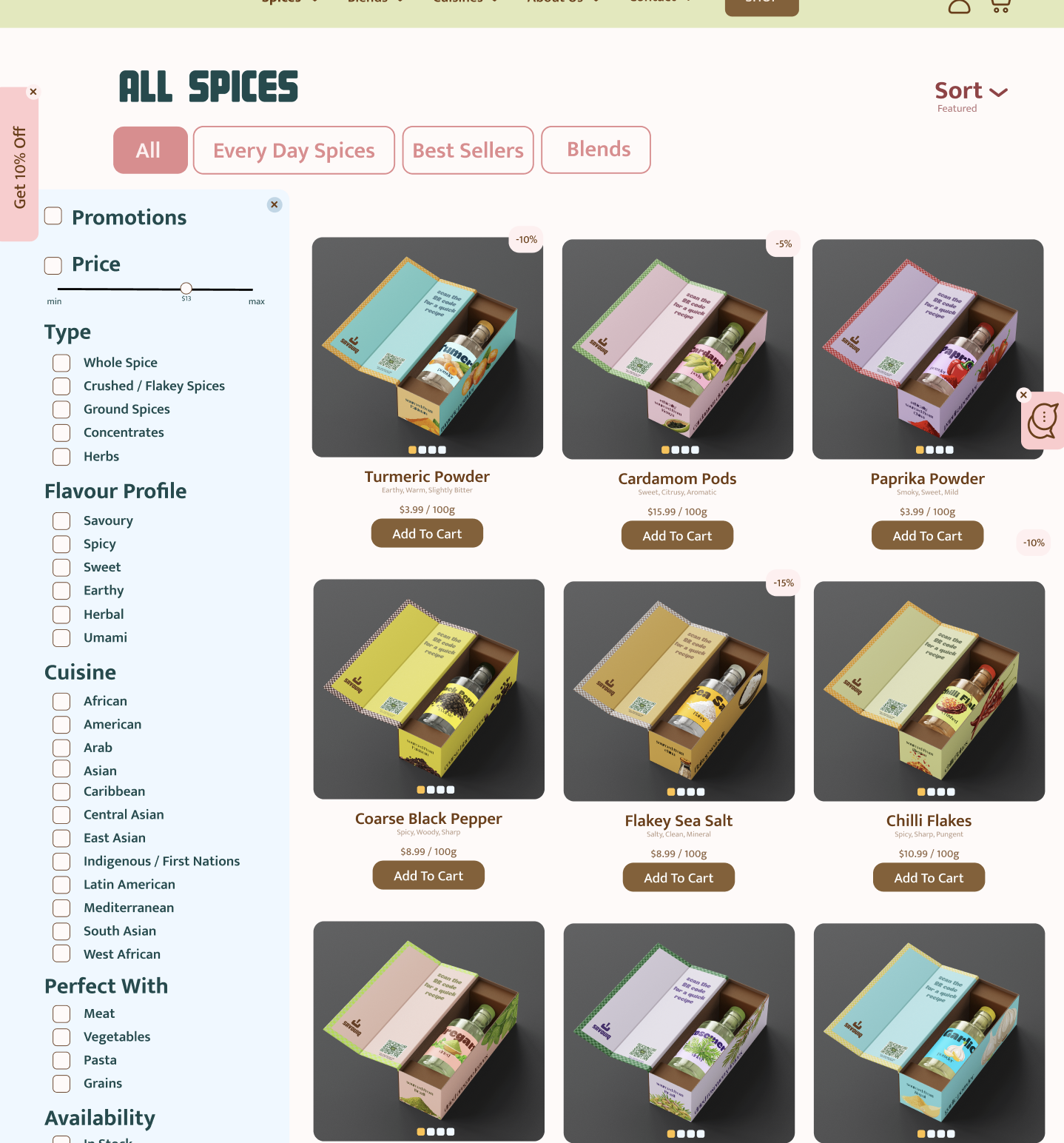
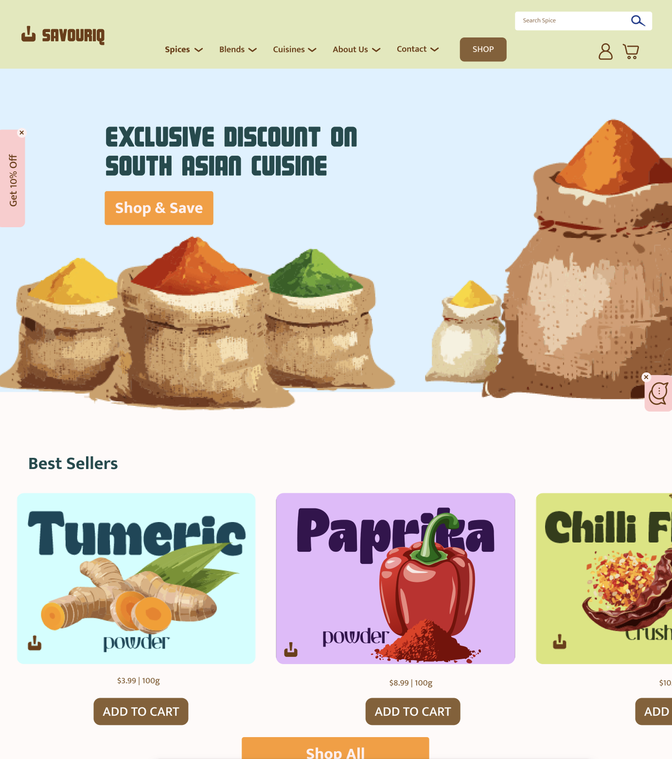
Shop Page
Clean and simple product selection page with a focus on visual hierarchy and ease of use.
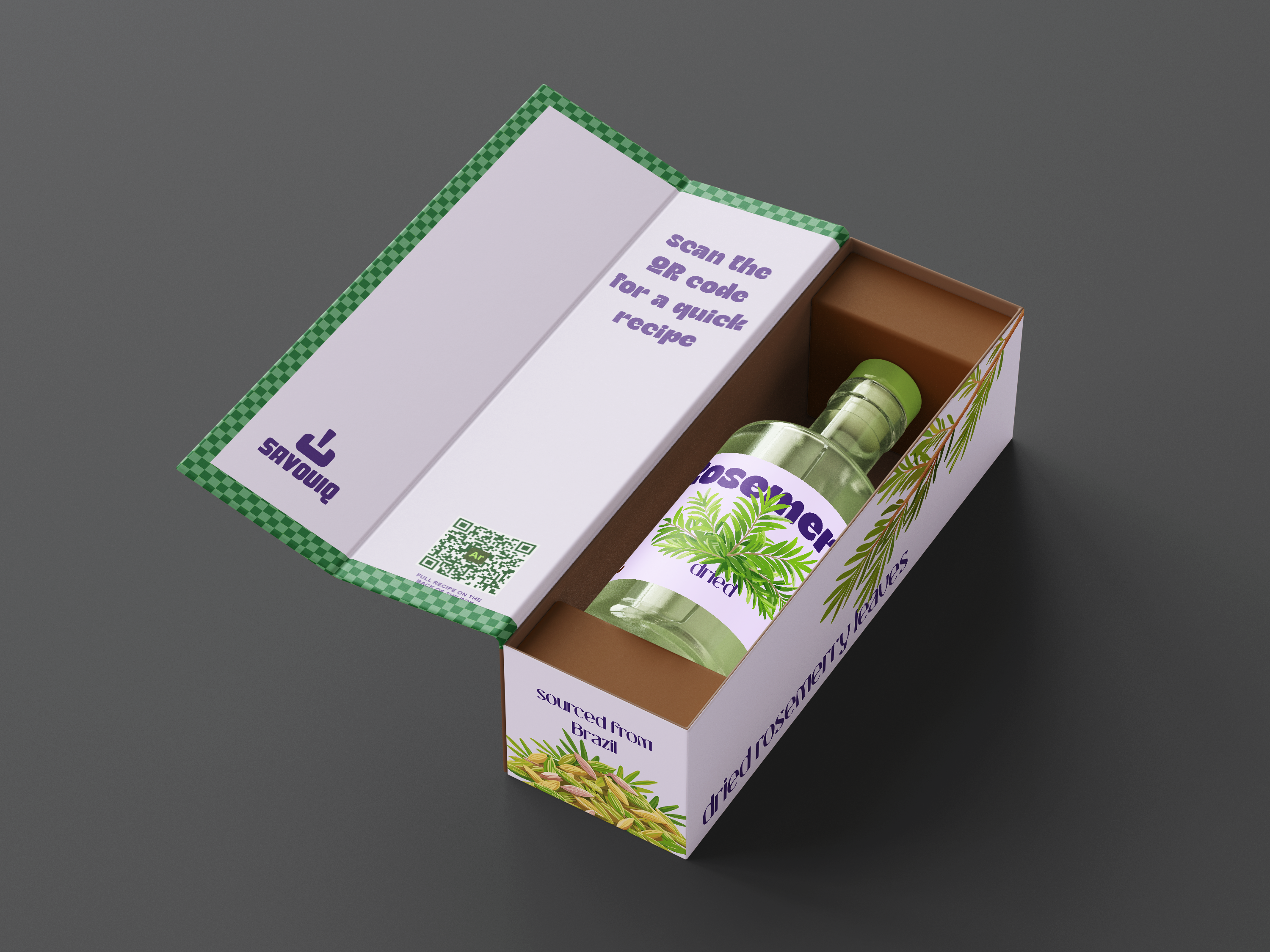
Packaging Design
Design Close-up

Interactive Recipe
Survey Results
Most people currently purchase their spices from grocery stores, but our survey revealed strong interest in buying spices online , as long as the website offers a smooth and visually appealing experience. Users emphasized the importance of simple navigation, minimal clutter, and clearly displayed discounted prices. One key insight was that many respondents would consider purchasing spices online if they had the option to schedule delivery based on their usage habits, such as monthly or bi-monthly restocks. Minimal or free delivery fees also played a significant role in influencing their decision. Users appreciated the idea of learning more about each spice before purchase, such as its origin, recipe ideas, or health benefits, which made them feel more connected to the product
Strategy
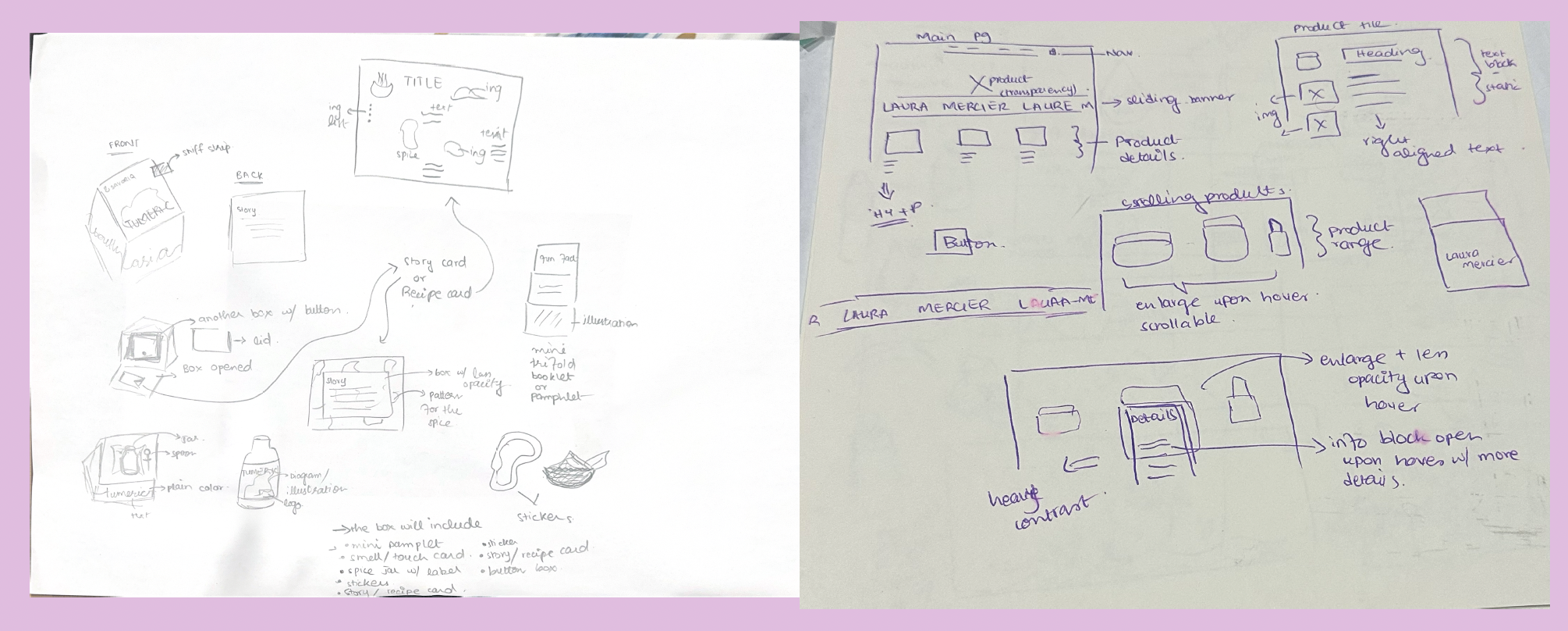
•Browsed design inspiration and researched websites to spark ideas
•Created wireframes to organize layout and user flow before diving into
visuals
•Used high contrast and ample white space to improve readability and
accessibility
•Chose a bold, clean typeface to maintain clarity and visual impact
•Carefully selected a cohesive color palette that matched the brand tone
•Ensured illustrations followed a consistent style and aligned with brand
identit
•Continuously tested the site while designing to maintain a smooth,
accessible user experience
Challenges
•Getting stuck while exploring different web design directions
•Choosing a color palette that felt vibrant yet cohesive
•Ensuring the overall design maintained brand consistency
•Aligning custom illustrations with the brand’s tone and
personality
•Making sure the website was user-friendly and accessible
•Balancing fun, functional, and premium in both packaging and
digital desin
•Keeping the look consistent across website, packaging, and
zine
Process Work
Research & Analysis
Initial research and concept development
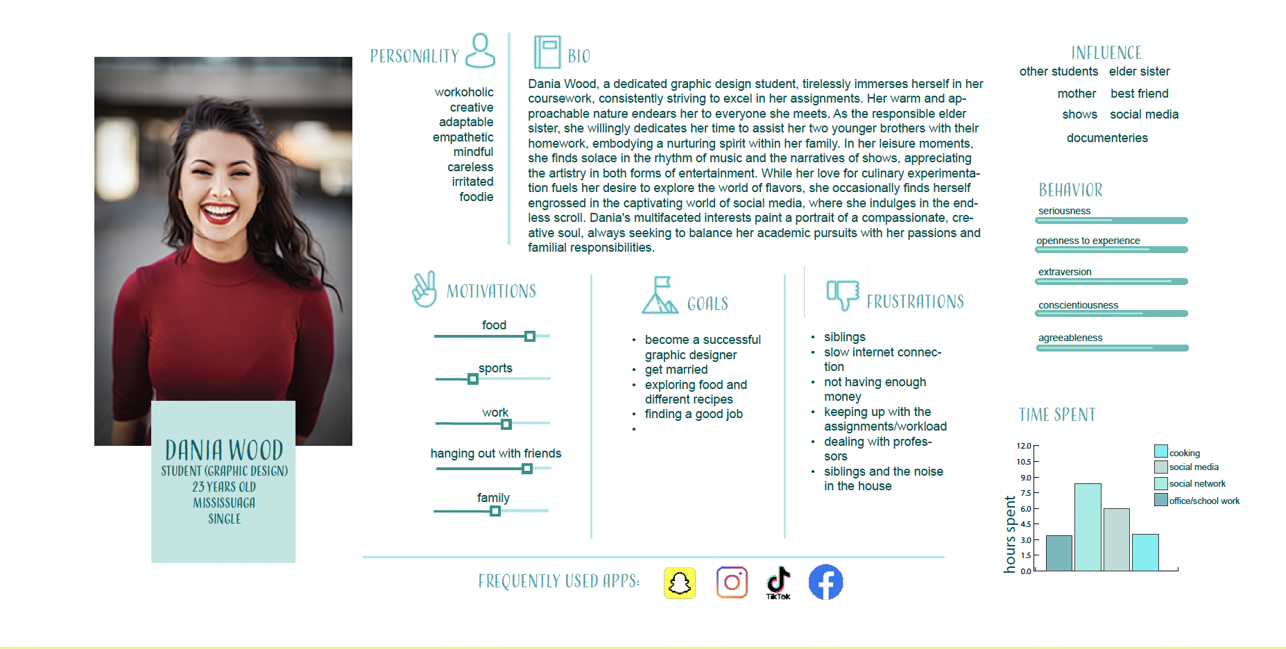
User Persona
Identifying the target audience and their needs
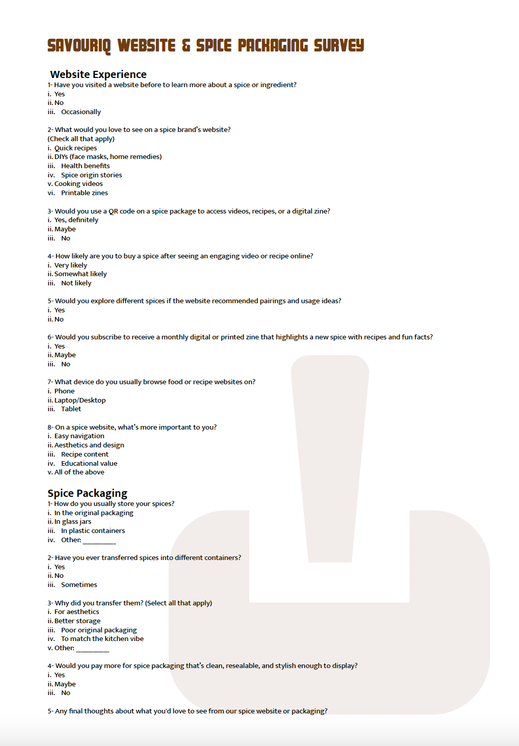
Surveys
Gathering insights from potential customers
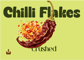
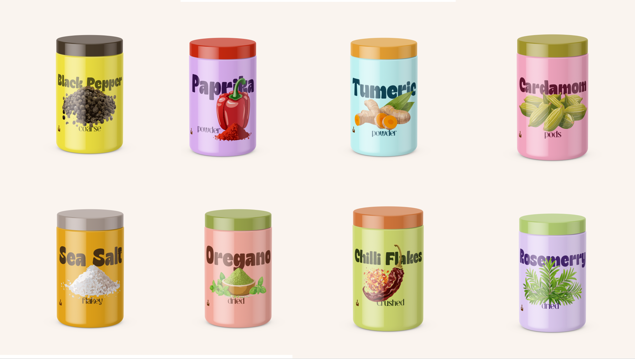
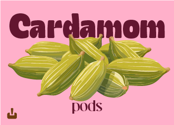
Custom Illustrations
Creating unique visuals for each spice
Design Elements
Color Palette
The color palette blends vibrant and earthy tones—warm saffron yellow (#fbb41b), zesty orange (#fe9a2a), rosy pink (#f68f93), deep plum (#6d1333), dark teal (#184b4e), and soft herbal green (#d2e080)—to reflect the bold, handcrafted, and flavorful essence of spices, while adding energy, contrast, and depth that highlight the zine’s cultural storytelling.
Typography
The typography features Magnum for mini headings and Mukta Mahee for body copy on the website, while the packaging uses Gyoza DEMO Regular for main headings and Chaslow Regular for subheads.
Illustration
Each spice blend has its own unique illustration, designed to be fun, engaging, and visually appealing. The illustrations are designed to be simple, clean, and easy to understand, while still being able to convey the personality of the spice blend.
Layout
The website is clean, intuitive, and visually engaging, guiding users to explore turmeric’s story, try recipes, and shop the spice and zine, with QR codes on packaging linking to recipes online.
Project Gallery