Nylon Magazine
Creative Direction & Visual Redesign of NYLON Magazine
Graphic Designer | Concept Development | Art Direction | Layout Design
Adobe Creative Suite | Illustrator | Photoshop | InDesign
Project Overview
As part of an editorial design project, I undertook a complete conceptual redesign of NYLON magazine—an iconic publication known for its bold voice, fashion-forward content, and youthful aesthetic. My goal was to modernize the magazine's visual language while preserving its edgy, trend-driven identity.
This redesign focused on refining NYLON's editorial hierarchy, introducing dynamic grid systems, and integrating expressive typography to elevate both legibility and visual impact. I explored bold color palettes, disruptive negative space, and layered compositions to better reflect the energy and attitude of its target audience.
From the masthead to feature spreads, each layout was thoughtfully reimagined to create a cohesive narrative flow. I also paid close attention to white space, visual rhythm, and the balance between imagery and type—allowing content to breathe and speak more effectively.
What began as a creative challenge evolved into one of my most rewarding explorations of editorial storytelling. This project reflects not only my passion for print design but also my belief in the power of layout and visual identity to transform how audiences engage with content.
Design Process
Typeface Analysis
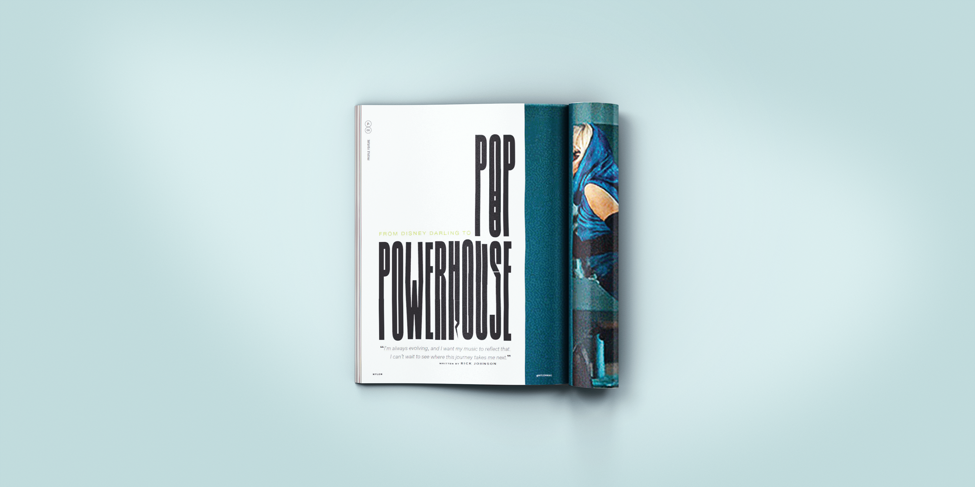
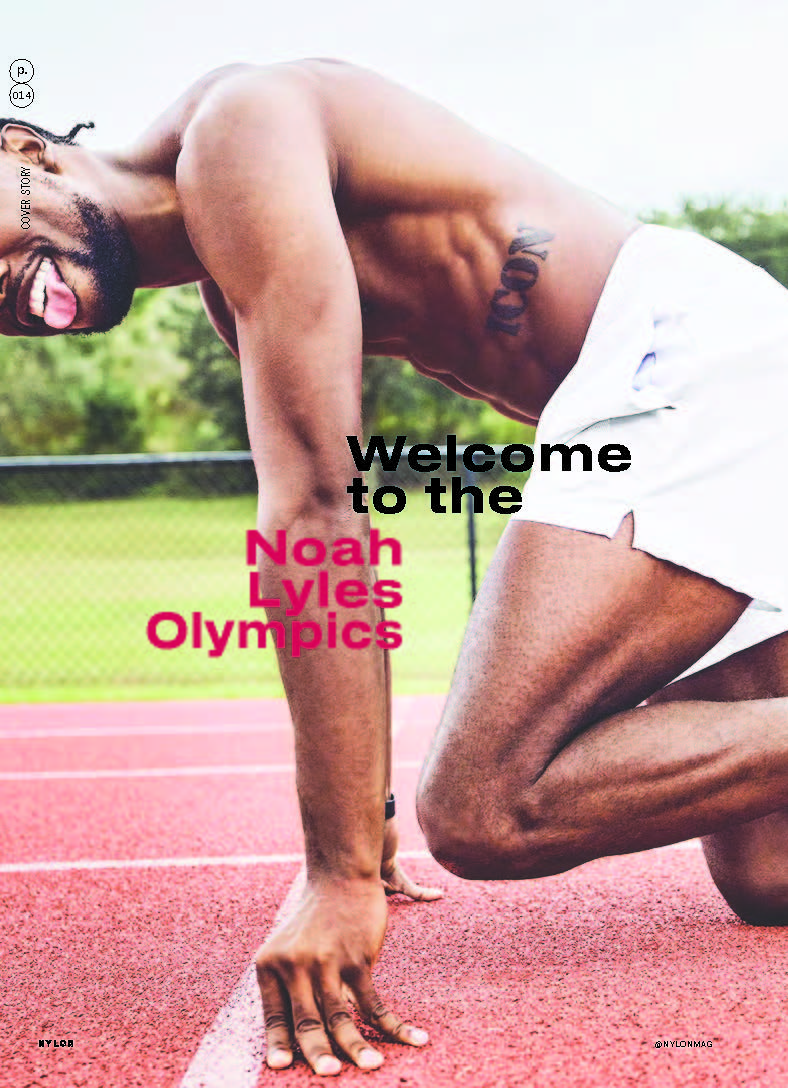
Nylon Magazine uses modern sans-serif typefaces for a clean, trendy look that appeals to its young audience for the headings and uses traditional serif font for the bodycopy for easy readability. The magazine uses a mix of sans-serif and serif typefaces. For headings, it uses Druk Text Wide Trial, a bold sans-serif font in 30pt in heavy weight to create a strong visual impact. The body copy will be set in Source Serif 4, a serif font at 9pt in custom weight for readability and a classic look. The leading for the body copy is around 10pt, giving the text enough breathing space for clarity without overwhelming the layout. For added flair, it incorporate Post Grotesk TRIAL (OTF) , 9pt, medium for drop caps, dropping upto three lines, maintaining a clean, modern feel. In some places it also uses customized, unique fonts like 'edgy paint brush stroke's looking fonts to make the design more appealing and playful, enhancing its energetic and fashion-forward brand identity. The magazine's typesetting enhances its brand and tone with smart typography choices. The use of clean sans-serif and geometric typefaces creates a modern, streamlined look that appeals to its trendfocused readers. Bold display fonts in headlines provide strong visual impact, grabbing attention and adding energy. For body text, the sans-serif fonts improve legibility and flow, making content easier to read. Consistent use of these typographic styles across pages creates a unified design. the magazine's use of contemporary fonts reflects its role as a cultural trendsetter in fashion and design. format typeface typesetting
Target Audience
This magazine is mainly targetted for women aged 18-35 who are single, into fashion, and love creativity or anyone who loves fashion, new trends, industry insights etc. Its readers tend to be college students or grads who are employed and always on the hunt for the latest magazines trends. The indie style of this nylon magazine makes it a go-to for people who want something different from mainstream. Nylon Magazine is important because it sets trends and influences fashion, culture, and media with its distinct editorial style.
Voice & Tone
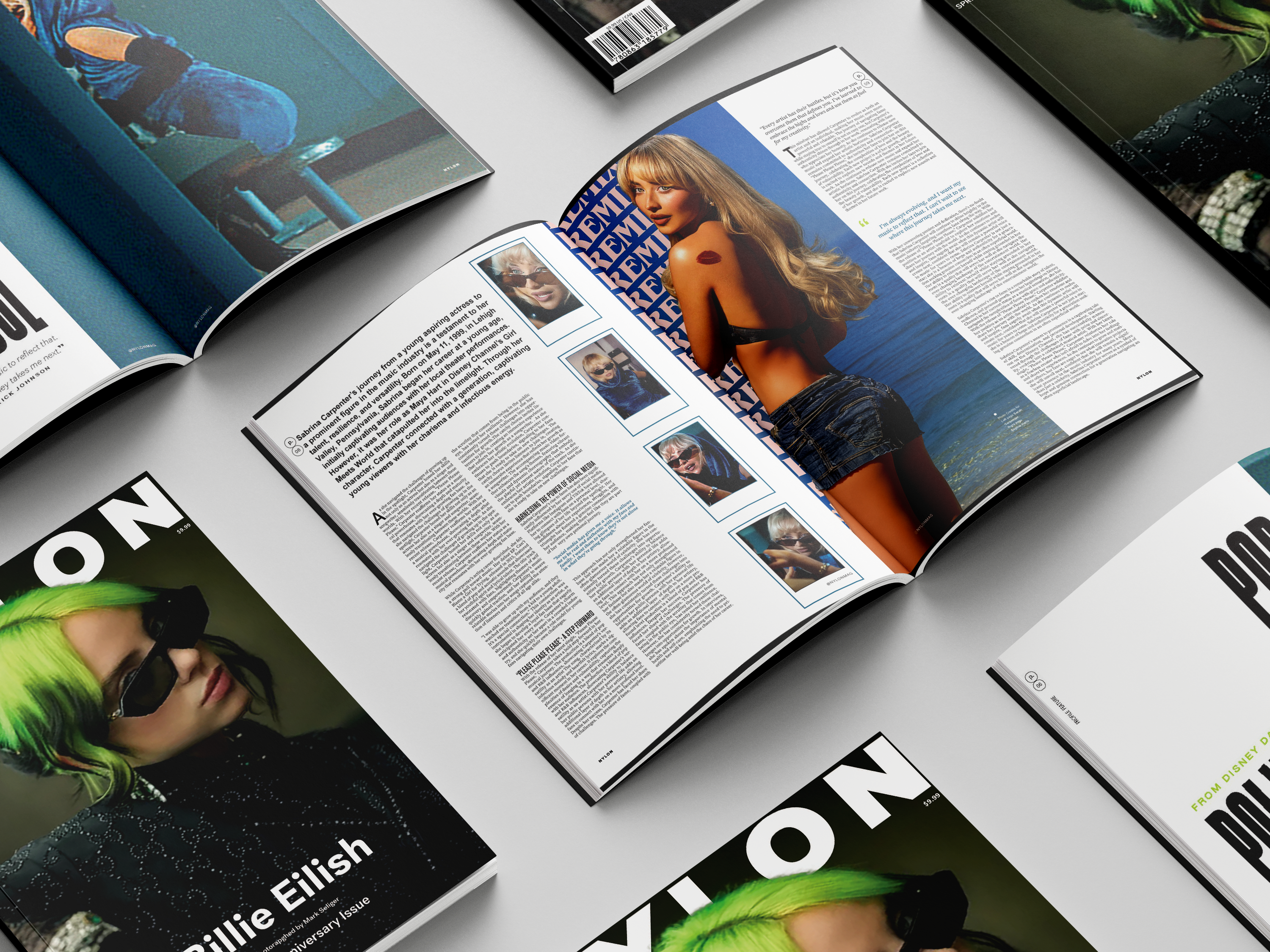
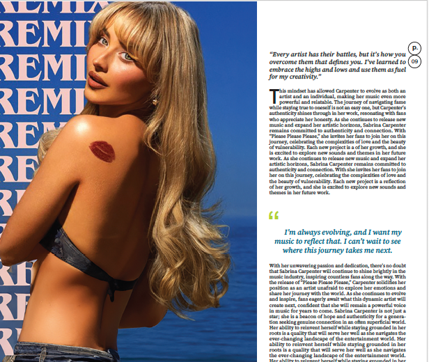
Nylon magazine's editorial tone is youthful, energetic, and rebellious, using a conversational voice that feels like a stylish friend who's always up on the latest trends. Visually, Nylon embraces a bold and eclectic design approach, often using vibrant colors, dynamic typography, and a 9x9 grid layout that gives the magazine a structured yet creative feel. The content seamlessly integrates fashion, music, and pop culture with strong visuals, offering readers a visually stimulating experience. The tone is inclusive and playful, while the design reinforces its cutting-edge style with attention-grabbing layouts and striking imagery, creating a cohesive and immersive editorial experience.
Final Design
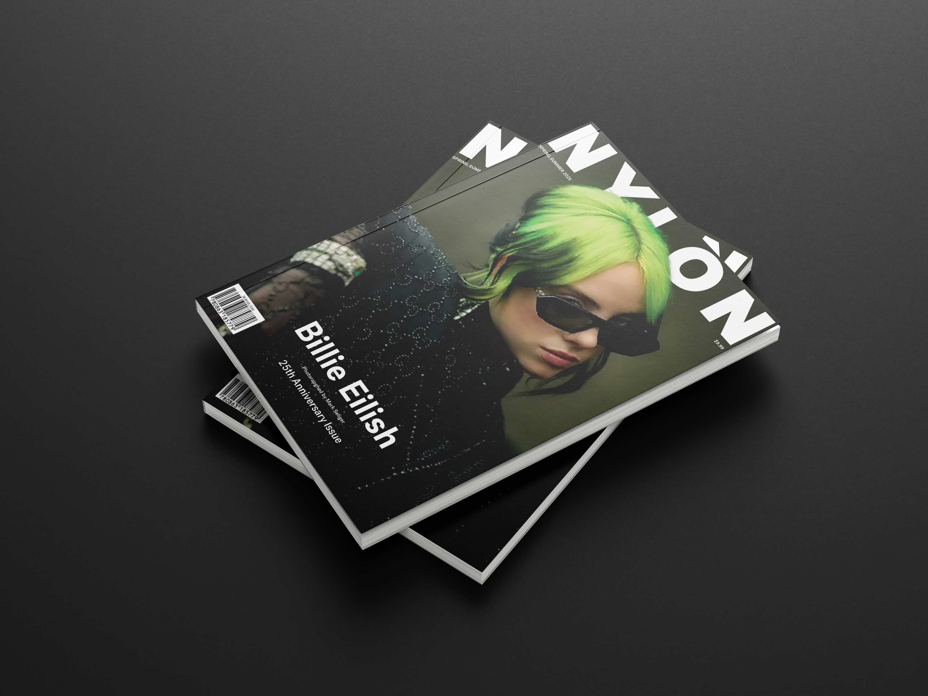
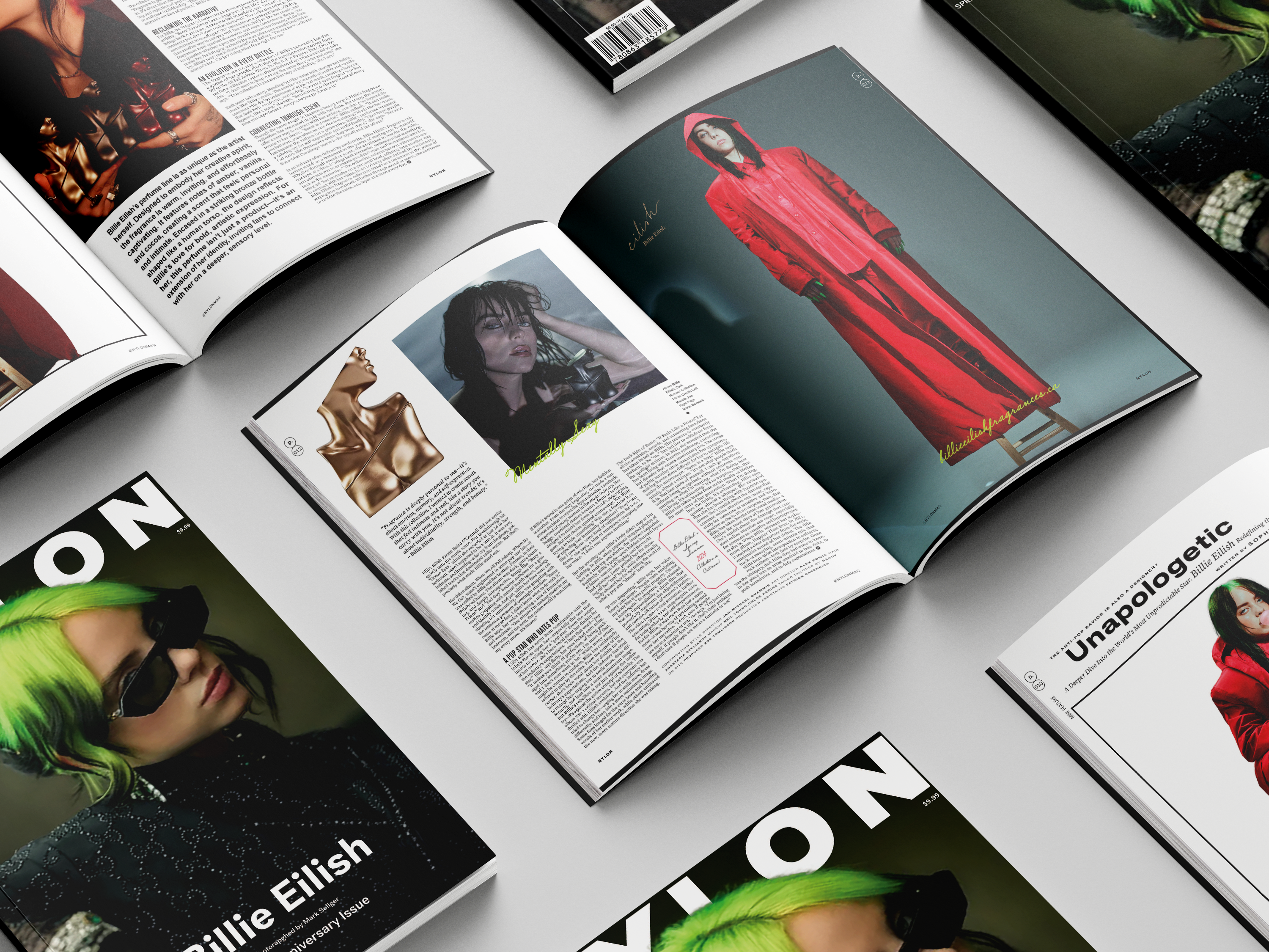
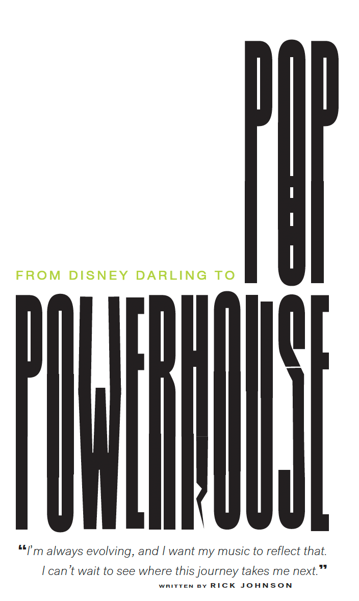
Nylon Magazine Redesign
A modern reinterpretation of the original magazine
Custom Typeface
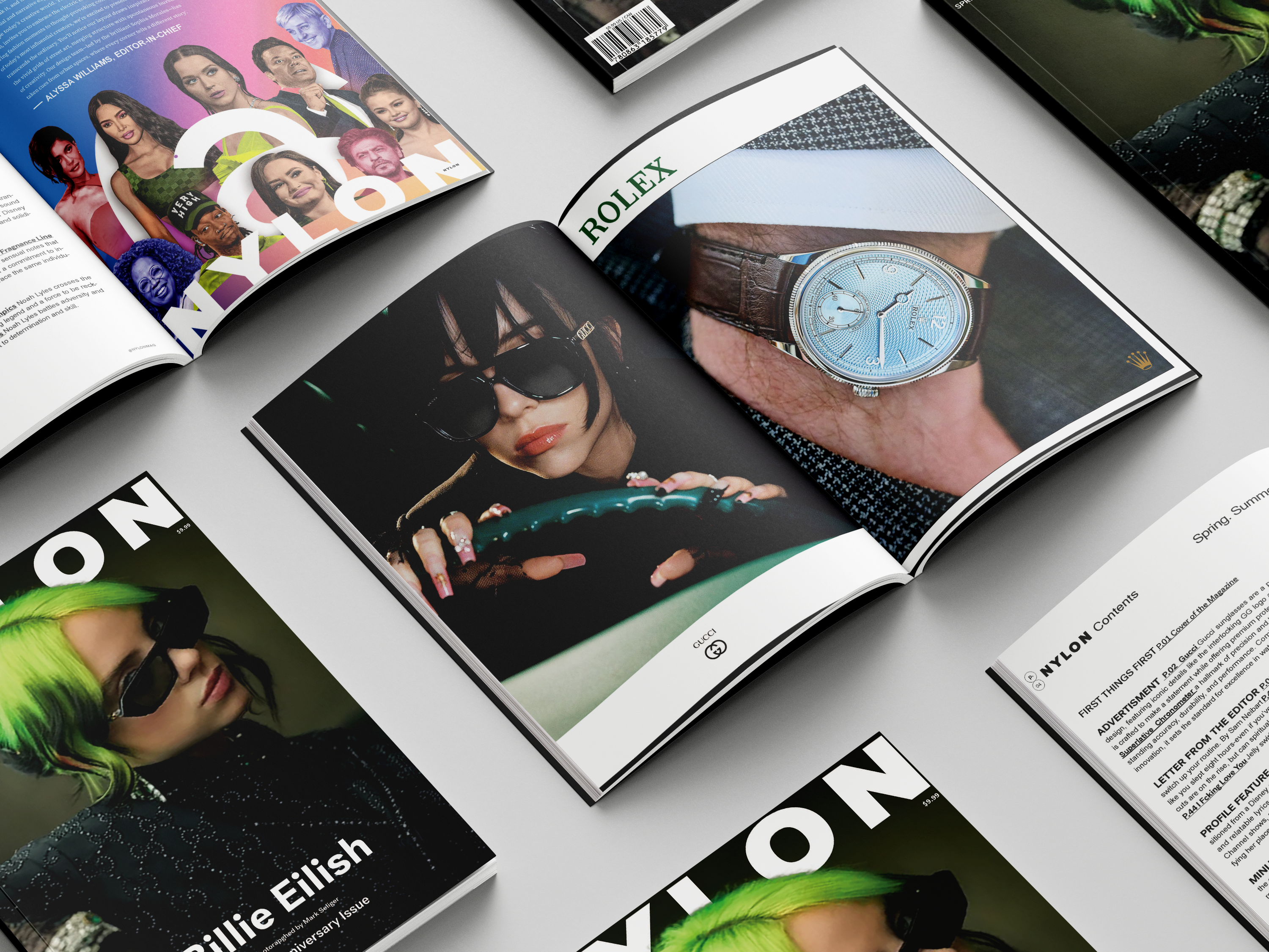
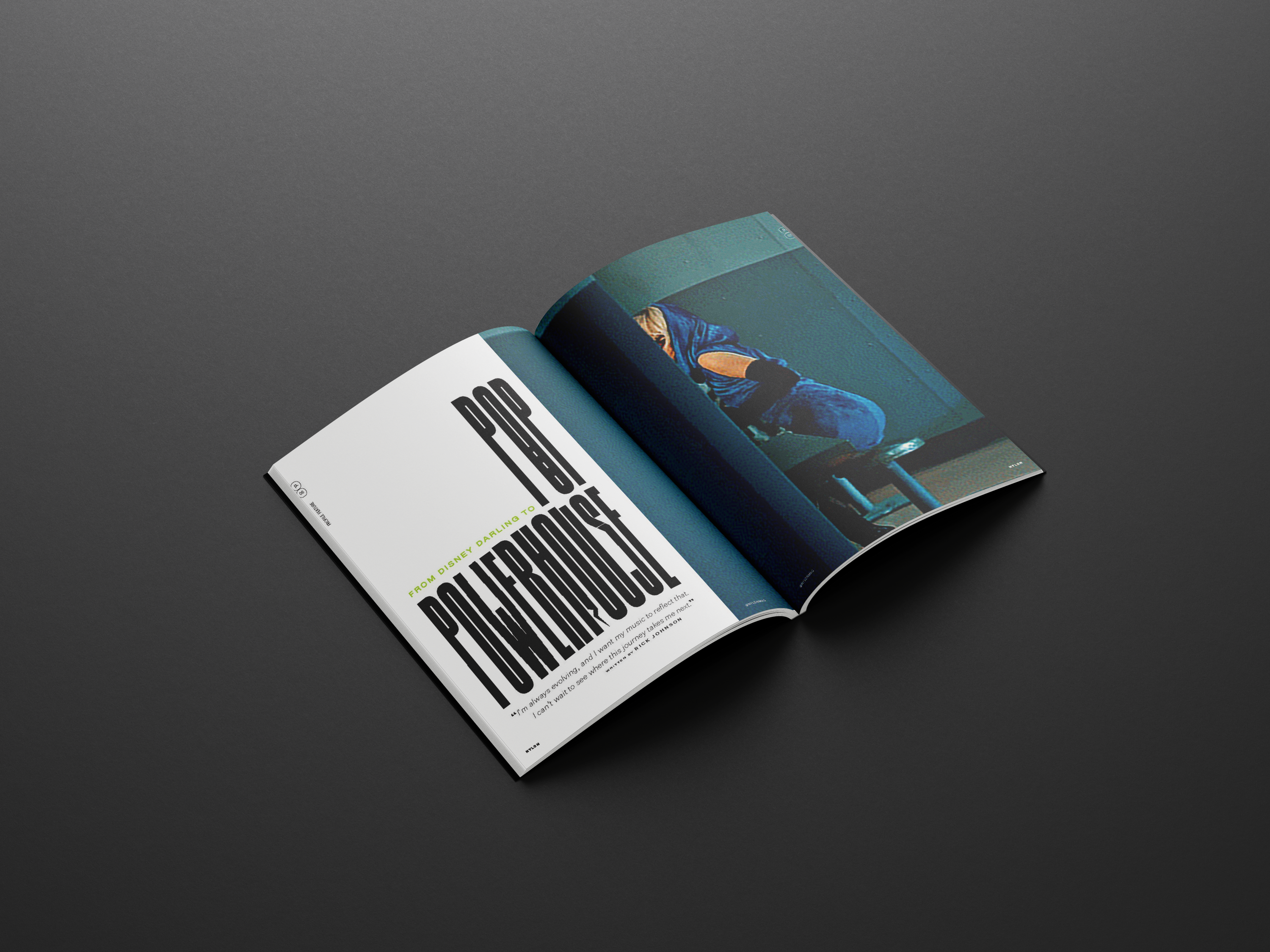
Page Spread
Close-up Details
Design Strategy
The goal was to visually follow the original design principles, ensuring the grid structure, typography, and visual hierarchy were consistent with the brand. I made careful adjustments to values such as H&J settings, line spacing (leading), column width, gutters, rags, orphan and widow control, justification, and hyphenation for optimal readability. While I maintained the original color scheme, I also experimented with some stylized fonts for added visual interest, ensuring they blended seamlessly with the clean, modern layout. The use of sharp, high-contrast photography complemented the bold, minimalistic design, creating a visually dynamic experience that remains true to Nylon's edgy style.einterpret a timeless story in a way that resonates with both longtime fans and new audiences. I wanted to bring attention to the individuality of each sister while maintaining the emotional unity of the story through a cohesive and appealing visual language.
Key Takeaways
This project reinforced the importance of layout flexibility—understanding when to adhere to the grid and when to break it for visual impact. I learned how small adjustments, from hyphenation and justification to gutter width, can elevate a design from good to exceptional. Maintaining color consistency helped create a cohesive visual narrative, while refining typographic choices deepened my appreciation for how font, spacing, and structure shape both readability and style. Ultimately, this experience taught me how to adapt and refresh a brand's identity, blending its essence with my own creative voice.
Challenges
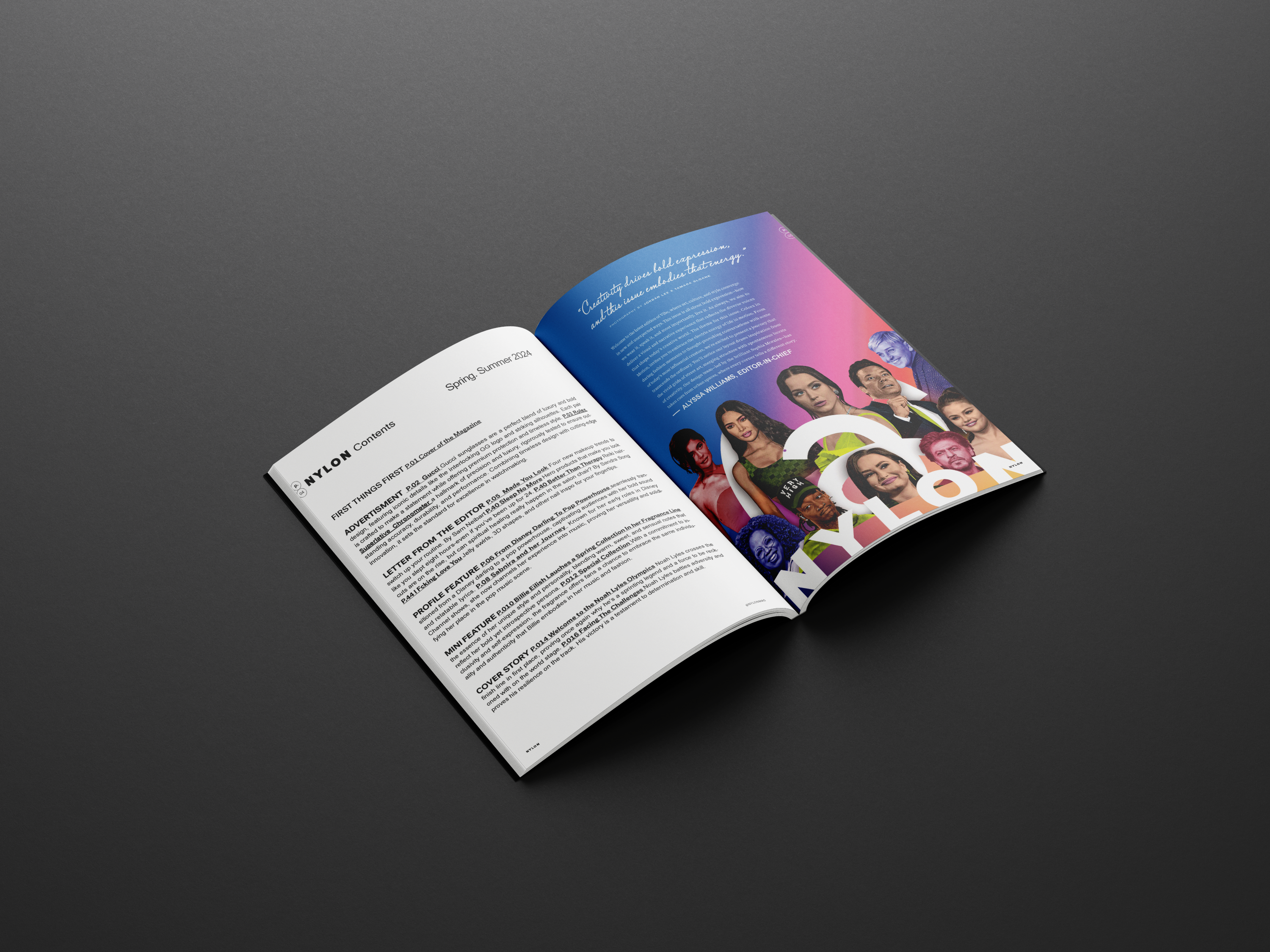
I used a single, consistent grid system to create a range of diverse yet cohesive layouts throughout the project. Careful attention was given to text formatting—eliminating orphans and rags—for a clean, polished appearance. I successfully replicated the original magazine cover, capturing its exact style and tone, and meticulously matched the typography to mirror the original design. Ads were presented in a bold yet minimalistic manner, aligning with the magazine's aesthetic. The table of contents layout was also precisely recreated, maintaining visual accuracy and editorial flow.
Process Work
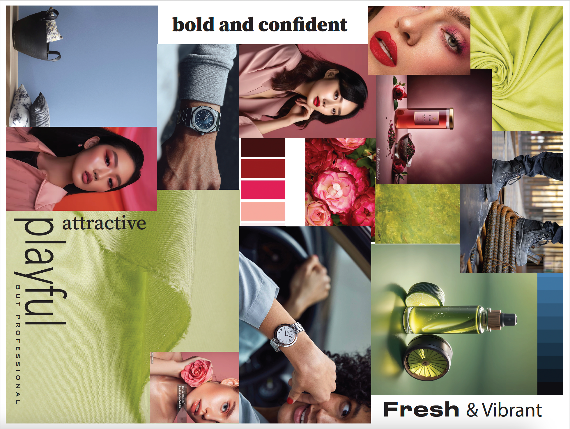
Moodboard
Initial research and moodboard development
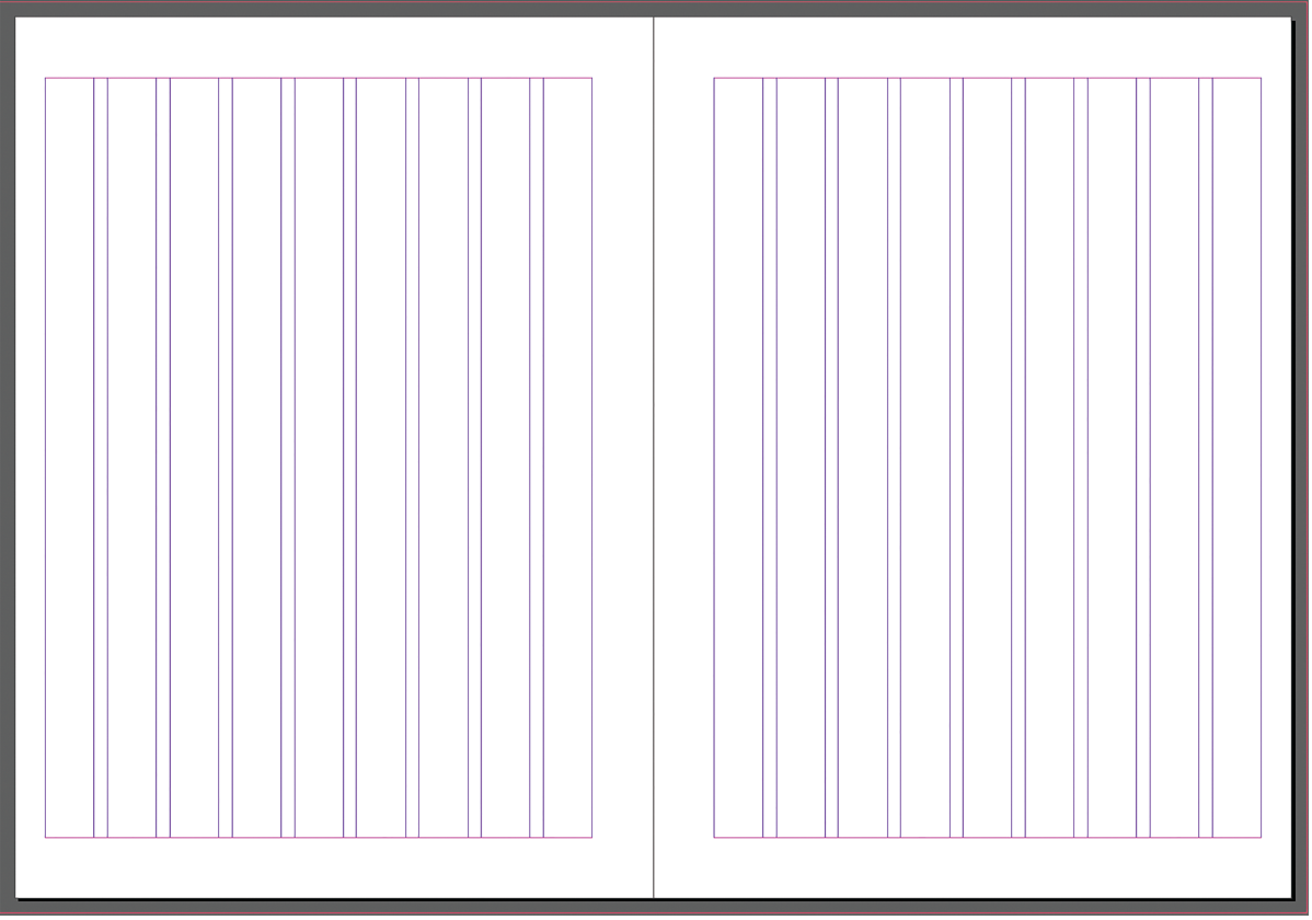
Grid System
the grid is 9x9 with a gutter space of 16 pixels the top, bottom, and inside & outside margins are 72pt, baseline grid has 10pt increments
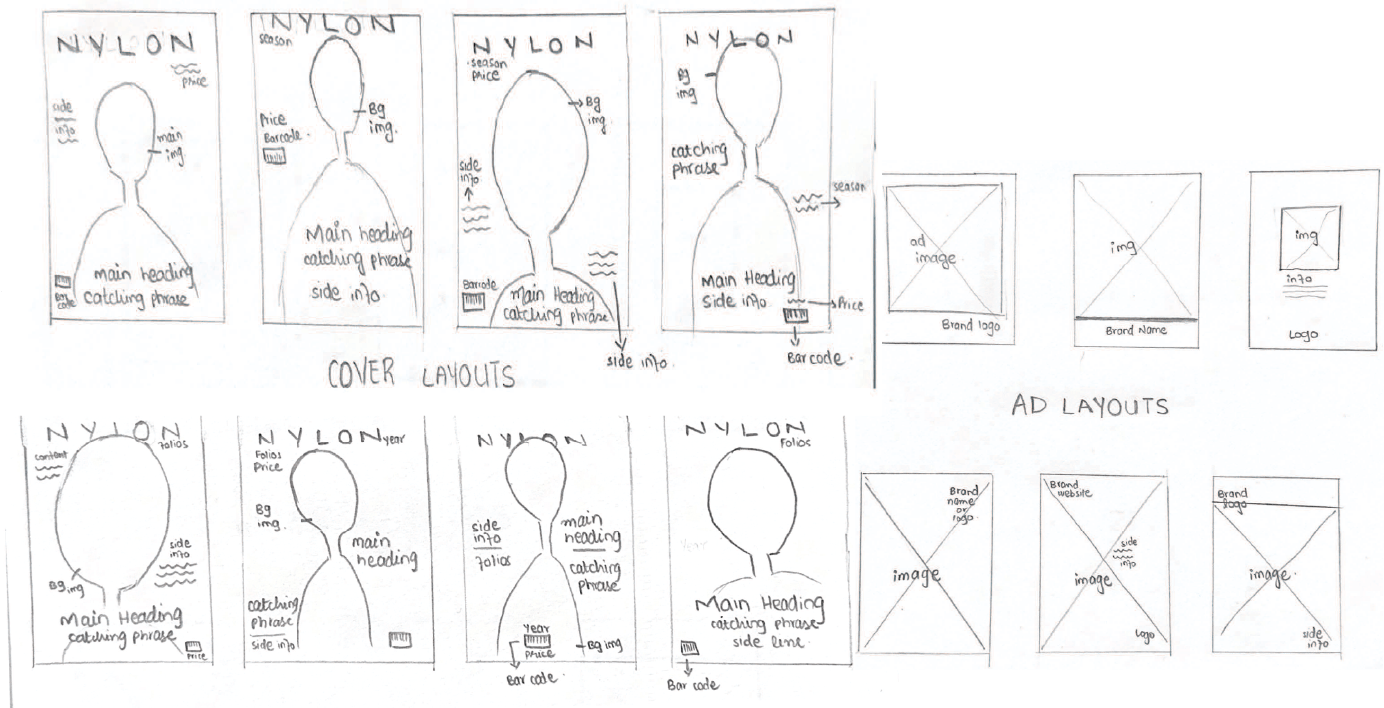
Rough Sketches
Brainstorming different layouts and ideas
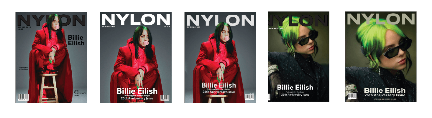
Cover Layouts
Visually striking and engaging, with a focus on typography, imagery, and layout.
Design Elements
Color Palette
Used the same color palette as the original magazine, with a few tweaks to make it more modern and edgy.
Layout
Used a grid system to create cohesive layouts, polished text formatting, and closely matched the original magazine’s cover, typography, ads, and table of contents for visual and editorial accuracy.
Typography
found the same typefaces as the original magazine, added some stylized fonts as well as custom typefacesfor added visual interest.
Project Gallery