Designing a Typeface for The Little Mermaid
A bespoke typeface designed specifically for The Little Mermaid film, capturing the essence and whimsy of its underwater world.
Graphic Designer | Concept Development | Art Direction | Layout Design
Adobe Creative Suite | Illustrator | Photoshop | InDesign
Project Overview
In this project, I set out to design a bespoke typeface inspired by The Little Mermaid, reimagining the film's visual identity through a modern, typographic lens. My goal was to create a typeface that felt both timeless and enchanted — echoing the fluidity of the ocean, the curiosity of the protagonist, and the whimsical charm of the undersea world.
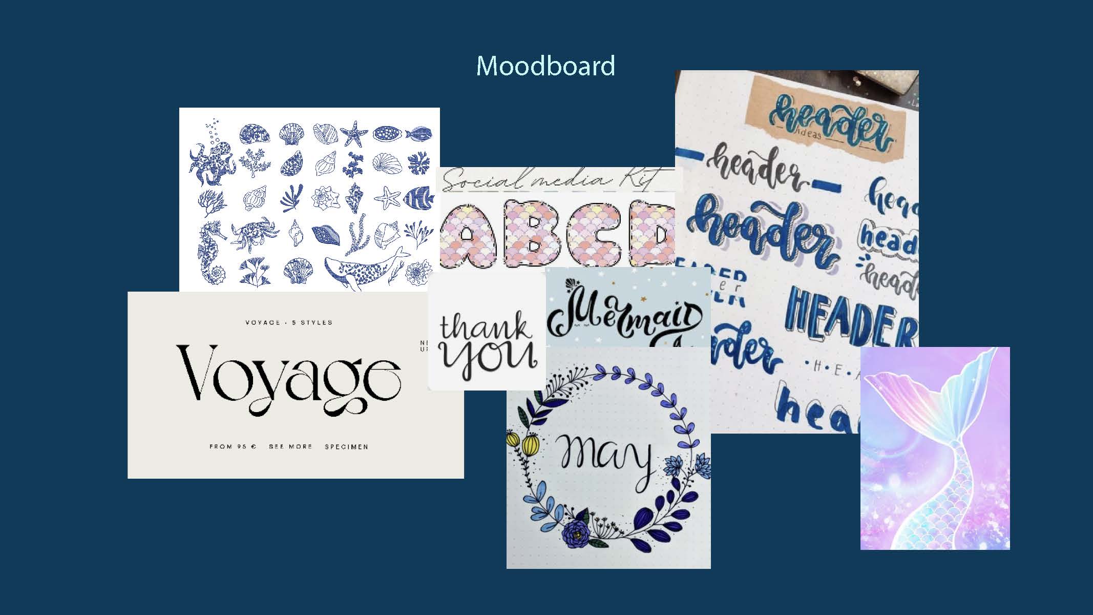
The conceptual foundation for the typeface came from the ocean itself — the curves of waves, the elegance of sea creatures, and the mystical tones of underwater mythology. I wanted each letterform to feel organic and fluid, yet maintain strong legibility and character integrity. I drew references from nautical scripts, calligraphy, and Art Nouveau motifs to reflect the film’s romantic and fantastical themes.
The typeface is designed to be versatile, with a range of weights and styles that can be used for both display and body text. It is designed to be used in both print and digital media, and is designed to be used in both English and Spanish.
Design Process
Progress Work
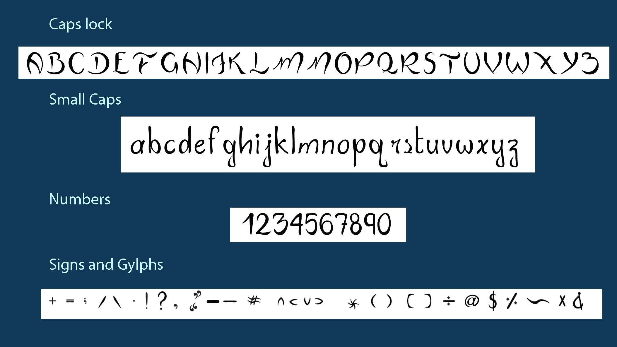
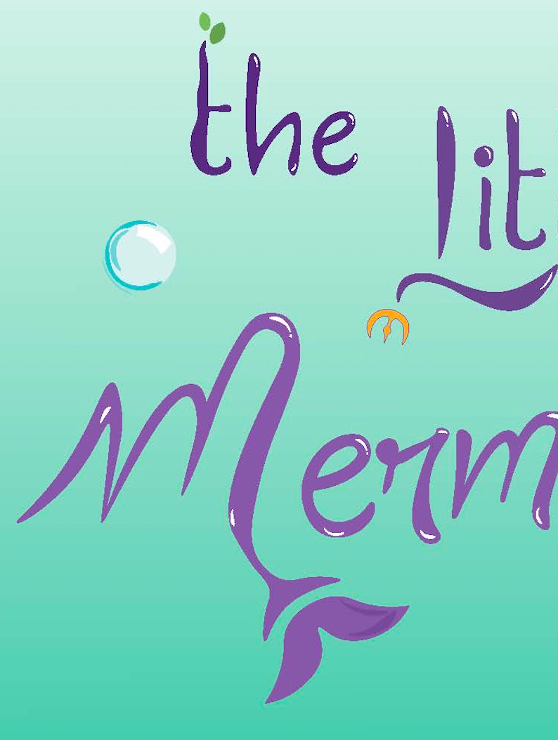
I designed a custom typeface inspired by The Little Mermaid, featuring heavy weights concentrated in the center of each letterform and lighter edges to create a fluid, wave-like motion. Each character was refined for consistency and tested for readability, ensuring the type remained both expressive and functional. To reflect the oceanic theme, I integrated pointed terminals that echo the sharp elegance of underwater forms. The result is a visually cohesive type system that balances aesthetic storytelling with practical application.
Why i Chose This Movie
Creating a new, modern font for The Little Mermaid can make the movie's design more engaging and fresh. The previous font was boring and didn't resonate with the film's fantasy and adventure themes. Using a clean sans-serif typeface with unique details, like heavy and light strokes, fits the underwater setting perfectly. This new look will strengthen the film’s branding and make it more appealing, helping it stand out and connect with today's audience.
Design Considerations
I explored both serif and sans-serif fonts for the typography. While serif fonts can evoke a classic
fairy tale feel, they felt too formal for the modern adventure vibe of The Little Mermaid. Instead, I
focused on clean, playful sans-serif options that align better with the underwater theme.
I experimented with different weights, emphasizing heavier sections in the middle of the letters to
create a strong visual impact, representing the ocean’s depth. Lighter weights towards the edges
were used to suggest fluidity and movement, mimicking how water flows.
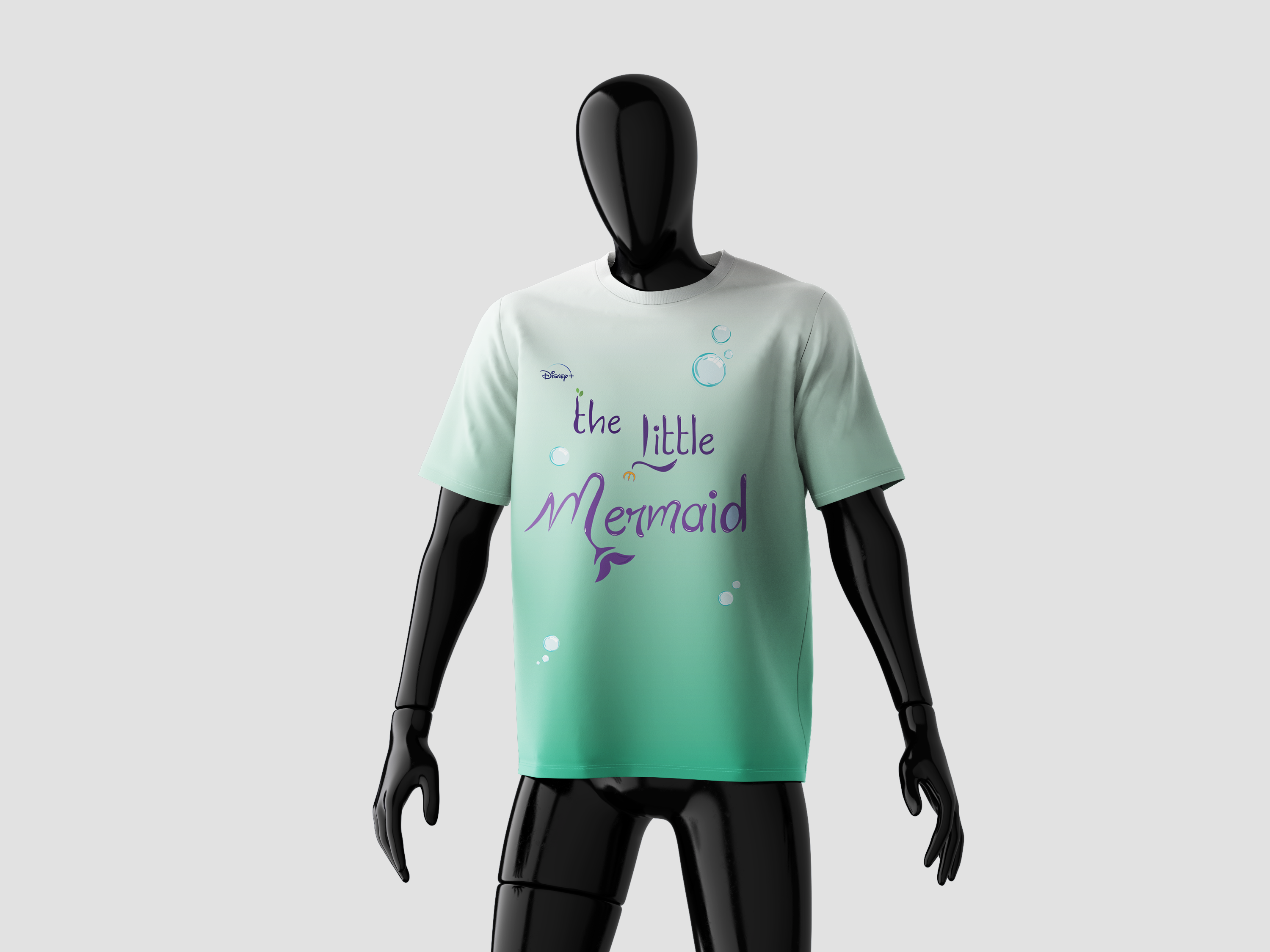
Final Design
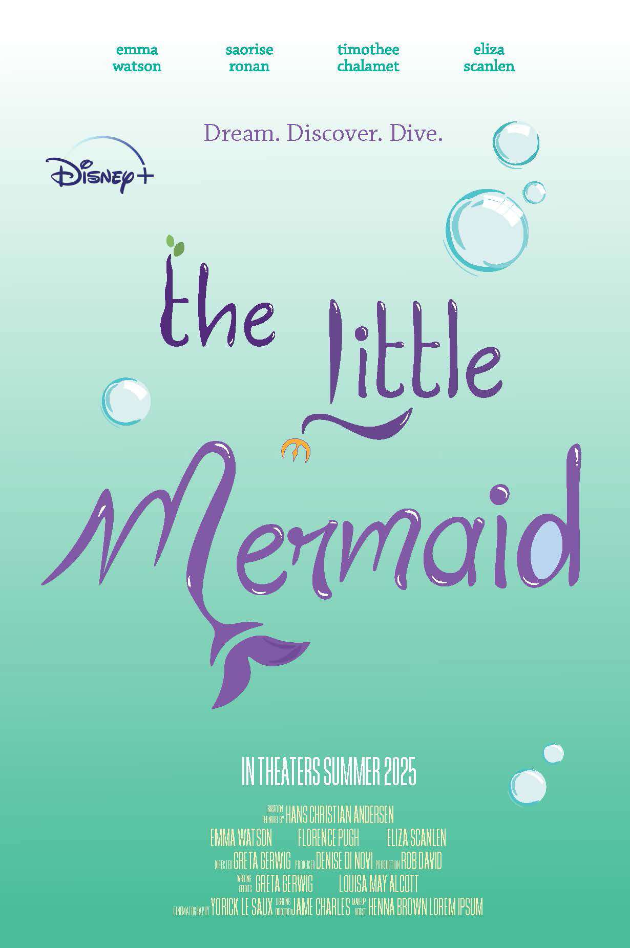
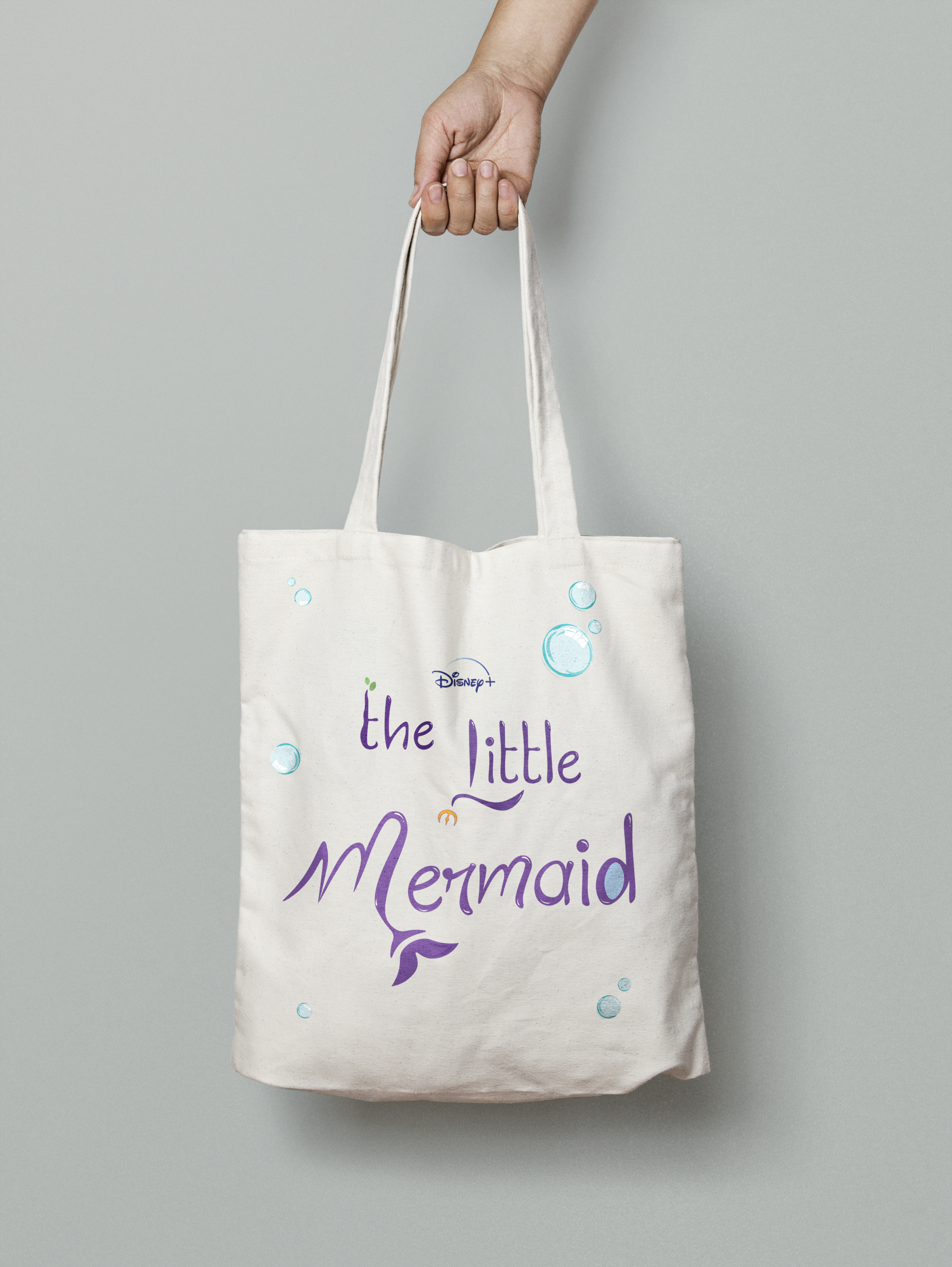
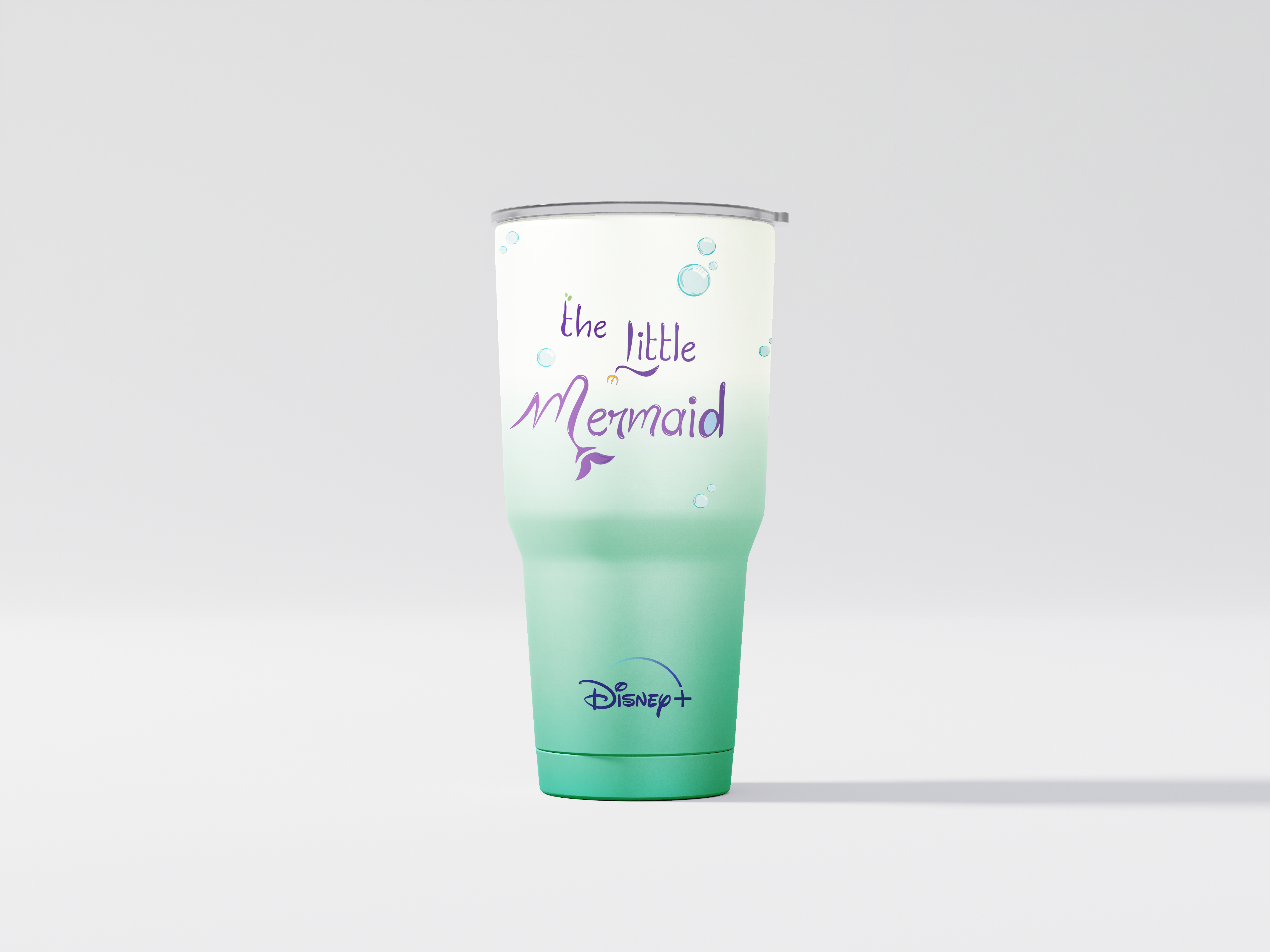
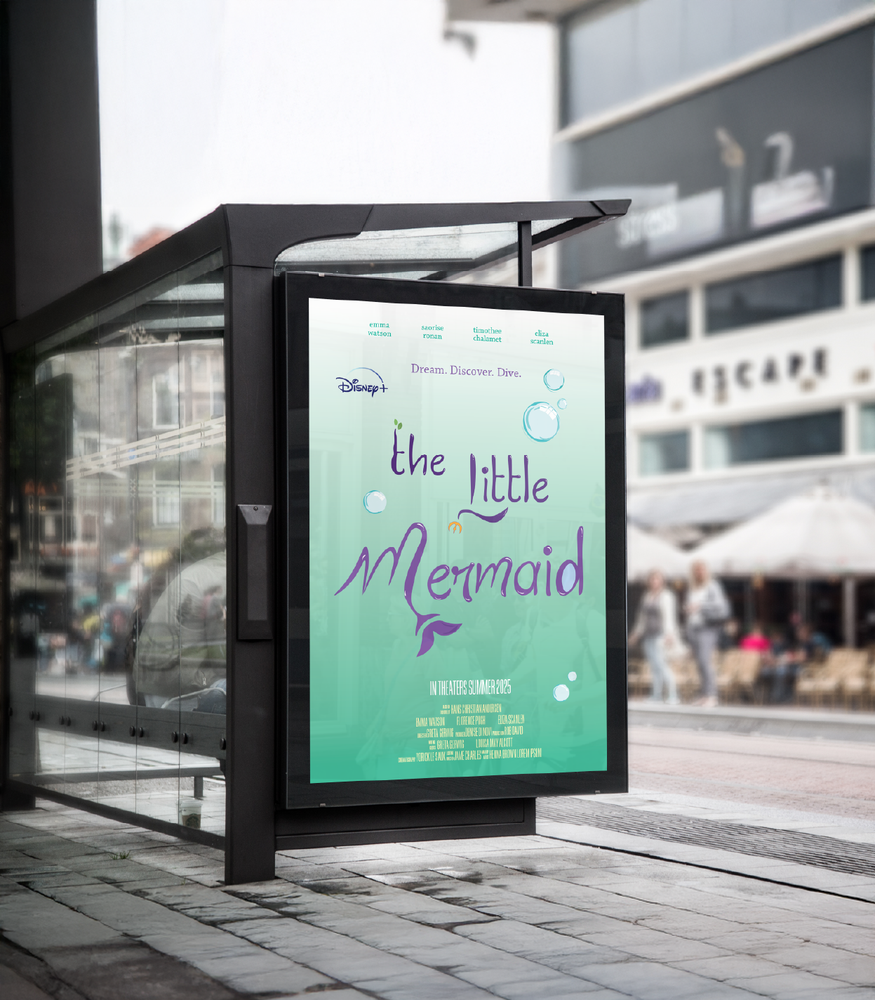
Using the Typeface
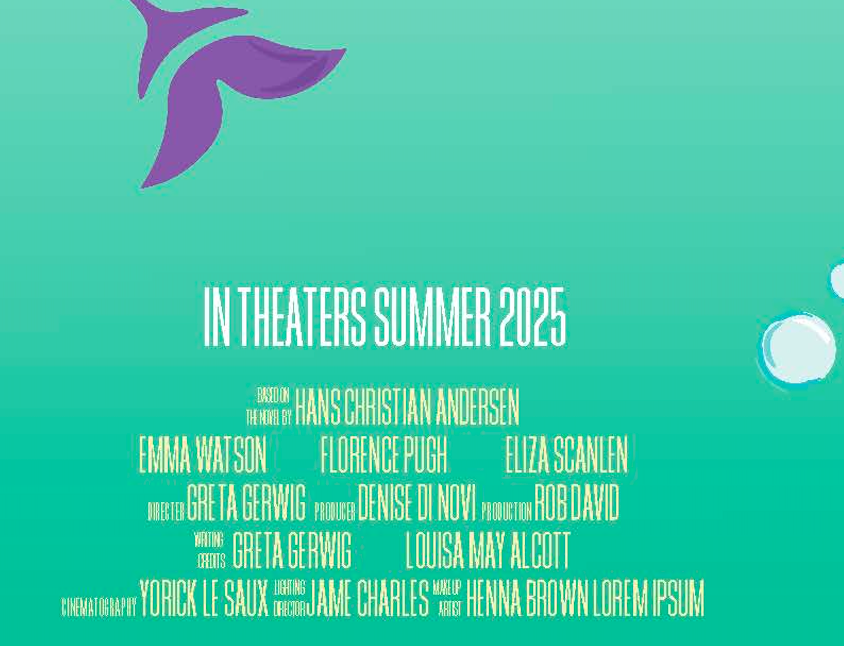
Applying the custom typeface to the movie poster
Custom Additions

Illustrations
Color Choices
Design Strategy
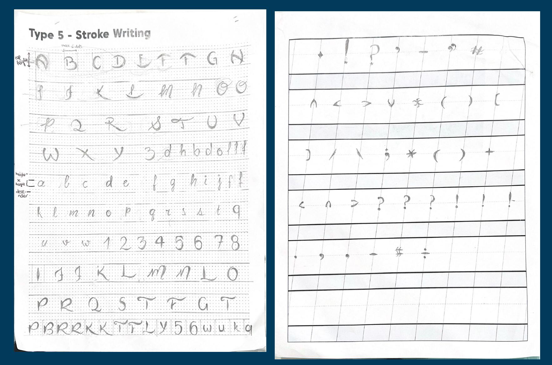
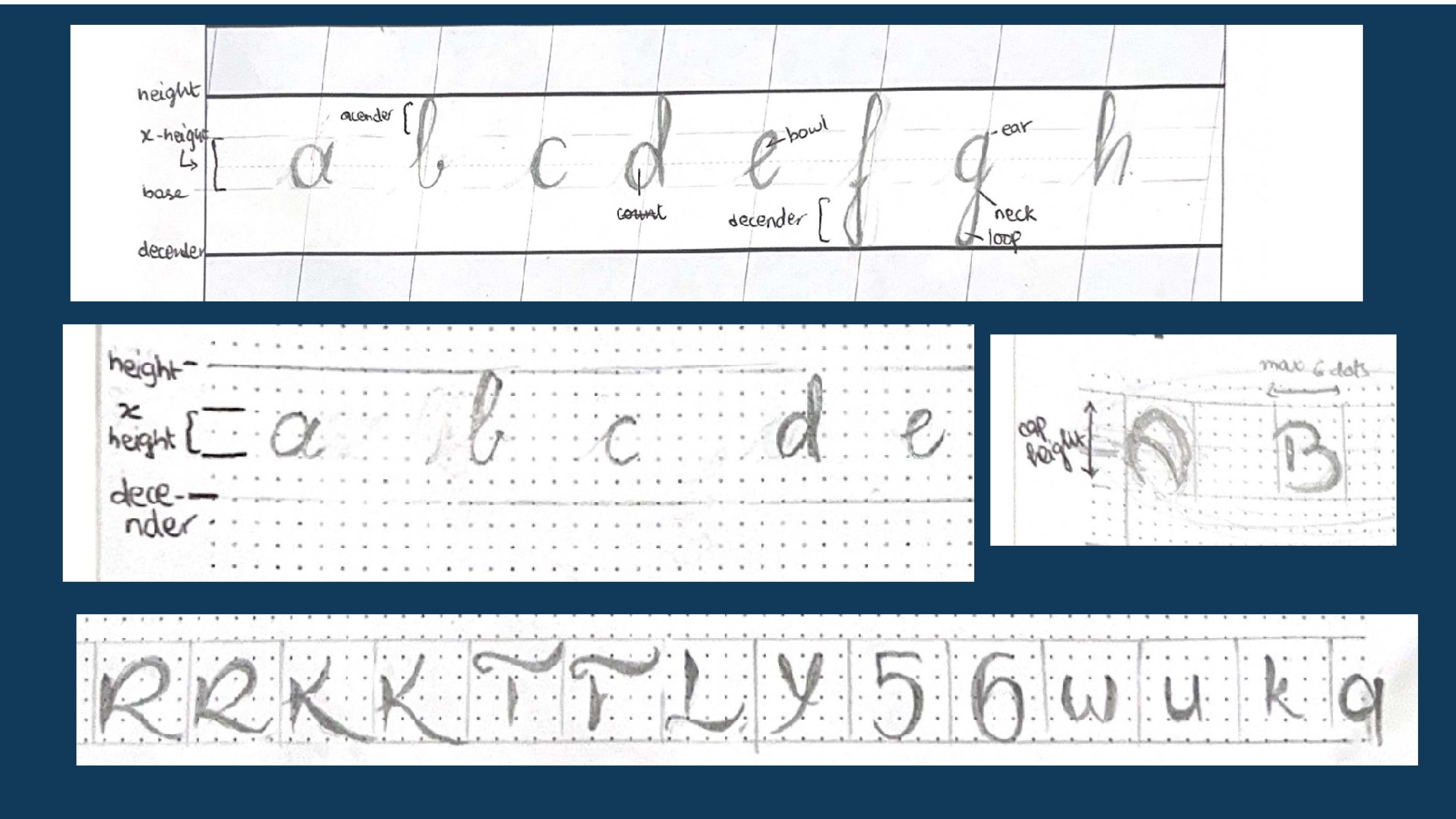
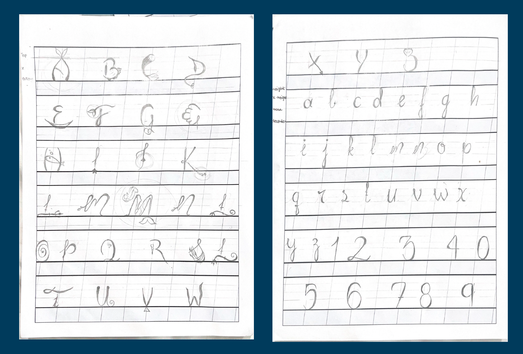
To develop a cohesive and functional typeface, I began by establishing precise proportions using a ruler and guides. The letterforms were built with clear structural intent: uppercase letters were made taller to establish hierarchy, while the lowercase characters featured a smaller x-height for balance. The cap height was set to approximately 75% of the total letter height, allowing ascenders to extend 25% above the cap line and descenders to drop 25% below the baseline—creating a rhythm that supports both readability and visual interest.
Initially, I explored a cursive style with joined lowercase letters to reflect fluidity. However, during the development process, I found that the complexity of achieving legibility and cohesion in this form presented significant challenges. To resolve this, I refined the design by removing brackets and ears, resulting in a non-cursive, more contemporary lowercase style that aligned better with the typeface’s overall vision.
As the letterforms took shape, I carefully defined side bearings to ensure consistent spacing. This phase was critical in achieving a harmonious visual flow—each character was spaced to feel naturally close without appearing cramped, striking a balance between openness and cohesion. This iterative approach allowed me to build a typeface that feels intentional, legible, and stylistically unified.
Major Wins
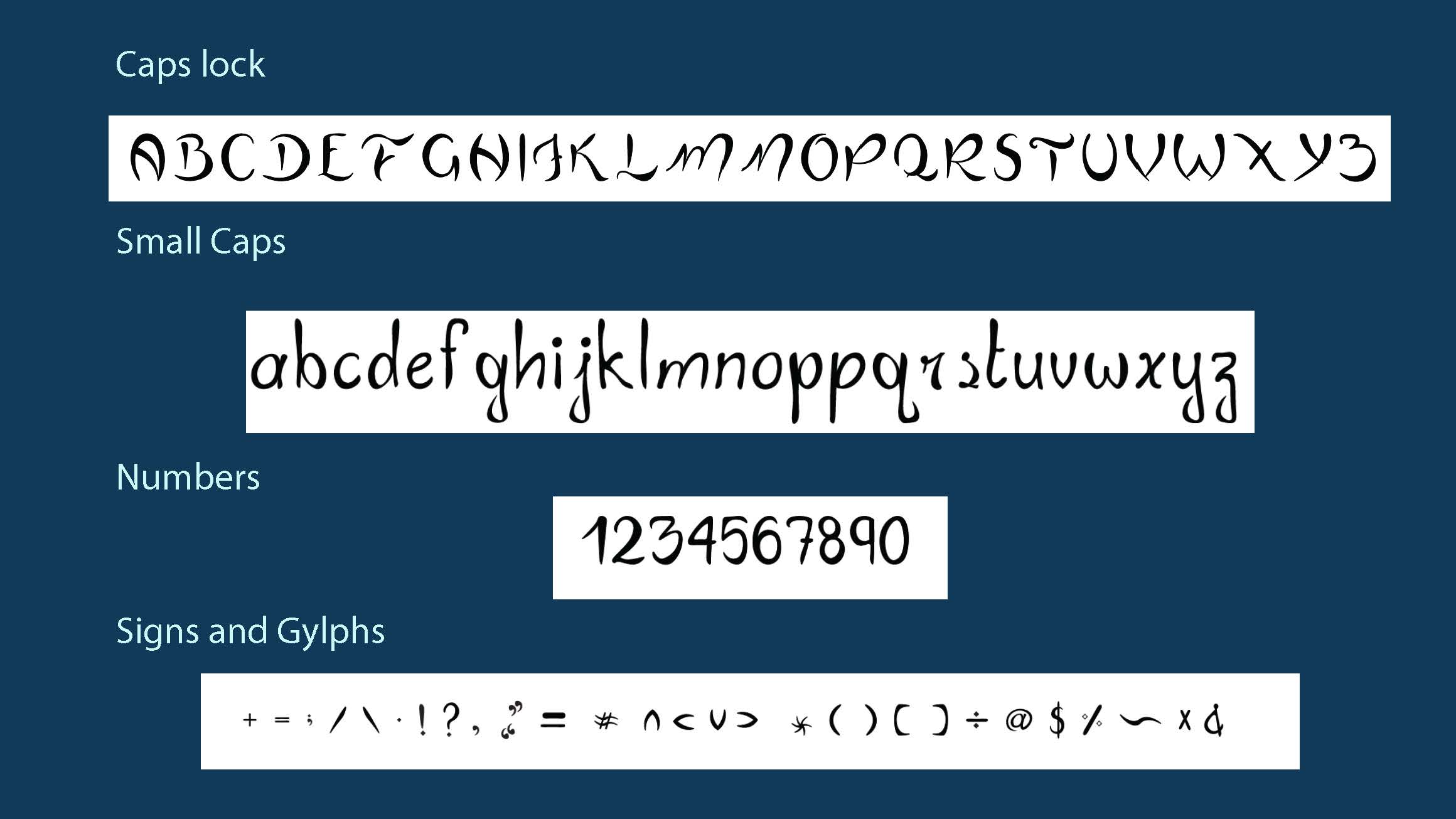
The design was carefully aligned with the underwater theme, drawing inspiration from the fluidity and movement of the ocean. I experimented with weight variations across characters to bring a sense of rhythm and depth to the typeface. Vibrant, ocean-inspired colors were introduced to evoke the lively and magical underwater world. To add a whimsical touch, I crafted bubble-like letterforms that felt playful yet refined. Playful illustrations were integrated to complement and enhance the typography, creating a rich visual narrative. The result was a cohesive and imaginative design that captured the enchanting tone of The Little Mermaid while maintaining strong typographic integrity.
Pain Points
A key part of the design strategy involved ensuring that both small caps and caps lock versions felt cohesive, as though they belonged to the same unified type family. I focused on designing consistent loops across letterforms to maintain rhythm and visual flow. Special attention was given to the ends of each letter, refining them with a unified terminal style that aligned with the overall aesthetic. Balancing the typeface's unique, ocean-inspired features with legibility was crucial, especially for diverse applications. Throughout the process, I worked to harmonize contemporary typographic design with the whimsical, fluid essence of the underwater theme, creating a typeface that feels both modern and magical.
Process Work
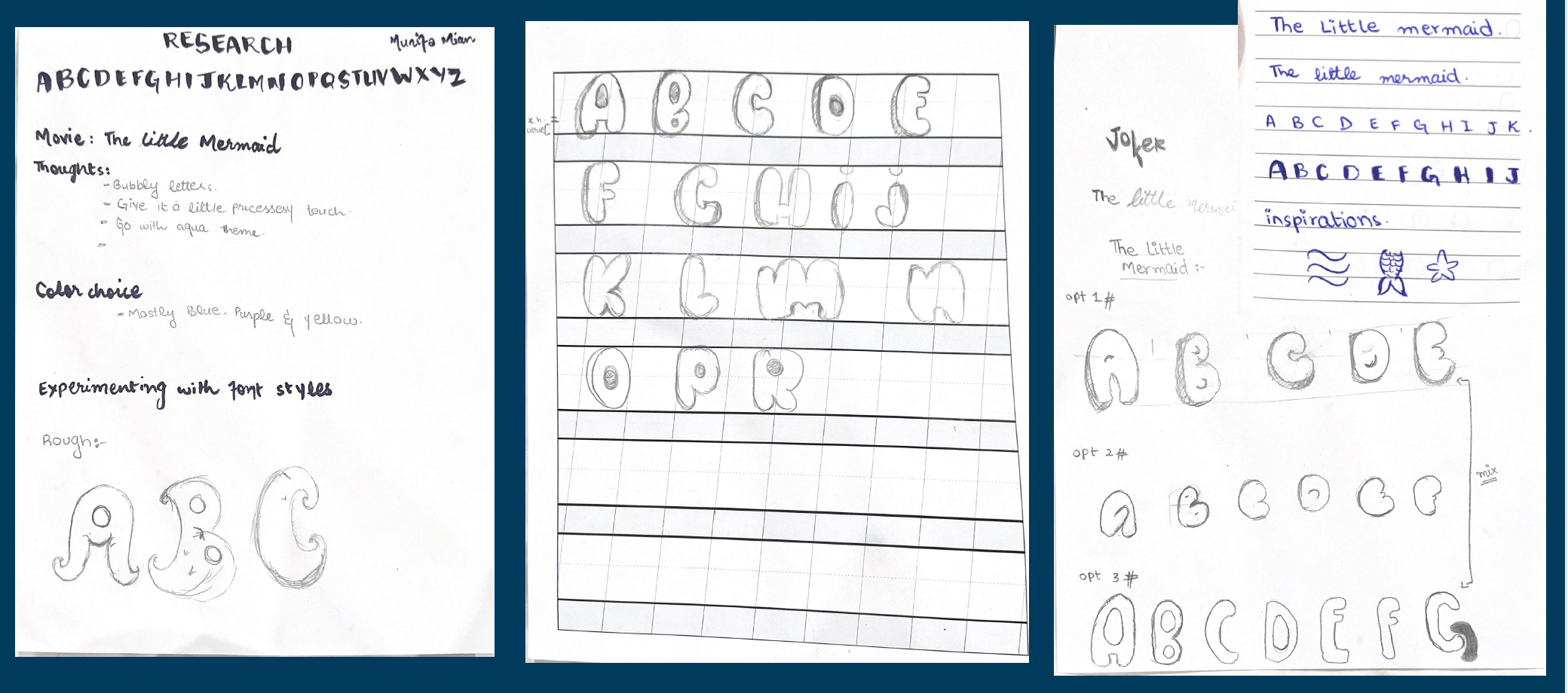
Rough Sketches
Brainstorming different type designs
Stylized Letters
Creating unique letterforms
Finalizing the Typeface
sticking to the original design
Transferring the Typeface to Illustrator
Project Gallery