Redesigning Evian's packaging
A modern reinterpretation of the original packaging
Lead Designer
Adobe Creative Suite | Illustrator | Photoshop
Project Overview
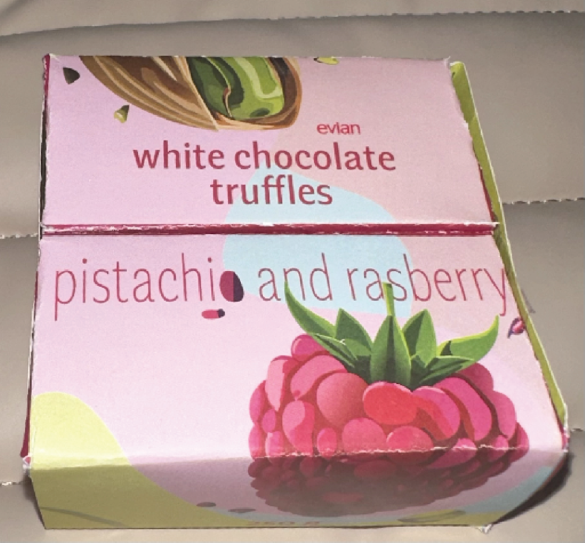
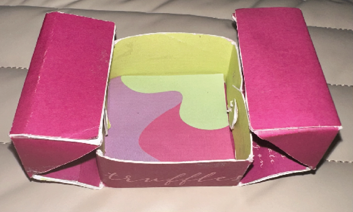
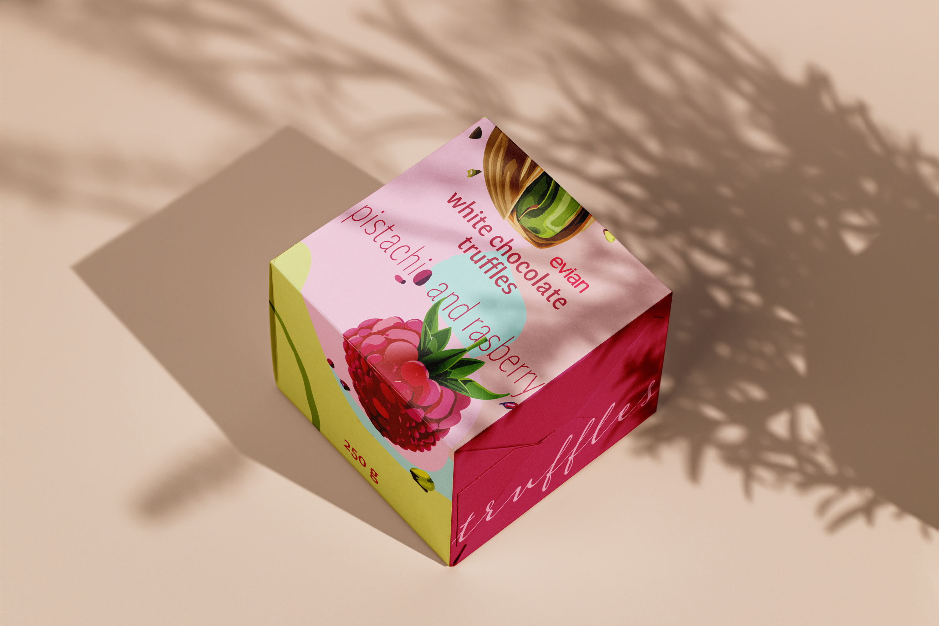
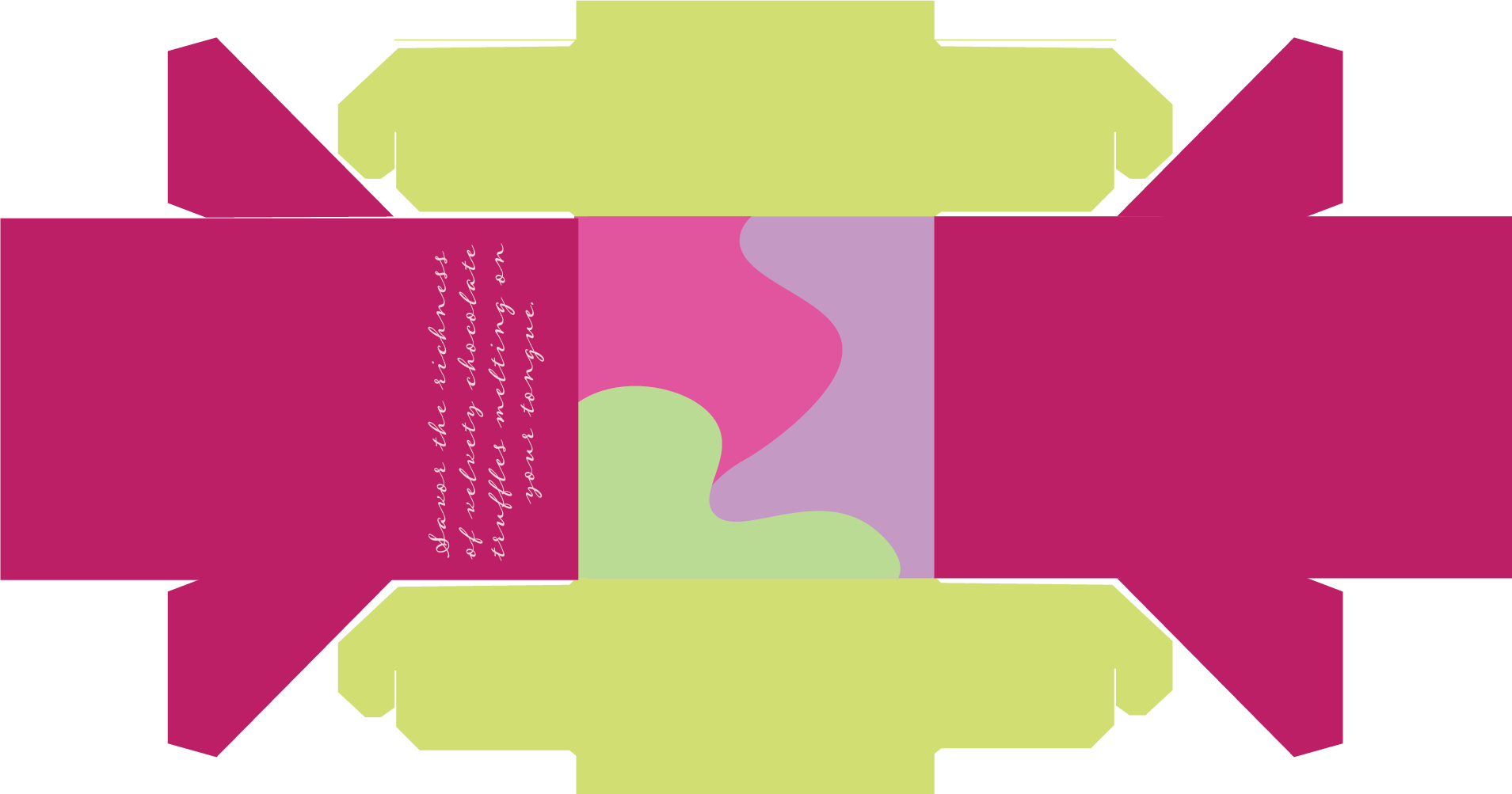
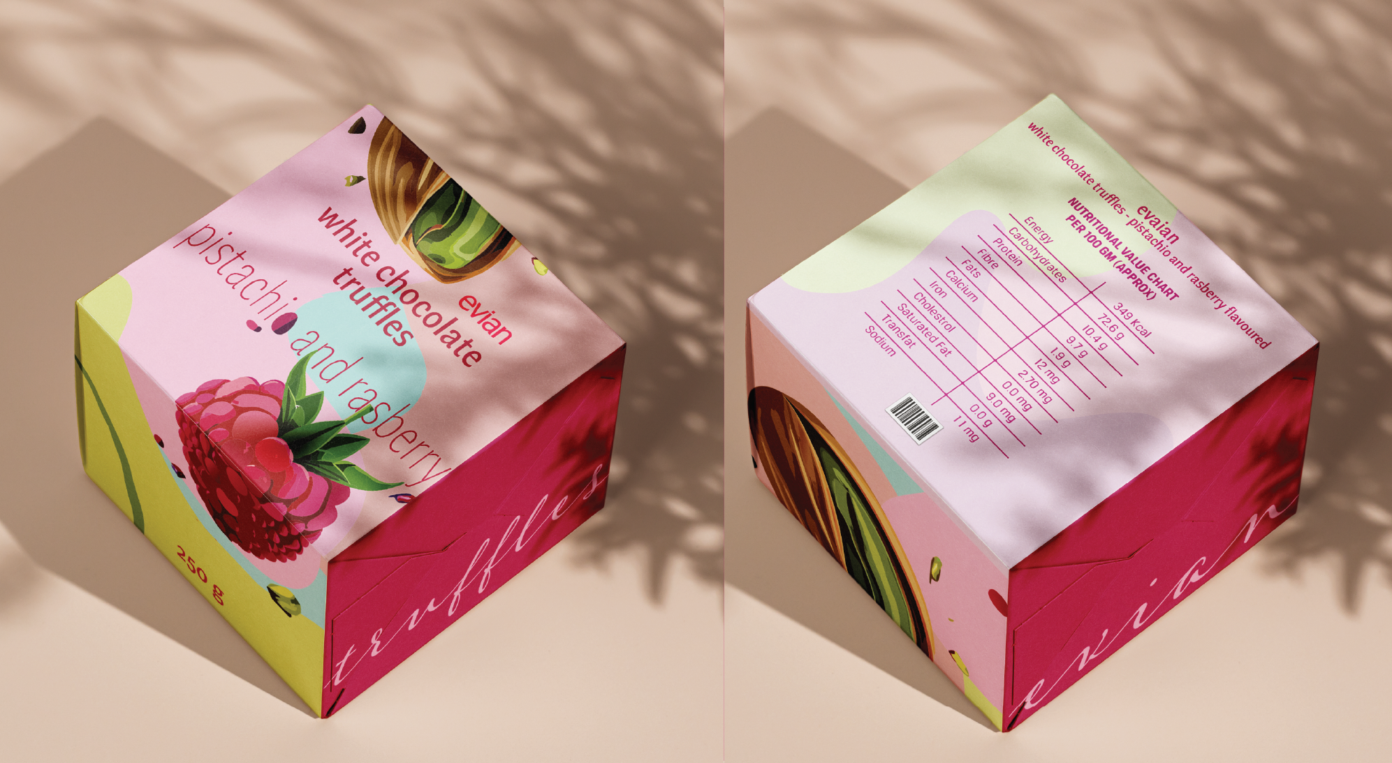
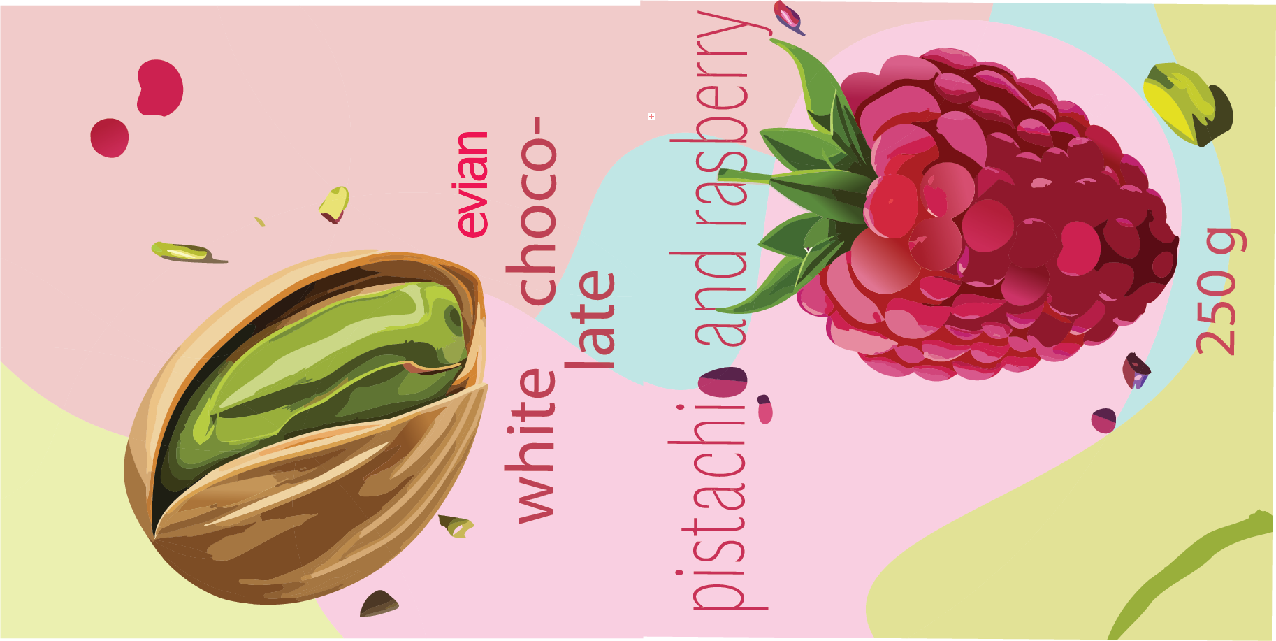
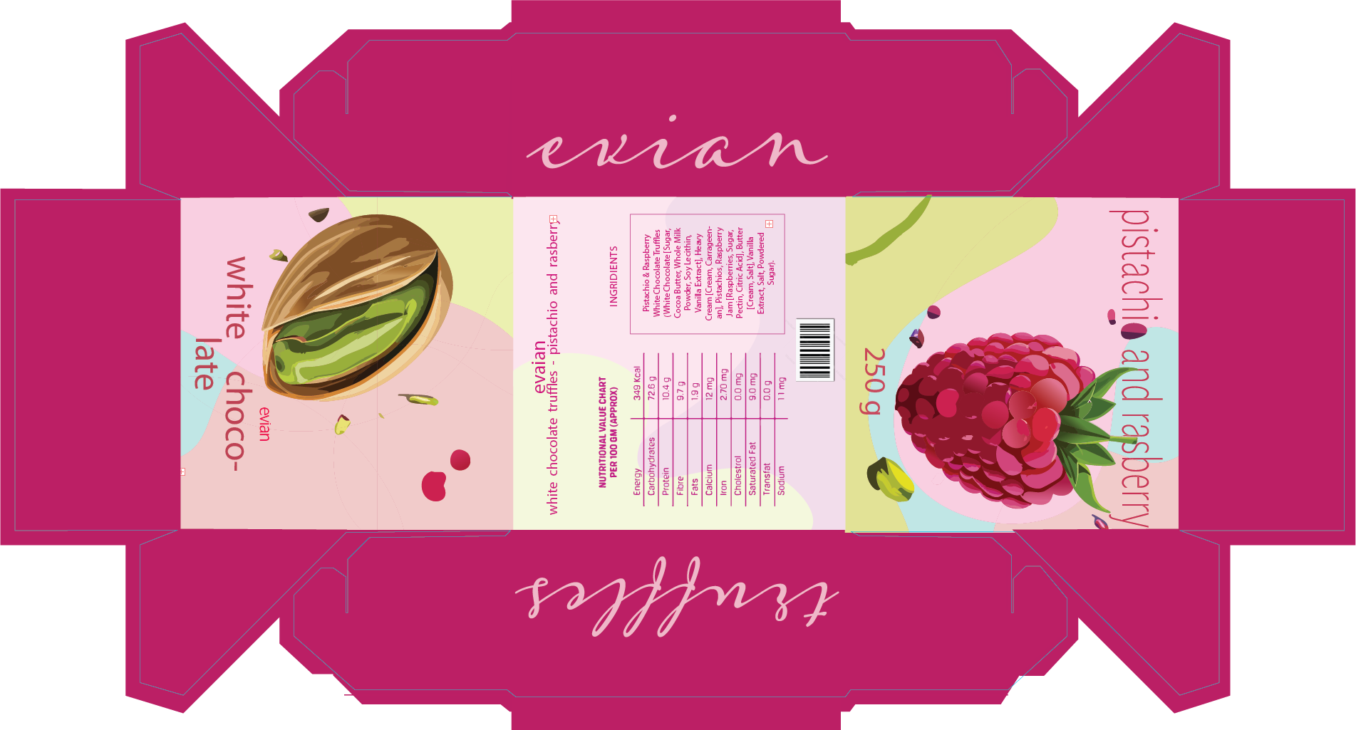
For Evian's white chocolate pistachio and raspberry truffles, I designed vibrant packaging that captures attention and conveys the luxurious, playful nature of the flavors. Using bold, eye-catching colors, I aimed to create an immediate appeal that reflects the product's freshness and aligns with Evian's brand identity. The main headings feature simple, rounded text to maintain a modern, approachable look, while side captions use a more artistic font to add a touch of sophistication. I also matched the nutritional values with the brand's colors, integrating design language to ensure these details feel cohesive rather than secondary. Altogether, the design strikes a balance between visual attraction and brand consistency, making the truffles irresistible on the shelf.
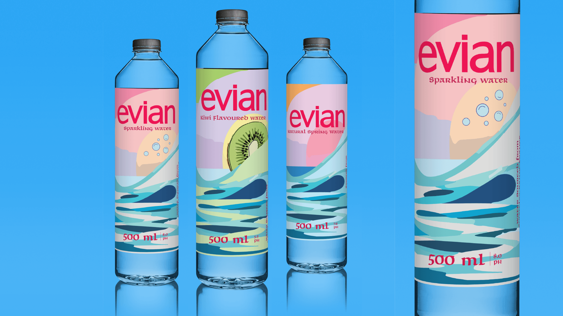
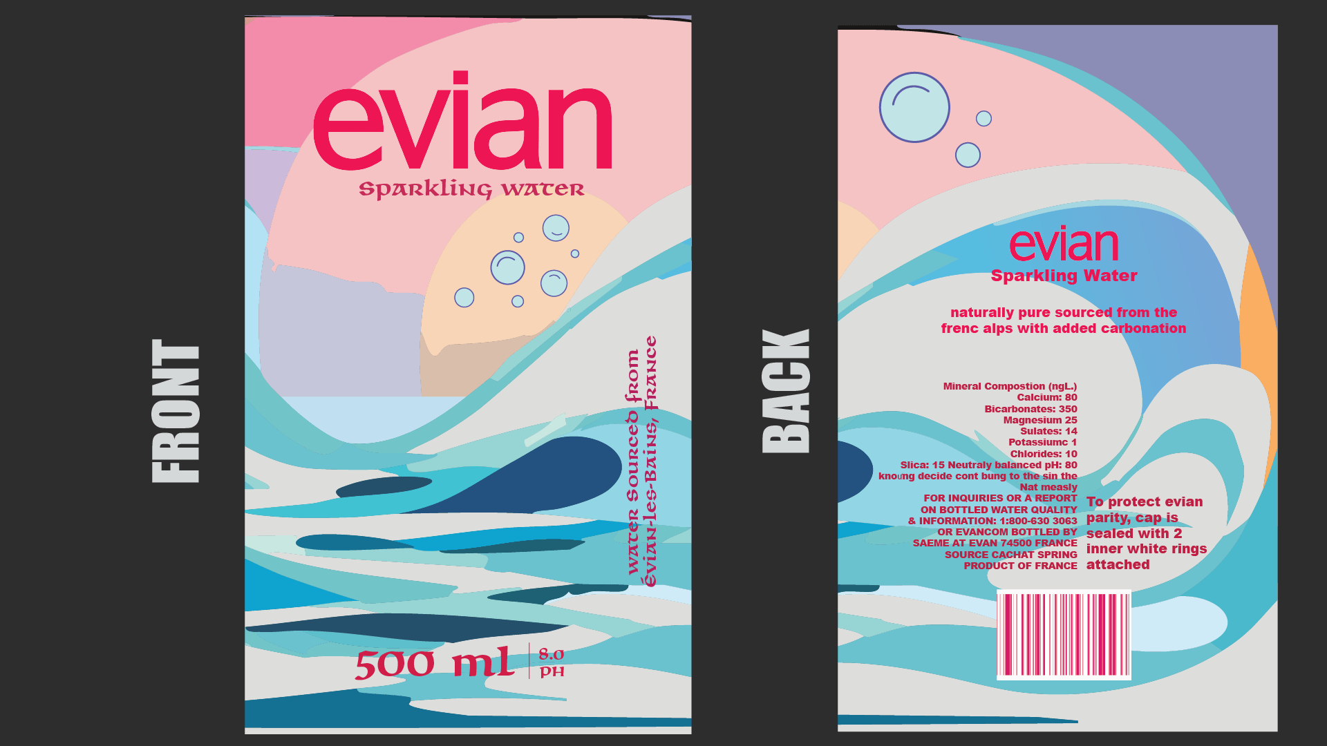
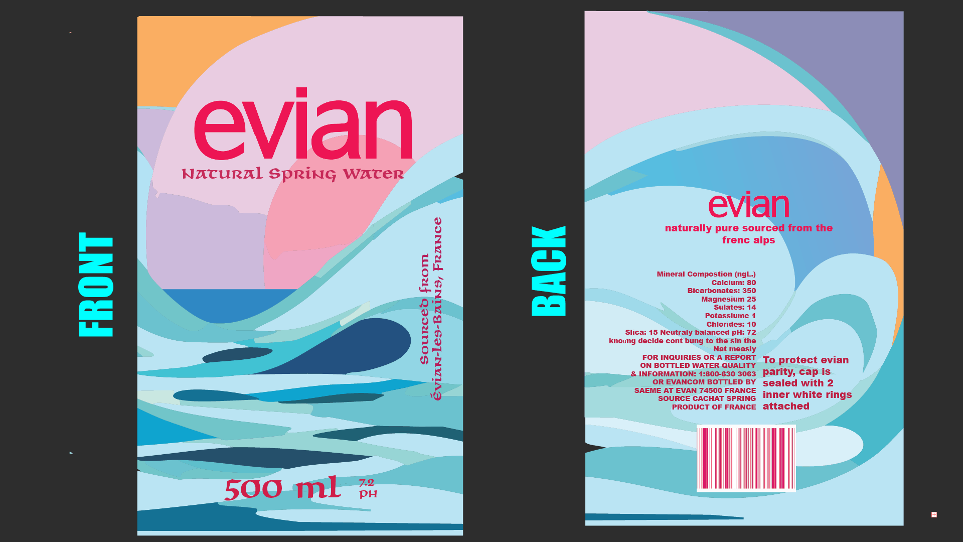
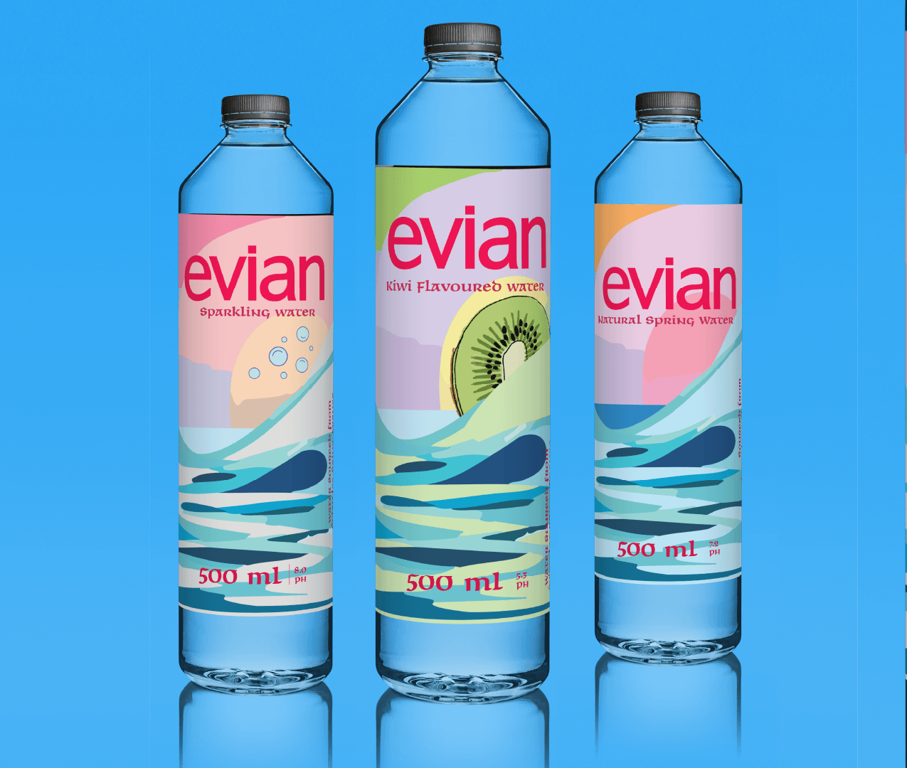
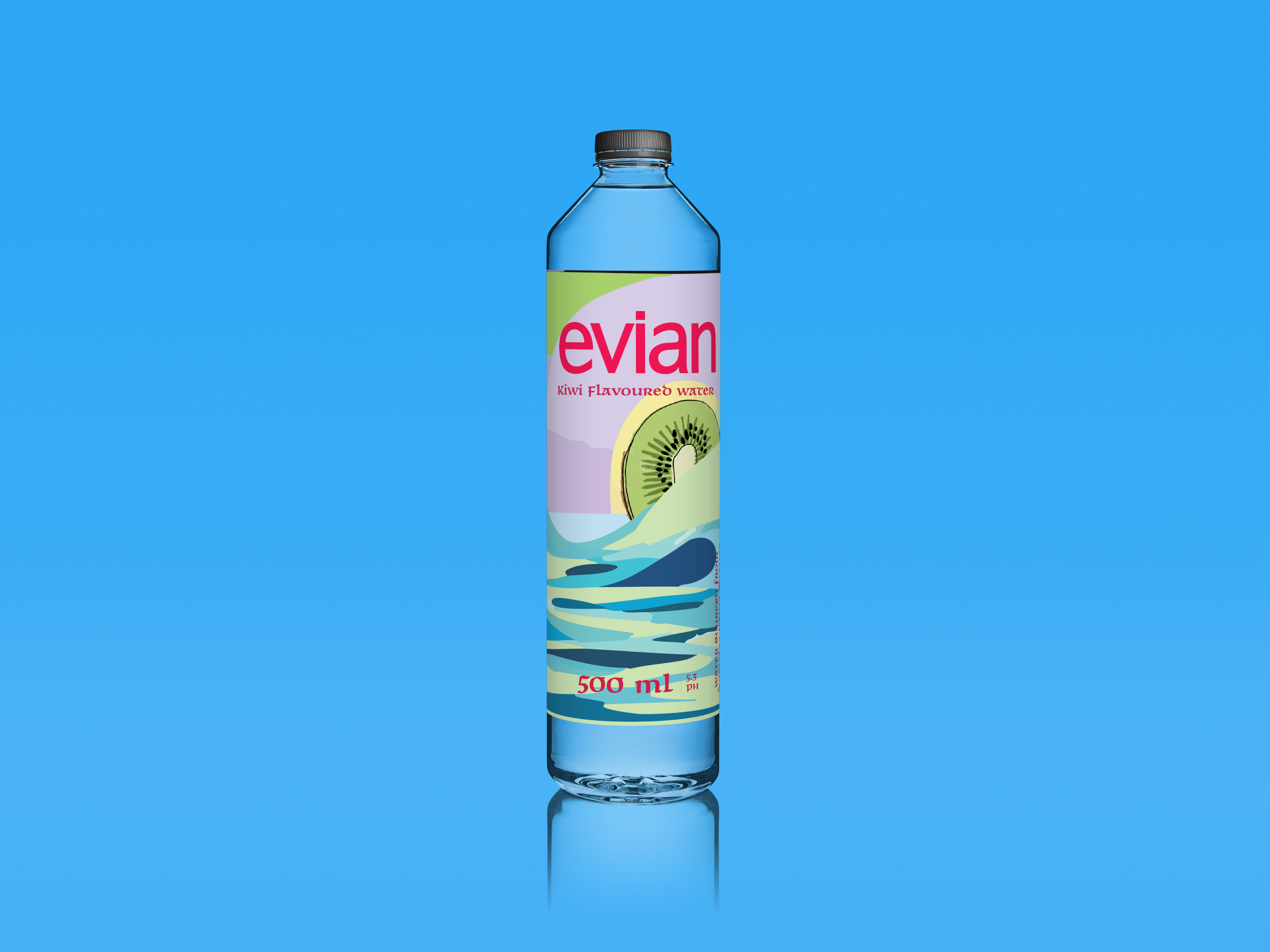
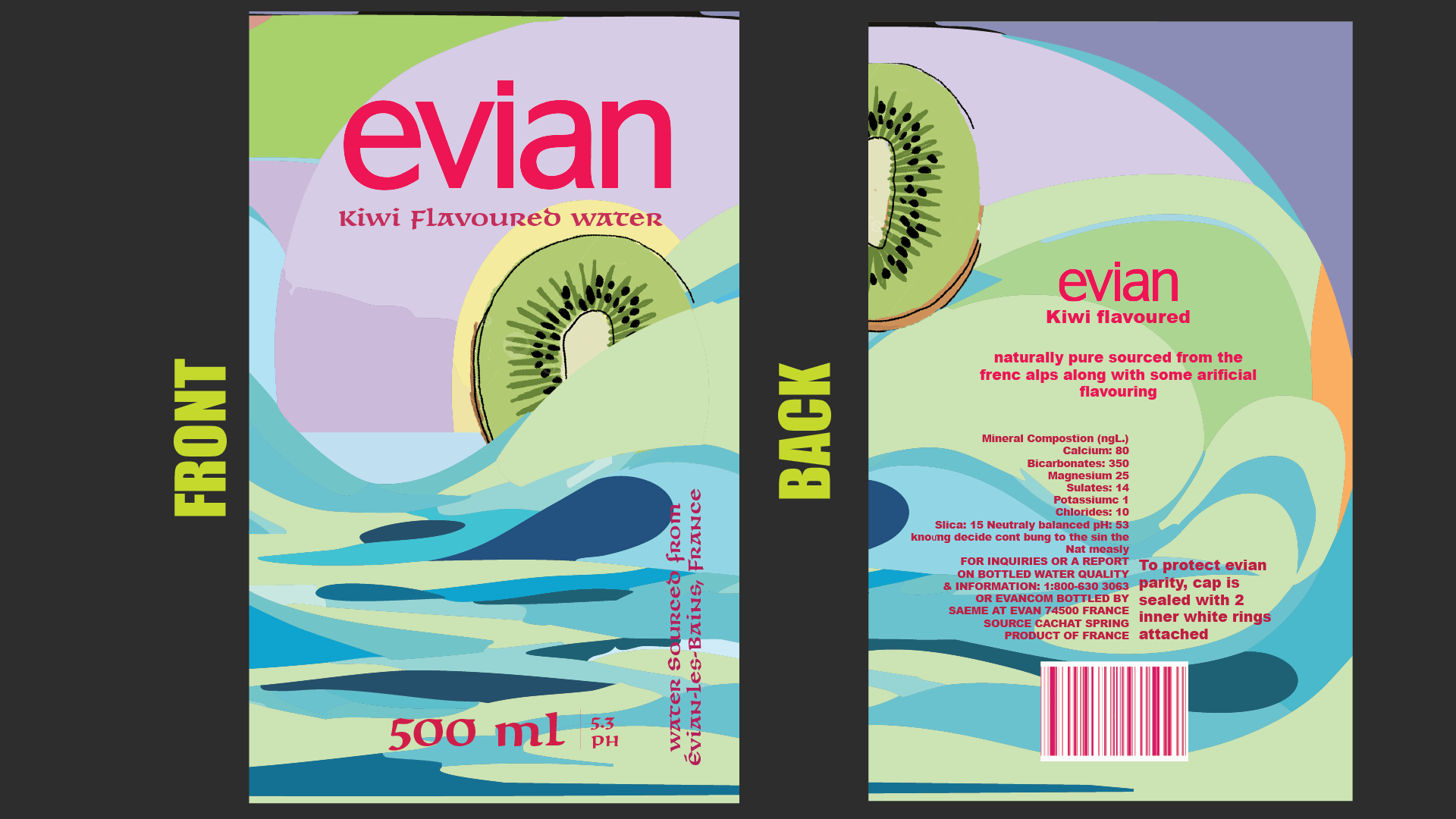
In addition to the truffle packaging, I redesigned Evian's bottle packaging for three product lines: spring water, flavoured water, and sparkling water. Each design shares a consistent visual language—delicate yet modern typographic choices, soft gradients, and clean minimalism—while incorporating subtle variations in color and icons to reflect each water type's distinct personality. This unified system strengthens brand recognition while giving each product a unique voice within the Evian family.
Design Process
Research
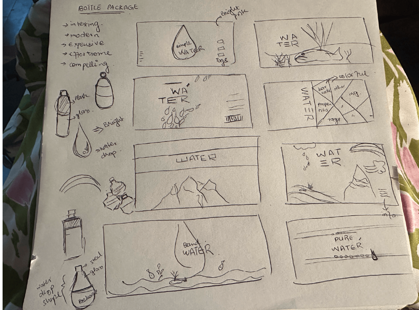
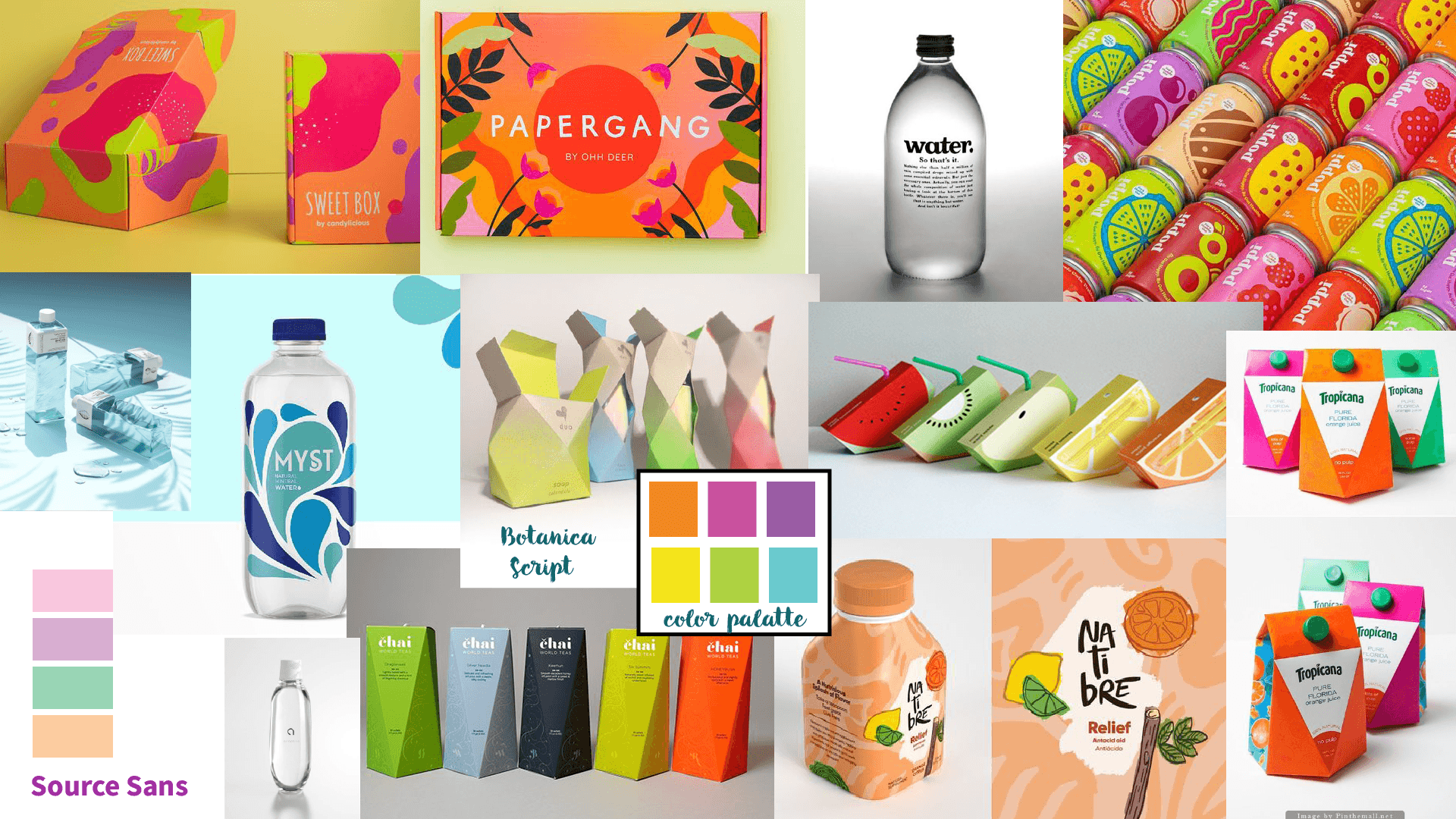
While researching bottle packaging, I noticed most designs were minimal but lacked fun or personality. I saw an opportunity to make Evian's packaging brighter and more playful while keeping it premium. I carried this concept across the spring, flavored, and sparkling water bottles, as well as the white chocolate pistachio and raspberry truffles—creating a cohesive, vibrant look that feels fresh and joyful.
Concept Development
The concept focused on blending Evian's elegance with bold, playful visuals to create a cohesive and modern packaging system.
Visual Design
The visual design incorporates bright, playful illustrations paired with clean typography and vibrant colors, using a modern design language that balances fun with elegance to reflect Evian's premium yet youthful identity.
Final Design
Main Poster Design
Featuring the March sisters in a contemporary composition
Bottle Cover
Illustrations
Close-up Details
Goals
The goal was to create a high-impact packaging design that would immediately stand out in a competitive retail space while embodying both the elegance and playful flavor profile of the product. The intention was to elevate Evian's presence in the luxury snack market, especially among younger consumers who value design driven branding and quality ingredients.
>Strategy
The challenge was to balance two contrasting qualities, luxury and playfulness. The product needed to feel premium without being overly traditional or serious. Nutritional information often disrupts visual flow in food packaging, so the challenge was to seamlessly integrate this data into the design without compromising visual appeal.
Challenges
My approach focused on strong visual storytelling through color, typography, and layout. I used a vibrant palette inspired by the product's ingredients, pistachio green, raspberry pink, and Light peachy pink, to instantly communicate flavor and freshness. I chose a minimalist and thin font for headings to ensure clarity, paired with a simple sans serif font for detail work to suggest sophistication. By matching design elements like the nutritional chart to the overall palette and treating them as an intentional part of the layout, I was able to maintain a cohesive look. User experience principles were applied to hierarchy and readability, ensuring the packaging is not only beautiful but also easy to navigate.
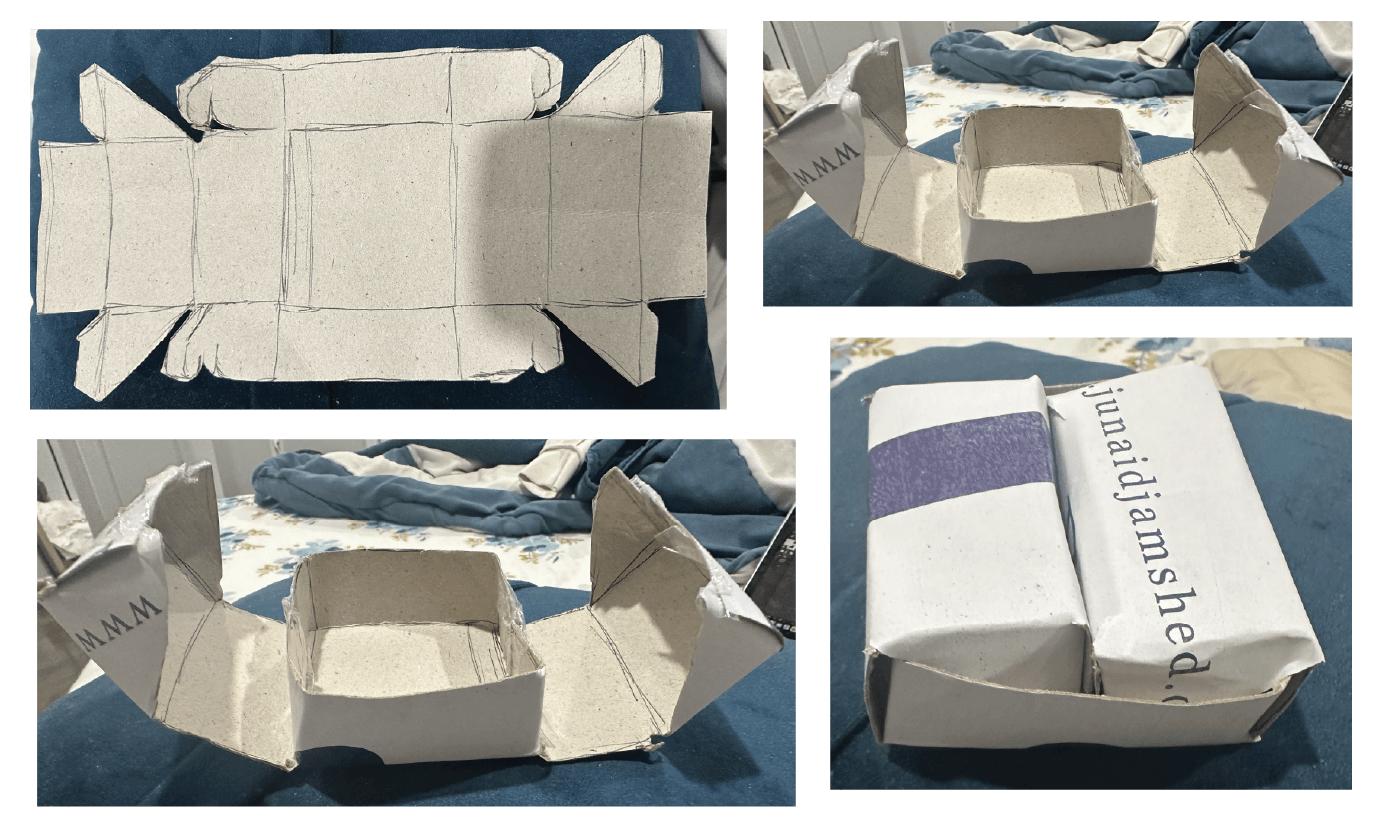
Process Work
Research & Analysis
Initial research and concept development
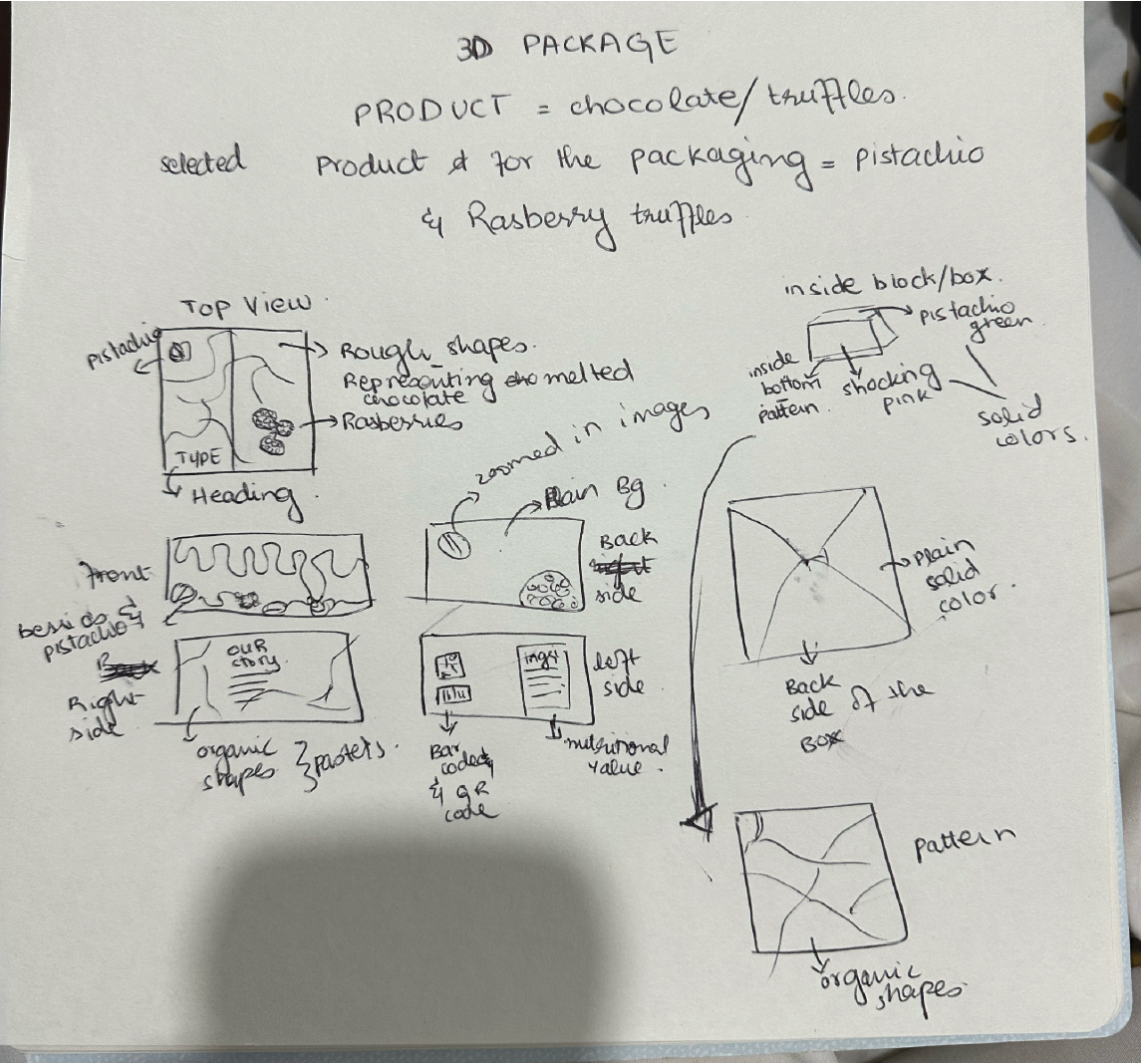
Packaging Exploration
Exploring different packaging designs for the truffles
Design Choices
Finalizing the visual elements
Final Design
Completed project outcome
Design Elements
Color Palette
bright, colorful, and eye-catching, chosen to create an attractive and energetic shelf presence.
Typography
primary typeface mirrors Evian's simple, clean logo style for brand consistency, while the secondary type is playful and expressive to add personality and charm.
Illustration
bold, colorful, and whimsical, designed to reflect the playful tone of the flavors and attract attention on the shelf.
Project Gallery